 kage
kage
heypi.xyz
Design analysis
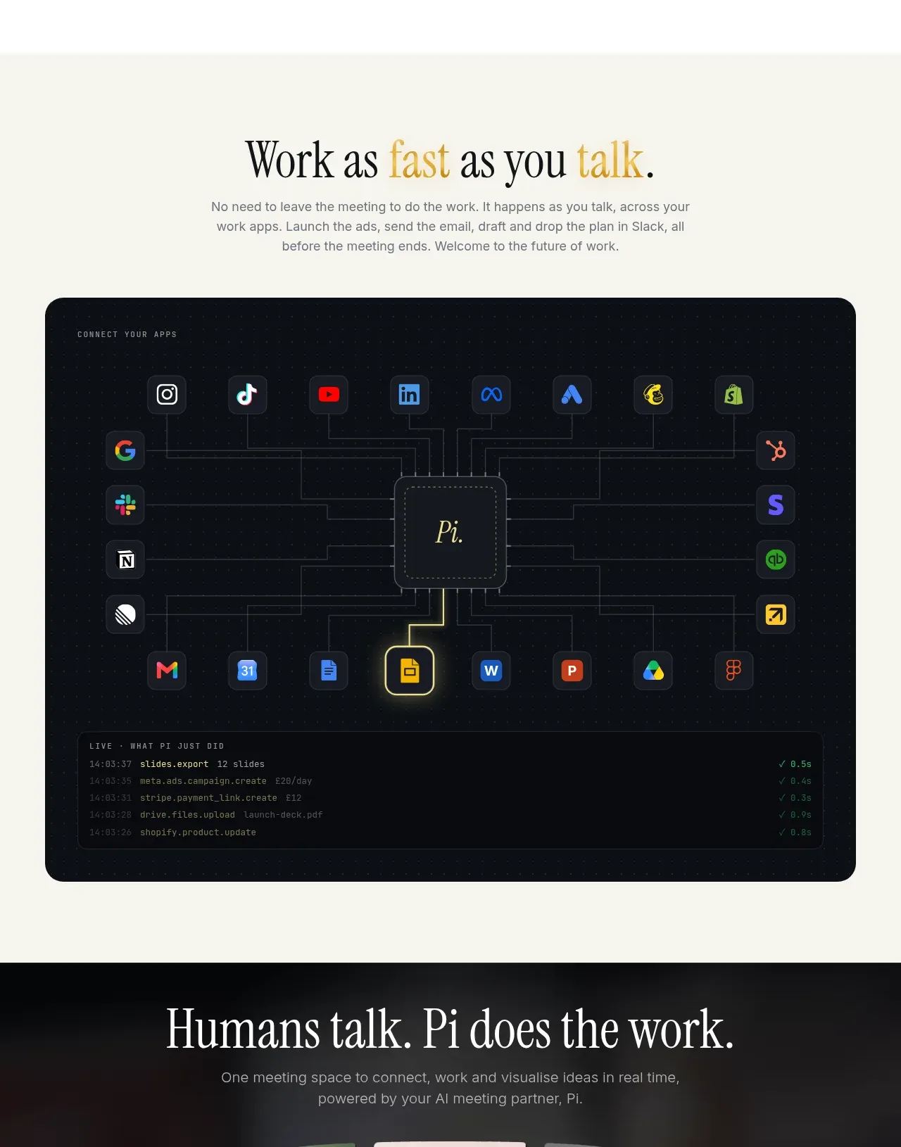
A centered promise about working at conversational speed is followed by a dark integration map showing many app nodes feeding a central workspace and activity log.
Prompt preview
## Reference images

Study these alongside the description below: hierarchy, rhythm, spacing, colour. Build for the product you are asked about, using this design language.

- Component: https://kage-design-assets.t3.tigrisfiles.io/components/heypi/9fccb756-63dd-4cec-9422-c066b077bc89-1791612277-5.webp
- Full page it was cut from: https://kage-design-assets.t3.tigrisfiles.io/screenshots/heypi/9fccb756-63dd-4cec-9422-c066b077bc89-1791612175185-full.webp
- Component on Kage: https://kage.design/component/heypi-feature-grid-4

## Before you start
Ask the user which tools or systems their product connects to and what work should happen automatically. Use their ecosystem and brand while preserving this compositional logic.

Create a warm section with a centered serif headline, one short explanatory paragraph, and a large dark rounded integration visualization. Place a central product-neutral workspace node in the middle, surround it with a balanced grid of generic app-category nodes, and connect them with thin circuit-like lines. Add a compact activity log panel along the bottom of the visualization to communicate live automation. Use a near-black navy panel with a faint dotted texture, muted grey connectors, small coloured node accents, and a single luminous yellow highlight on the central or primary path. Suggested colours: #F4F3EA, #0B1115, #1A2228, #CFCBBA, #E4D56B. Preserve generous whitespace above the panel, keep lines behind nodes, and provide hover/focus states that highlight a path without relying on colour alone.

Never use logos, product names, copy, illustrations, or imagery from the reference.
More components

 Agent orchestration section
Hypervibe · Feature grid
Agent orchestration section
Hypervibe · Feature grid
 Continuity and memory grid
Hypervibe · Feature grid
Continuity and memory grid
Hypervibe · Feature grid
 Core workspace feature section
Hypervibe · Feature grid
Core workspace feature section
Hypervibe · Feature grid
 Voice collaboration section
Hypervibe · Feature grid
Voice collaboration section
Hypervibe · Feature grid
 Studios and output grid
Hypervibe · Feature grid
Studios and output grid
Hypervibe · Feature grid

 What it is: trusted knowledge features
Lune · Feature grid
What it is: trusted knowledge features
Lune · Feature grid