 kage
kage
luneresearch.com
Design analysis
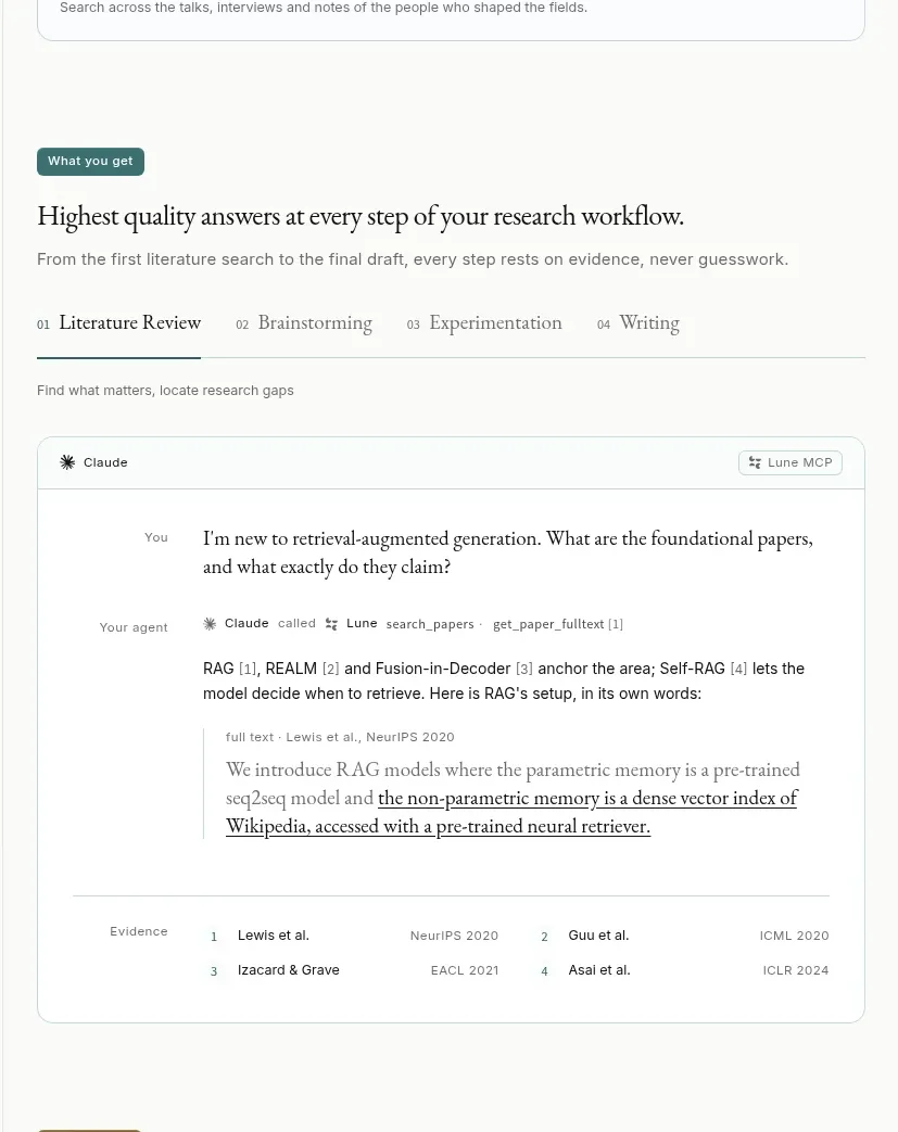
This section presents a four-step workflow tab row and a large conversation/evidence card showing how an agent answers with citations and source details.
Prompt preview
## Reference images

Study these alongside the description below: hierarchy, rhythm, spacing, colour. Build for the product you are asked about, using this design language.

- Component: https://kage-design-assets.t3.tigrisfiles.io/components/lune/4bf7ff48-f6a1-4cc9-aba1-cb69c6f24fa8-1791698509-2.webp
- Full page it was cut from: https://kage-design-assets.t3.tigrisfiles.io/screenshots/lune/4bf7ff48-f6a1-4cc9-aba1-cb69c6f24fa8-1791698434673-full.webp
- Component on Kage: https://kage.design/component/lune-feature-grid-2

## Before you start
Ask which workflow your product improves and what proof users need to trust it. Apply the same interaction pattern to that product.

Create a workflow demonstration section. Start with a small colored eyebrow, editorial serif heading, and muted supporting line. Add a four-step horizontal tab bar with numbered labels, a dark or accent underline under the active step, and a subtle divider across the row. Under it, render a large rounded demonstration card: a compact header with the selected tool, a user question block, an agent response block, a visible tool-call/status line, and an evidence quotation area with source metadata. End with a two-column citation list inside the card. Use #f8f8f5 as the page background, #ffffff for the demo surface, #171716 text, #777772 metadata, #deded8 borders, and a muted olive/gold accent #9b8b55. Use 8px radius, 16–22px padding, 12–14px body text, and 20–26px serif headings. Tabs should update content, preserve focus rings, and become horizontally scrollable on mobile.

Never: use the reference's logos, product names, copy, illustrations, imagery, or exact conversation text.
More components

 Studios and output grid
Hypervibe · Feature grid
Studios and output grid
Hypervibe · Feature grid
 Continuity and memory grid
Hypervibe · Feature grid
Continuity and memory grid
Hypervibe · Feature grid
 Voice collaboration section
Hypervibe · Feature grid
Voice collaboration section
Hypervibe · Feature grid
 Core workspace feature section
Hypervibe · Feature grid
Core workspace feature section
Hypervibe · Feature grid
 Agent orchestration section
Hypervibe · Feature grid
Agent orchestration section
Hypervibe · Feature grid

 How it works: connected research tools
Lune · Feature grid
How it works: connected research tools
Lune · Feature grid