kage
kage
luneresearch.com
Design analysis
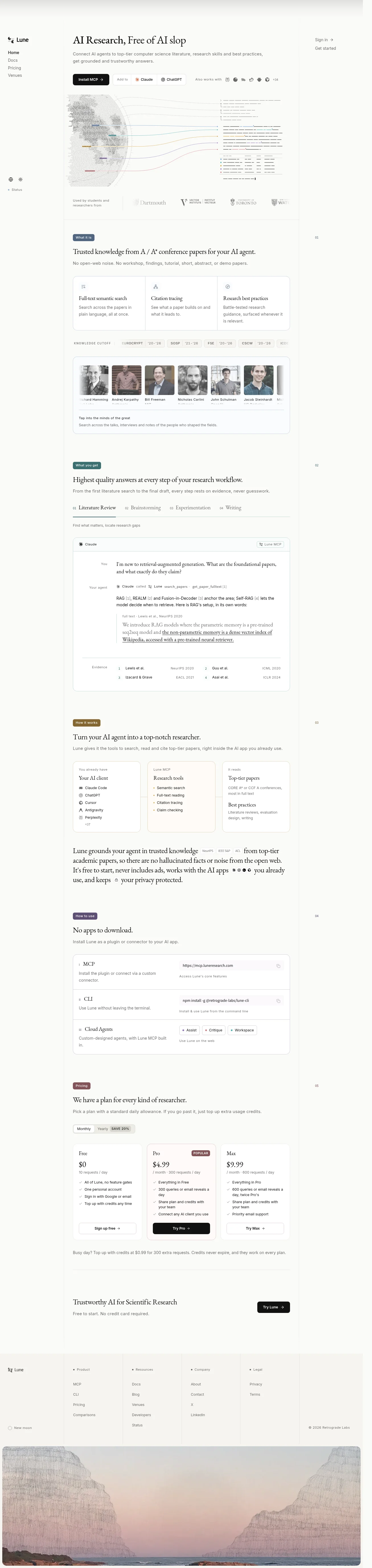
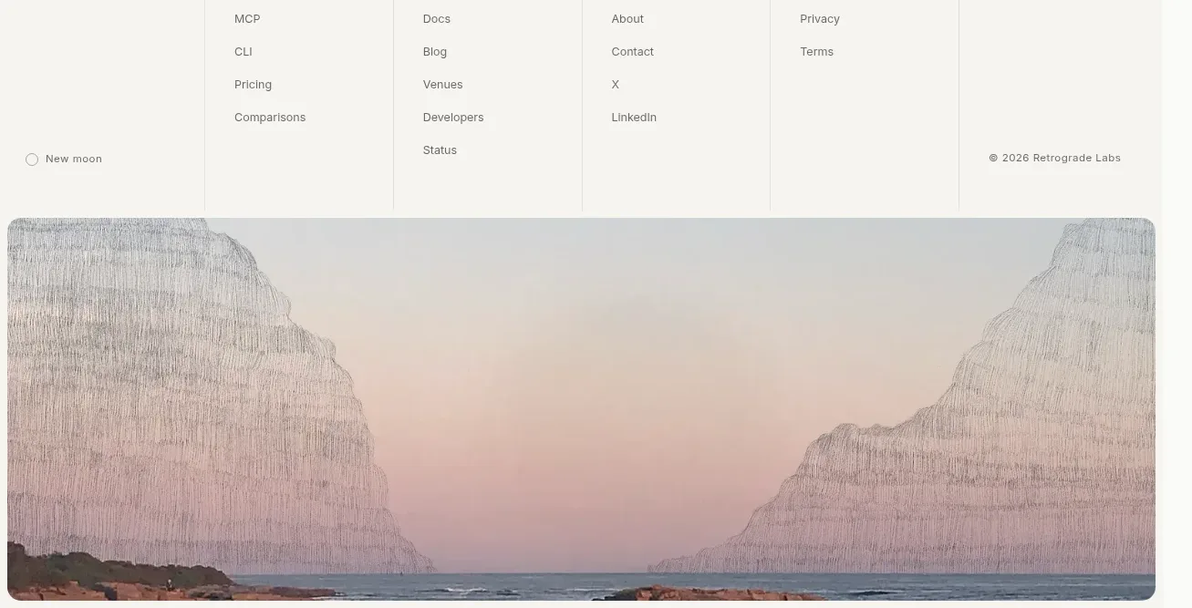
A restrained, editorial landing page uses a narrow centered content column, generous white space, fine gray rules, and a serif display face paired with small sans-serif utility text. The hero moves from a compact product pitch into a diagram and institution strip; below it, the page alternates labeled feature sections, bordered cards, workflow tabs, an evidence-rich chat example, implementation options, pricing, and a quiet CTA before ending in a multi-column footer and full-width coastal image. Muted blue, green, ochre, and plum labels provide sparse section coding without disrupting the largely monochrome canvas.
Prompt preview
## Reference images

Study these alongside the description below: hierarchy, rhythm, spacing, colour. Build for the product you are asked about, using this design language.

- Full page: https://kage-design-assets.t3.tigrisfiles.io/screenshots/lune/4bf7ff48-f6a1-4cc9-aba1-cb69c6f24fa8-1791698434673-full.webp
- Above the fold: https://kage-design-assets.t3.tigrisfiles.io/screenshots/lune/4bf7ff48-f6a1-4cc9-aba1-cb69c6f24fa8-1791698431338.webp
- Design on Kage: https://kage.design/designs/lune-landing-page

## Before you start
Ask the user what they are building, who it is for, and what brand assets they already have (name, colours, type choices, logo or other visual assets). Wait for their answers before designing. Apply everything below to that product, not to the reference product.

## Page structure
- **Persistent left rail and utility edge:** Create a slim, quiet navigation rail with a small brand mark area, stacked primary links, and low-contrast status/theme controls near the bottom; keep sign-in and the main action in the upper-right of the content area. On long desktop pages, use a subtle right-side section index with small sequential numbers.
- **Hero introduction:** Set a large serif headline on the left of the main column, followed by a short sans-serif description and a compact row of dark primary action, integration buttons, and small compatible-tool marks.
- **Research visualization:** Place a large, delicate diagram or product illustration beneath the hero controls, using fine lines, paper-like text fragments, and restrained colour traces rather than a heavy screenshot frame.
- **Institution proof strip:** Follow the hero visual with a low-height row that states who uses the product and displays subdued academic or customer names/logotypes separated by generous spacing.
- **What it is section:** Start with a small coloured pill label, then a serif statement about the product’s core value and a muted explanatory line. Add a three-column bordered feature card for semantic search, citation tracing, and research practices.
- **Knowledge cut-off strip:** Insert a compact horizontal row of small uppercase metadata chips or filters to make the research corpus feel bounded and deliberate.
- **People/researchers card:** Add a wide bordered carousel-like panel with grayscale portrait tiles, names, and a short caption explaining access to influential thinkers; keep the card visual and information-dense but calm.
- **What you get section:** Introduce the outcome with a coloured section label, serif heading, and supporting line. Add a horizontal four-step workflow navigation, then a large bordered conversation/evidence panel showing a user question, agent response, cited source excerpt, and evidence list.
- **How it works section:** Use another colour-coded label and a serif heading to explain the system. Present three connected cards: the user’s existing AI client, the research tools layer, and the top-tier papers it reads; use tiny bullets and a light connector line.
- **Trust statement:** Break the card rhythm with a larger serif paragraph that embeds small inline conference/category chips and tool marks, emphasizing grounded answers, citations, and privacy.
- **How to use section:** Show a compact setup explanation followed by a bordered three-row options table for MCP, CLI, and cloud agents. Each row should pair a short description with a URL, install command, or small action chips and copy affordance.
- **Pricing section:** Add a pricing label, serif heading, short billing explanation, and monthly/yearly toggle. Use three equal pricing cards for free, pro, and max; make the middle plan visually prominent with a muted accent border, popularity badge, dark CTA, and concise check-list details.
- **Pricing note:** Place a small muted usage-credit note below the cards, then a thin divider.
- **Final CTA:** Use a sparse two-column row with a serif trust-oriented heading and supporting line on the left and a dark rounded action button on the right.
- **Footer:** Build a pale, ruled multi-column footer with brand/status content on the far left, grouped Product, Resources, Company, and Legal links across the middle, and copyright on the right.
- **Closing image:** Finish with a wide rounded-corner atmospheric landscape image, giving the page a visual pause after the dense informational footer.

## Design language
- Build hierarchy through contrast in type scale and spacing rather than loud colour: use a large literary serif for headlines and section statements, and a small neutral sans-serif for navigation, labels, descriptions, metadata, and controls.
- Keep the main reading column narrow and vertically paced. Let the hero breathe, then increase density through bordered cards, workflow tabs, evidence rows, setup tables, and pricing; restore air around the trust statement and final CTA.
- Use an off-white/white base around `#fafaf8` to `#ffffff`, near-black text around `#171716`, and cool gray secondary text around `#777873`. Rules should be very light, approximately `#e4e5e1`.
- Treat colour as section coding only: use small muted pills in dusty blue `#536b83`, teal `#3f7774`, ochre `#8a6b2d`, and plum `#765567`; keep large surfaces neutral.
- Pair a refined high-contrast serif with a restrained grotesk sans-serif. Use generous serif line-height, compact all-caps metadata with tracking, and modest sans-serif body sizes around 12–15px on desktop.
- Prefer 1px borders, hairline dividers, subtle inner lines, and little or no shadow. Use modest 8–12px radii for cards and controls; the design should feel printed, catalogued, and precise rather than glossy.
- Make cards mostly white against the warm page background, with occasional very faint tinted surfaces for selected pricing or workflow states. Emphasize one primary action with a near-black filled button and keep secondary buttons outlined or text-based.
- Use small sequential section numbers and a fixed navigation rail to give the long page an indexed, archival quality. Keep navigation quiet and let content carry the visual weight.
- Where interaction is visible, use simple tab selection, billing toggles, copy controls, carousel-like horizontal content, and hover states that change border or text colour rather than introducing large motion. Keep transitions short and understated.
- Use product diagrams, evidence excerpts, portraits, and the final landscape as editorial content with low saturation and fine detail; avoid decorative gradients, oversized illustrations, and visual noise.

## Never
- Do not use the reference product’s logos, wordmarks, product names, copy, illustrations, photography, portraits, institution names, tool marks, or icon sets.
- Do not reproduce Lune’s exact research diagram, pricing copy, screenshots, people, or landscape image.
- Do not present the result as Lune or imply an affiliation; replace all content and brand assets with the user’s own product, audience, terminology, and assets.
Components from this page
All components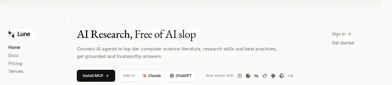
 Editorial research product navigation
Lune · Navigation
Editorial research product navigation
Lune · Navigation
 What it is: trusted knowledge features
Lune · Feature grid
What it is: trusted knowledge features
Lune · Feature grid
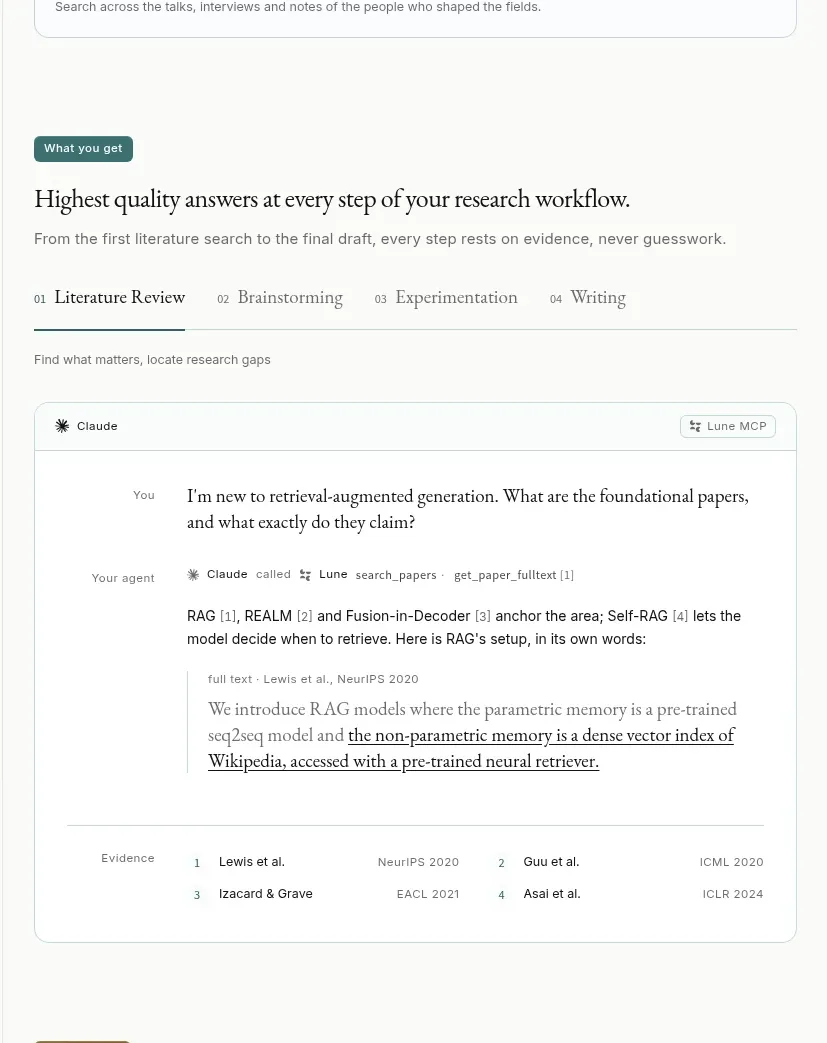 Workflow quality and research answer demo
Lune · Feature grid
Workflow quality and research answer demo
Lune · Feature grid
 How it works: connected research tools
Lune · Feature grid
How it works: connected research tools
Lune · Feature grid
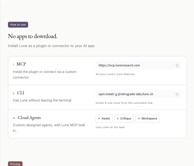 Ways to use the product
Lune · Table
Ways to use the product
Lune · Table
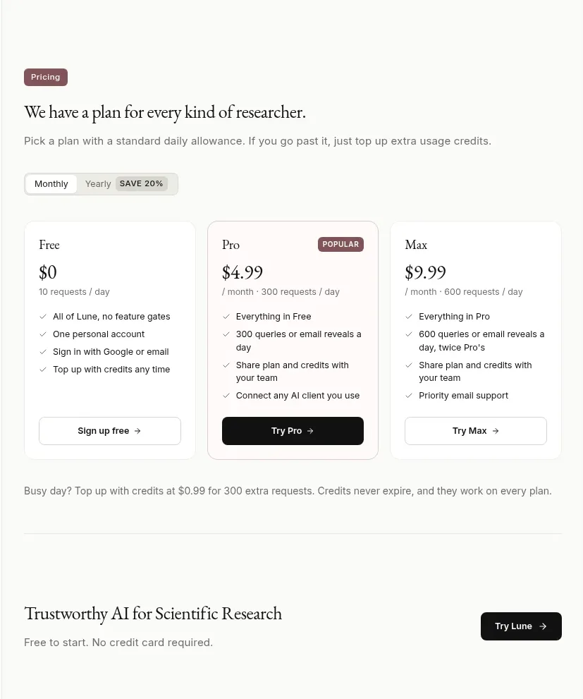 Researcher pricing plans
Lune · Pricing table
Researcher pricing plans
Lune · Pricing table
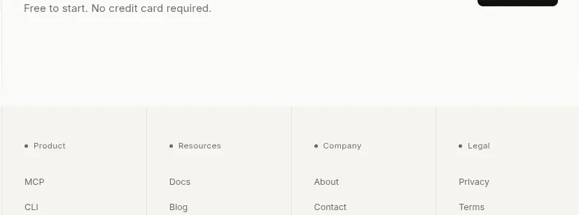 Trust and final conversion
Lune · Call to action
Trust and final conversion
Lune · Call to action
 Multi-column product footer with landscape artwork
Lune · Footer
Multi-column product footer with landscape artwork
Lune · Footer