 kage
kage
pinecomputer.io
Design analysis
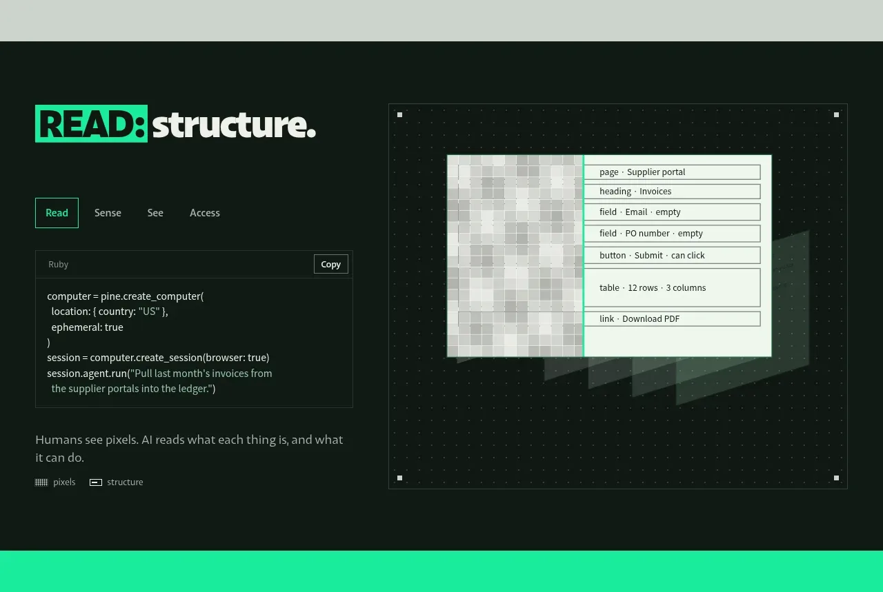
A dark split feature band pairs a compact code-like interaction panel with a large framed product visual. Tabs and tiny metadata make the feature feel inspectable and technical rather than decorative.
Prompt preview
## Reference images

Study these alongside the description below: hierarchy, rhythm, spacing, colour. Build for the product you are asked about, using this design language.

- Component: https://kage-design-assets.t3.tigrisfiles.io/components/pine-computer/b47ce26e-68eb-4b09-b29e-15beff007c2f-1791612327-2.webp
- Full page it was cut from: https://kage-design-assets.t3.tigrisfiles.io/screenshots/pine-computer/b47ce26e-68eb-4b09-b29e-15beff007c2f-1791612242987-full.webp
- Component on Kage: https://kage.design/component/pine-computer-feature-grid

## Before you start
Ask the user what core workflow their product automates and what proof or interface should demonstrate it. Apply the system below to that workflow and brand.

Build a dark, full-width feature section with a two-column layout. On the left, use a bold accent-highlighted heading, a small tab row, a bordered code or command panel, and a short explanatory sentence with tiny metadata labels. On the right, place a large framed product-demo viewport on a subtle dotted technical grid; show a believable abstract interface that turns messy input into structured fields or actions. Keep the demo visual secondary to the message but large enough to understand.

Use near-black green #07110D for the section, warm off-white #E8EDE6 for text, and mint #16E7A7 for active tabs and highlights. Use thin low-contrast borders #26352D, square corners, compact monospace labels, and generous internal padding. Visible interaction should include tabs changing the code/example and a demo frame that can be inspected or animated, but keep the default state understandable without interaction.

Never:
- use the reference code, labels, product name, or screenshots
- copy the exact demo UI or illustration
- add unrelated stock imagery or logos
- make every element glow, rounded, or card-heavy
More components

 Continuity and memory grid
Hypervibe · Feature grid
Continuity and memory grid
Hypervibe · Feature grid
 Agent orchestration section
Hypervibe · Feature grid
Agent orchestration section
Hypervibe · Feature grid
 Voice collaboration section
Hypervibe · Feature grid
Voice collaboration section
Hypervibe · Feature grid
 Studios and output grid
Hypervibe · Feature grid
Studios and output grid
Hypervibe · Feature grid
 Core workspace feature section
Hypervibe · Feature grid
Core workspace feature section
Hypervibe · Feature grid

 What it is: trusted knowledge features
Lune · Feature grid
What it is: trusted knowledge features
Lune · Feature grid