kage
kage
Design analysis
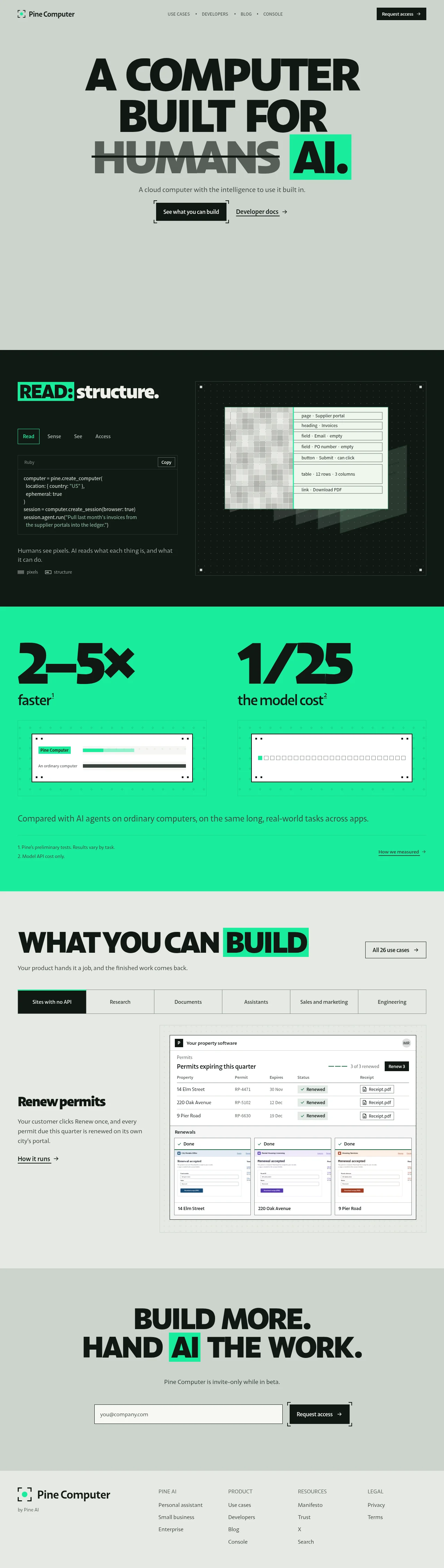
A stark editorial landing page that sells an AI-native cloud computer through scale contrast and flat colour fields. Massive condensed uppercase headlines do the talking — 'HUMANS' is struck through and 'AI.' sits in a spring-green highlight block, a device repeated down the page. Sections alternate hard between warm grey, near-black and saturated green with no gradients or shadows, while a machine-vision motif (corner brackets, dotted grids, corner tick marks) ties buttons, demo panels and mockups together. The dark 'READ: structure' demo pairs a Ruby snippet with a pixels-to-structure visualisation, the green band pairs giant numerals with small white proof cards and honest footnotes, and a tabbed use-case gallery embeds a dense, realistic product mockup.
Prompt preview
## Reference images

Study these alongside the description below: hierarchy, rhythm, spacing, colour. Build for the product you are asked about, using this design language.

- Full page: https://kage-design-assets.t3.tigrisfiles.io/screenshots/pine-computer/b47ce26e-68eb-4b09-b29e-15beff007c2f-1791612242987-full.webp
- Above the fold: https://kage-design-assets.t3.tigrisfiles.io/screenshots/pine-computer/b47ce26e-68eb-4b09-b29e-15beff007c2f-1791612233952.webp
- Design on Kage: https://kage.design/designs/pine-computer-landing-page

## Before you start

Ask the user what product they are building, who it is for, and what brand assets they already have (name, colours, typeface preferences). Wait for the answers before writing any code, then apply everything below to *their* product — this prompt describes a design language, not a page to clone.

## Page structure

1. **Top nav** — light grey bar: logo mark + wordmark left; centred uppercase micro-links separated by interpuncts (·); solid black pill-less button with an arrow on the right.
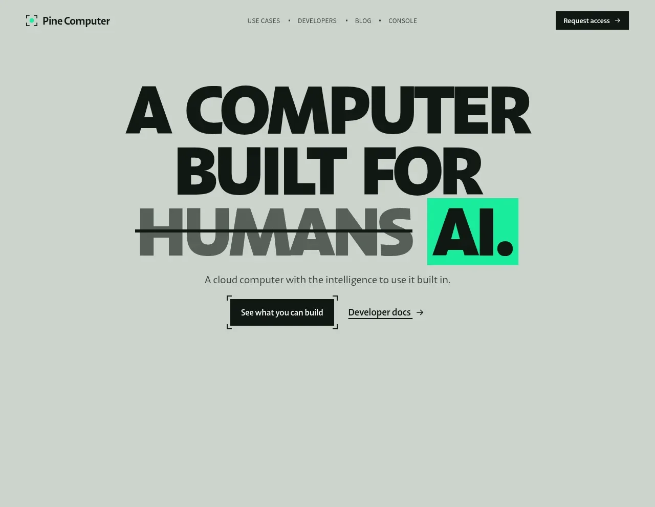
2. **Hero** — centred, extremely large condensed uppercase headline over three lines where the old concept is struck through in grey and the new concept sits in a saturated highlight block; one short subhead below; a black primary CTA framed with corner brackets plus an underlined text link with arrow. Leave generous empty grey space under the fold line.
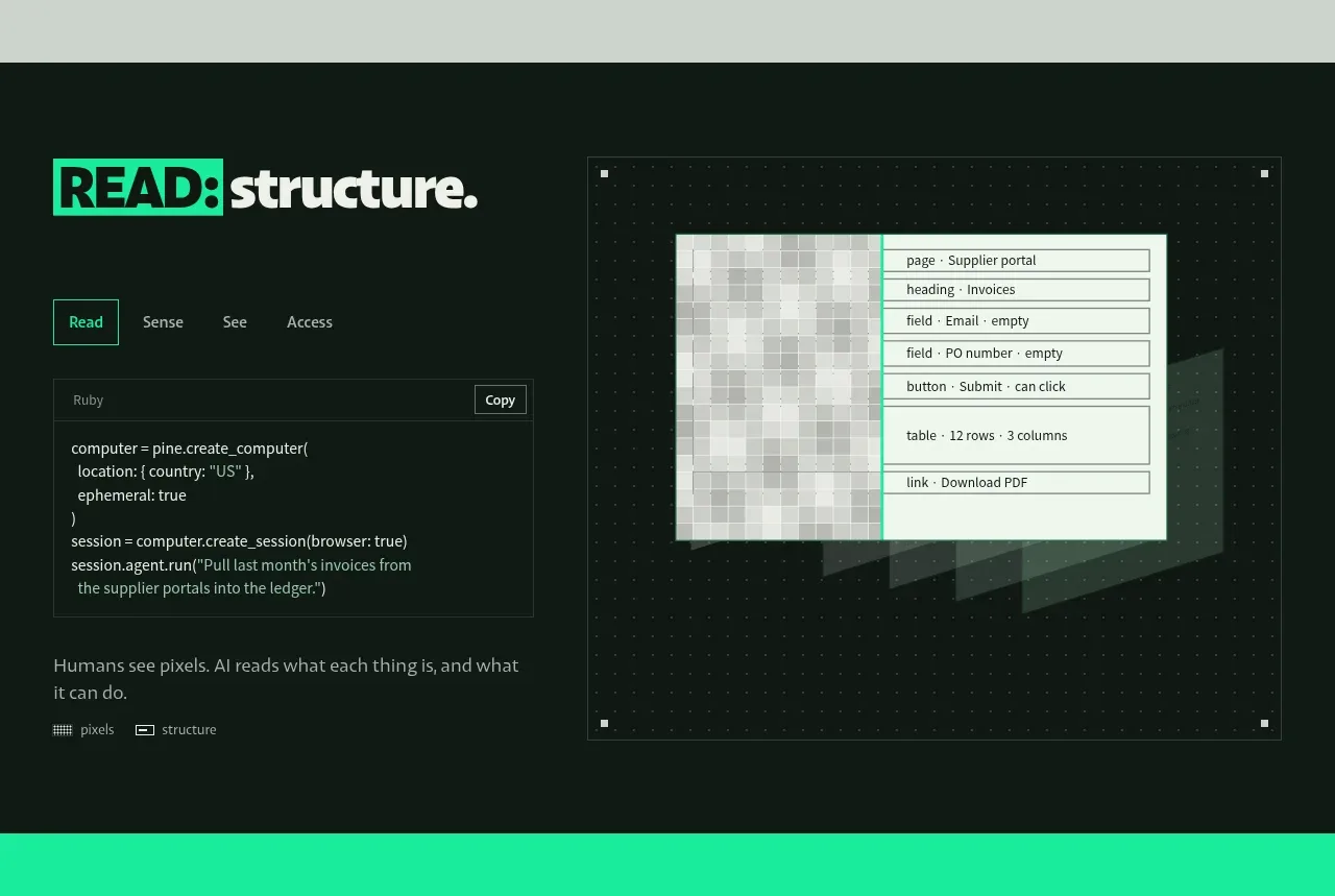
3. **Dark mechanism section** — near-black band, two columns. Left: section title with a highlight block on the first word, a small horizontal tab row (first tab active with a thin accent border), a dark code card with a language label, Copy button and short snippet, a one-sentence plain-language explanation, and a tiny legend row. Right: a demo panel on a dotted grid with corner tick marks, showing a pixelated screenshot beside a structured list of detected elements.
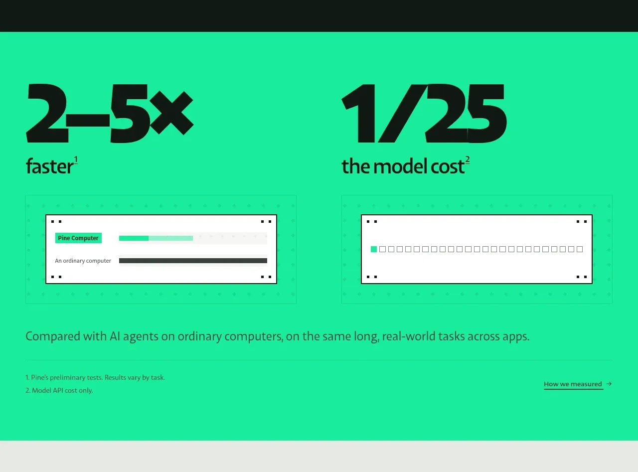
4. **Green stats band** — saturated accent background, two giant numerals with superscript footnote markers and small lowercase labels; beneath each a small white proof card (a progress-bar comparison in one, a checkbox grid in the other); a full-width comparison caption, then a footnote row of small print with a "How we measured →" link.
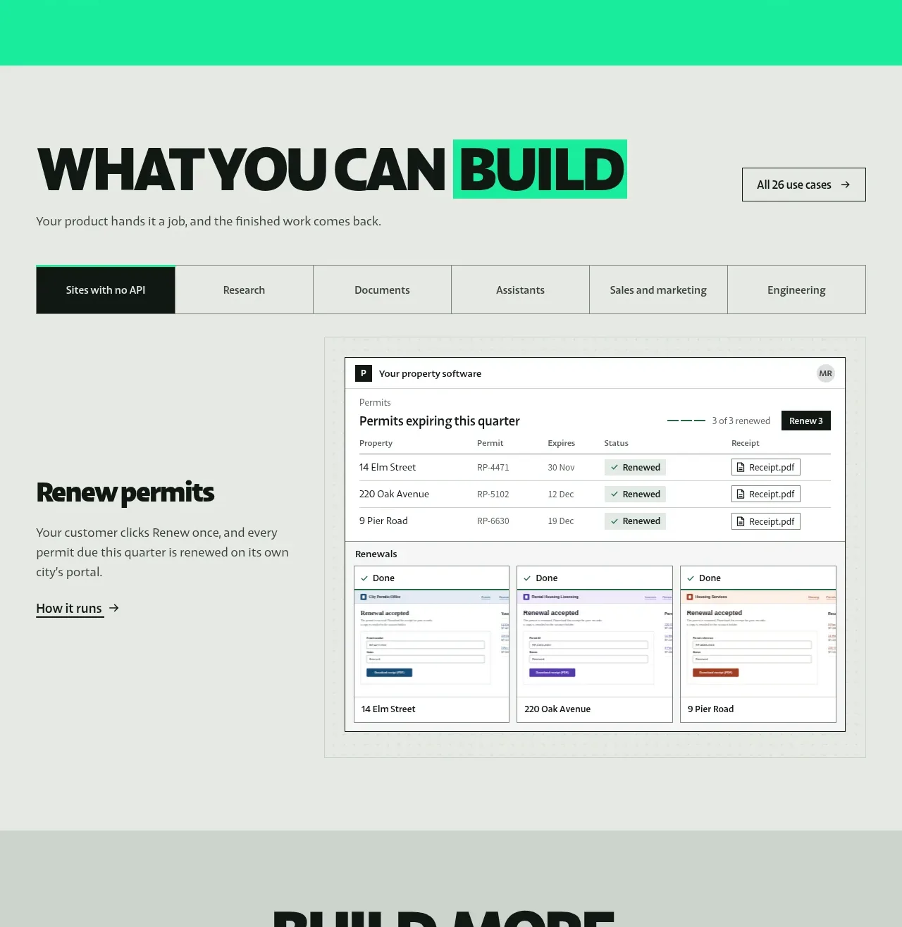
5. **Use-case gallery** — back on light grey: large left-aligned headline with the key word in a highlight block, a subhead, and a bordered "All N use cases →" button on the right; a full-width segmented tab bar of six categories with the active tab filled black; content split as a narrow left narrative column (use-case title, two-line description, "How it runs →" link) beside a large dense product mockup with a realistic table, status pills, file chips and a row of "Done" sub-cards.
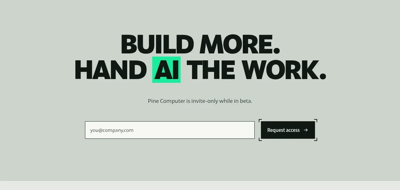
6. **Final CTA band** — slightly darker grey: centred two-line display headline with a highlight block on one word, an invite-only line, then an email input beside the black Request-access button.
7. **Footer** — lighter grey: logo + "by <parent>" on the left; four link columns with small uppercase headers.

## Design language

- **Hierarchy by scale, not decoration.** One display face set condensed and uppercase at ~120–160px with 0.9 line-height and near-zero letter-spacing for headlines; body copy is a neutral sans at 15–16px. There is almost nothing between the two — no mid-size ornament. If hierarchy is unclear, make the headline bigger, not the page busier.
- **Sections are flat colour fields.** Alternate hard between warm light grey `#D9D9D6`, near-black `#0E100E` and one saturated accent green `#2CEB8E`. No gradients, no shadows, no photographic backgrounds. Section changes are perceived instantly as colour switches, not borders.
- **The accent is rationed.** Green appears only as (a) a highlight block behind one or two words per headline, (b) active-tab borders and active states, (c) the stats band background, (d) one filled UI element inside mockups. Everything else is black on grey or white.
- **The swap device.** The page's core rhetorical move: strike through the old world in muted grey with a single line-through, then set the new word inside a solid accent block. Reuse this wherever the message is a replacement claim.
- **Machine-vision motif.** Draw corner brackets (⌐ ⌐ rotated L-shapes) around primary CTAs and demo panels; put 1px tick marks or plus-marks at panel corners; place dotted-grid backgrounds under visualisations. It should read as a viewfinder targeting the UI.
- **Cards and chrome.** White cards with 1px near-black borders, radius 0–4px, no shadows, and tiny square corner dots. Mockups are dense and realistic: 11–12px type, thin dividers, muted status pills, file chips with icons, small avatars — believable software, not abstract shapes.
- **Code presentation.** Dark surface `#131513`, mono type at 12–13px, muted grey strings, a small language tab and Copy button top-right. Pair every code block with one sentence of plain language underneath.
- **Numbers as typography.** Stats are set at display scale with superscript footnote markers; proof lives in small white cards directly beneath; small-print footnotes and a measurement link close the band. Credibility is part of the composition.
- **Tabs.** Full-width segmented bars with 1px borders; the active tab is filled black with white text (on light) or accent-bordered (in dark sections). Gallery content pairs one narrative column with one large artefact — never a card grid.
- **Links and motion.** Text links are underlined with a trailing → arrow. Motion is minimal and functional: hover fills on buttons, gentle underline/highlight swaps on links, tabs switching content in place. Nothing floats, bounces or parallax-scrolls.
- **Density rhythm.** The page alternates air and compression: airy hero → dense dark demo → punchy stats → dense mockup gallery → airy CTA. Keep that rhythm; never let two dense sections touch.

## Never

- Never use the Pine Computer name, wordmark, logo, copy, screenshots, code snippet text or the permits/invoices mockup content from the reference.
- Never present the result as Pine Computer or imply affiliation.
- Never add gradients, drop shadows, glass blur or stock illustration to this language — its power is flat, typographic restraint.
- Never let the accent colour exceed its rationed roles listed above.
Components from this page
All components
 Minimal product navigation
Pine Computer · Navigation
Minimal product navigation
Pine Computer · Navigation
 Oversized human-first hero
Pine Computer · Hero
Oversized human-first hero
Pine Computer · Hero
 Read, structure, and act feature
Pine Computer · Feature grid
Read, structure, and act feature
Pine Computer · Feature grid
 Performance comparison stats
Pine Computer · Stats
Performance comparison stats
Pine Computer · Stats
 Use-case showcase
Pine Computer · Feature grid
Use-case showcase
Pine Computer · Feature grid
 Request-access conversion block
Pine Computer · Call to action
Request-access conversion block
Pine Computer · Call to action
 Multi-column utility footer
Pine Computer · Footer
Multi-column utility footer
Pine Computer · Footer