 kage
kage
labs.google
Design analysis
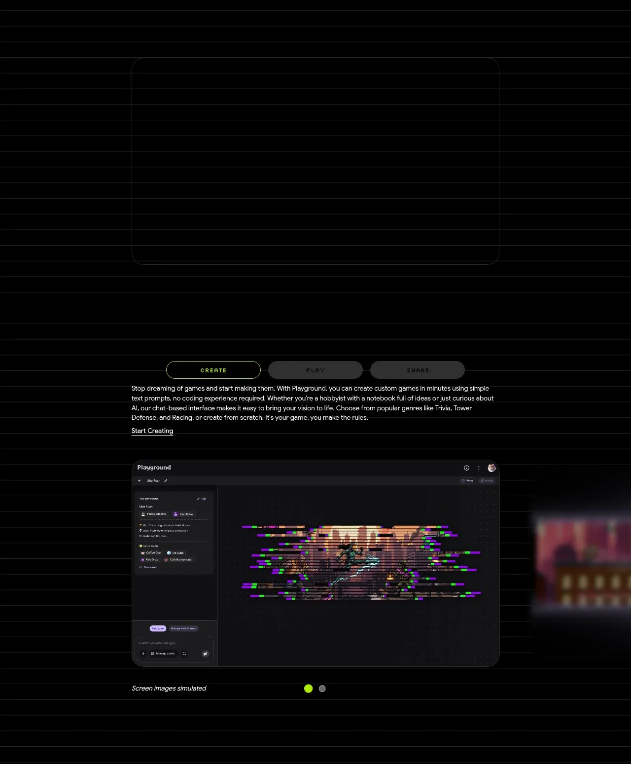
A dark product-explanation band combines a large framed media area, mode tabs, concise copy, and a product screenshot carousel to explain the creation workflow.
Prompt preview
## Reference images

Study these alongside the description below: hierarchy, rhythm, spacing, colour. Build for the product you are asked about, using this design language.

- Component: https://kage-design-assets.t3.tigrisfiles.io/components/playground-by-google-labs/93d2afab-1def-4986-9178-dd9a071e412b-1791612310-4.webp
- Full page it was cut from: https://kage-design-assets.t3.tigrisfiles.io/screenshots/playground-by-google-labs/93d2afab-1def-4986-9178-dd9a071e412b-1791612198337-full.webp
- Component on Kage: https://kage.design/component/playground-by-google-labs-feature-grid

## Before you start
Ask what workflow the user's product needs to explain and what proof or screenshots are available. Apply the principles below to that product rather than copying the reference.

Build a product workflow showcase with a centered media frame above or beside a compact tab control. Use three or fewer tabs for distinct modes, with one bright accent active state and subdued inactive states. Beneath the tabs, place a concise explanatory paragraph and a small text link, followed by a large rounded screenshot or demo frame. Constrain the content to about 520–900px depending on viewport, use 24–32px card radii, and add a very subtle #242424 border on a #050505 background. Use a bright lime accent near #B8F500 only if it suits the brand; otherwise derive one semantic accent. Add carousel dots or progress indicators, keyboard-accessible tabs, and responsive stacking. Maintain generous blank space around the demo so it feels premium.

Never: use logos, product names, copy, illustrations, or imagery from the reference.
More components

 Continuity and memory grid
Hypervibe · Feature grid
Continuity and memory grid
Hypervibe · Feature grid
 Agent orchestration section
Hypervibe · Feature grid
Agent orchestration section
Hypervibe · Feature grid
 Voice collaboration section
Hypervibe · Feature grid
Voice collaboration section
Hypervibe · Feature grid
 Studios and output grid
Hypervibe · Feature grid
Studios and output grid
Hypervibe · Feature grid
 Core workspace feature section
Hypervibe · Feature grid
Core workspace feature section
Hypervibe · Feature grid

 What it is: trusted knowledge features
Lune · Feature grid
What it is: trusted knowledge features
Lune · Feature grid