kage
kage
labs.google
Design analysis
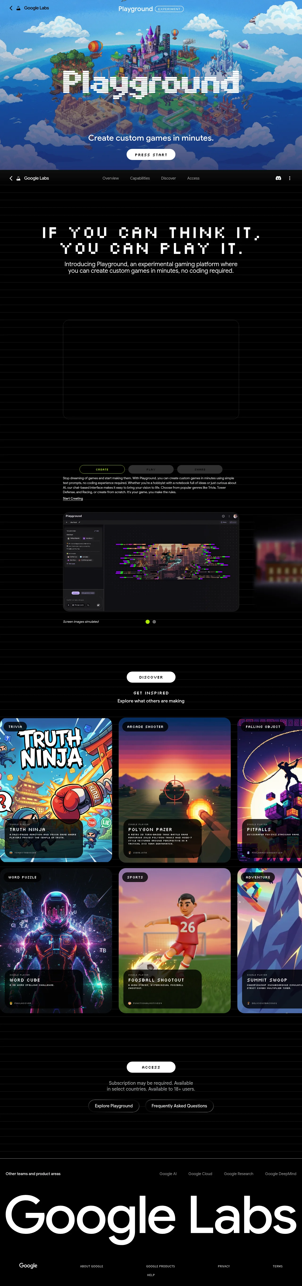
An illustrated sky-world hero with a pixelated wordmark cuts hard to a black, scanline-textured body where a dot-matrix display face carries the pitch and a rounded sans handles body copy. The page alternates austere black type sections with two vivid blocks — a simulated app screenshot and an edge-bleeding gallery of game cards with glass caption bars — while white pill CTAs with all-caps pixel type ("PRESS START") repeat the arcade motif. A single lime accent is reserved for active states (tab outline, carousel dot), and the viewport-wide footer wordmark closes the page at maximum scale.
Prompt preview
## Reference images

Study these alongside the description below: hierarchy, rhythm, spacing, colour. Build for the product you are asked about, using this design language.

- Full page: https://kage-design-assets.t3.tigrisfiles.io/screenshots/playground-by-google-labs/93d2afab-1def-4986-9178-dd9a071e412b-1791612198337-full.webp
- Above the fold: https://kage-design-assets.t3.tigrisfiles.io/screenshots/playground-by-google-labs/93d2afab-1def-4986-9178-dd9a071e412b-1791612195326.webp
- Design on Kage: https://kage.design/designs/playground-by-google-labs-landing-page

## Before you start
Ask the user what they are building, who it is for, and what brand assets they already have (name, colours, type). Wait for their answers before writing any code — everything below is applied to *their* product, not to the reference site.

## Page structure
Build a single dark landing page with these sections, top to bottom:

1. **Hero** — a full-viewport illustrated scene depicting the product's world (custom artwork or a generated hero image), with a slim top bar overlaying it: a back-style control, the brand name, and the product title next to a small outlined pill badge (e.g. "BETA"). Centre a very large display wordmark of the product name over the art, a one-line sans tagline beneath it, and one white pill button with all-caps display type acting as the entry CTA.
2. **Sticky section nav** — a slim bar just under the hero: brand mark left, four plain text links matching the page's main sections (e.g. Overview / Capabilities / Discover / Access), a single icon action on the right. Keep it pinned while scrolling.
3. **Manifesto statement** — a black section with a faint horizontal scanline texture. A huge two-line all-caps headline in the bitmap display face, centred, followed directly by a short two-to-three-line sans paragraph at body size. Nothing else in the section — the type carries it.
4. **Media frame** — one large rounded-corner media block (video or image, roughly 16:9) centred in a narrower column.
5. **Capability tabs** — a centred row of three pill tabs naming the product's three core abilities: the active one outlined in the accent colour, the inactive ones dark-filled with muted text. Below, a narrow left-aligned paragraph explaining the active capability plus an underlined text link; switching tabs swaps the copy.
6. **Product screenshot carousel** — a large app-UI screenshot inside a rounded frame, a tiny disclaimer caption beneath it ("screen images simulated" tone), and two small carousel dots centred under it with the active dot in the accent colour.
7. **Discover gallery** — a centred white pill button, then a small all-caps pixel label with a one-line sans subline inviting people to explore what others have made. Below it, a full-bleed gallery of community cards that bleeds past both viewport edges (horizontal-scroll feel): each card is a vivid cover image with a category tag pill pinned top-left, and a translucent dark glass caption bar pinned bottom-left holding a tiny meta label, an all-caps pixel title, a one-line description, and a creator handle. Lay the cards out in two rows, the second row offset horizontally from the first.
8. **Access CTA** — a centred white pill button, one or two small grey legal-style lines beneath it (availability and eligibility disclaimers), then two pill buttons side by side: a light primary and a dark outlined secondary.
9. **Footer** — a row with a small grey label for related links on the left and a short list of related products/teams right-aligned; then a viewport-wide giant brand wordmark set at massive scale; then a bottom bar with the logo left and small utility links right (About, Products, Help, Privacy, Terms).

## Design language
- **Palette**: near-black page background `#0a0a0a` with a repeating horizontal scanline texture (1–2px lines at ~4% white opacity); white `#ffffff` for primary text and pill buttons; muted grey `#9aa0a6` for secondary text; one acid lime accent `#d7f36a` reserved strictly for active states (tab outline, carousel dot). All colour saturation lives inside imagery — the interface chrome stays monochrome.
- **Type pairing**: a bitmap/pixel display face (e.g. Press Start 2P, Silkscreen, or a dot-matrix font) for headlines, section labels, buttons and card titles — always all caps with generous letter-spacing; a clean geometric sans for body copy and nav at 15–18px with ~1.5 line-height. Display headlines run from ~48px up to 120px, centred, capped at two lines.
- **Buttons**: fully-rounded pills. Primary = solid white with black pixel-caps text; secondary = dark fill with a subtle border and muted text. Small all-caps pixel labels rendered as white pills above section headings act like arcade signposts.
- **Cards and frames**: everything sits in soft-rounded containers (16–32px radius). Card captions are glass: translucent black (`rgba(0,0,0,.55)`) with backdrop blur, pinned to the bottom of the image, stacking meta label → title → description → handle in descending size.
- **Rhythm**: alternate immersion and austerity down the page — a full-colour illustrated hero, then long quiet black type sections, then a vivid media block, then the dense colourful gallery, then a quiet CTA and a maximal-scale footer. Centre-align nearly everything except card captions and tab copy; give sections 120–160px of vertical breathing room and let only the gallery be dense and edge-bleeding.
- **Badges and micro-labels**: tiny uppercase outlined pill badges for status words like "experimental"; tiny all-caps pixel labels for metadata such as category or player count.
- **Motion**: restrained — smooth carousel dot transitions, tab content swaps, and a slight hover lift or image zoom on gallery cards. No gratuitous animation; the pixel typography is the personality.

## Never
- Do not use Google or Google Labs logos, wordmarks, product names, or the "Playground" name.
- Do not reuse the reference copy, taglines, game titles, artwork, illustrations or icon sets.
- Never present the result as Google's product — build the user's own product wearing this design language.
Components from this page
All components
 Top experiment navigation
Playground by Google Labs · Navigation
Top experiment navigation
Playground by Google Labs · Navigation
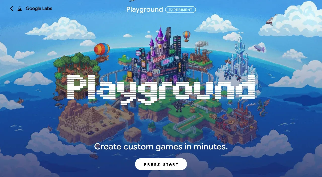 Pixel-art world hero
Playground by Google Labs · Hero
Pixel-art world hero
Playground by Google Labs · Hero
 Sticky section navigation
Playground by Google Labs · Navigation
Sticky section navigation
Playground by Google Labs · Navigation
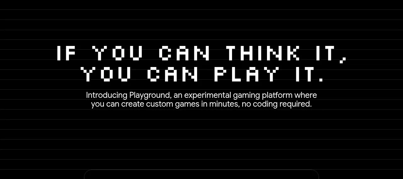 Introductory product statement
Playground by Google Labs · Hero
Introductory product statement
Playground by Google Labs · Hero
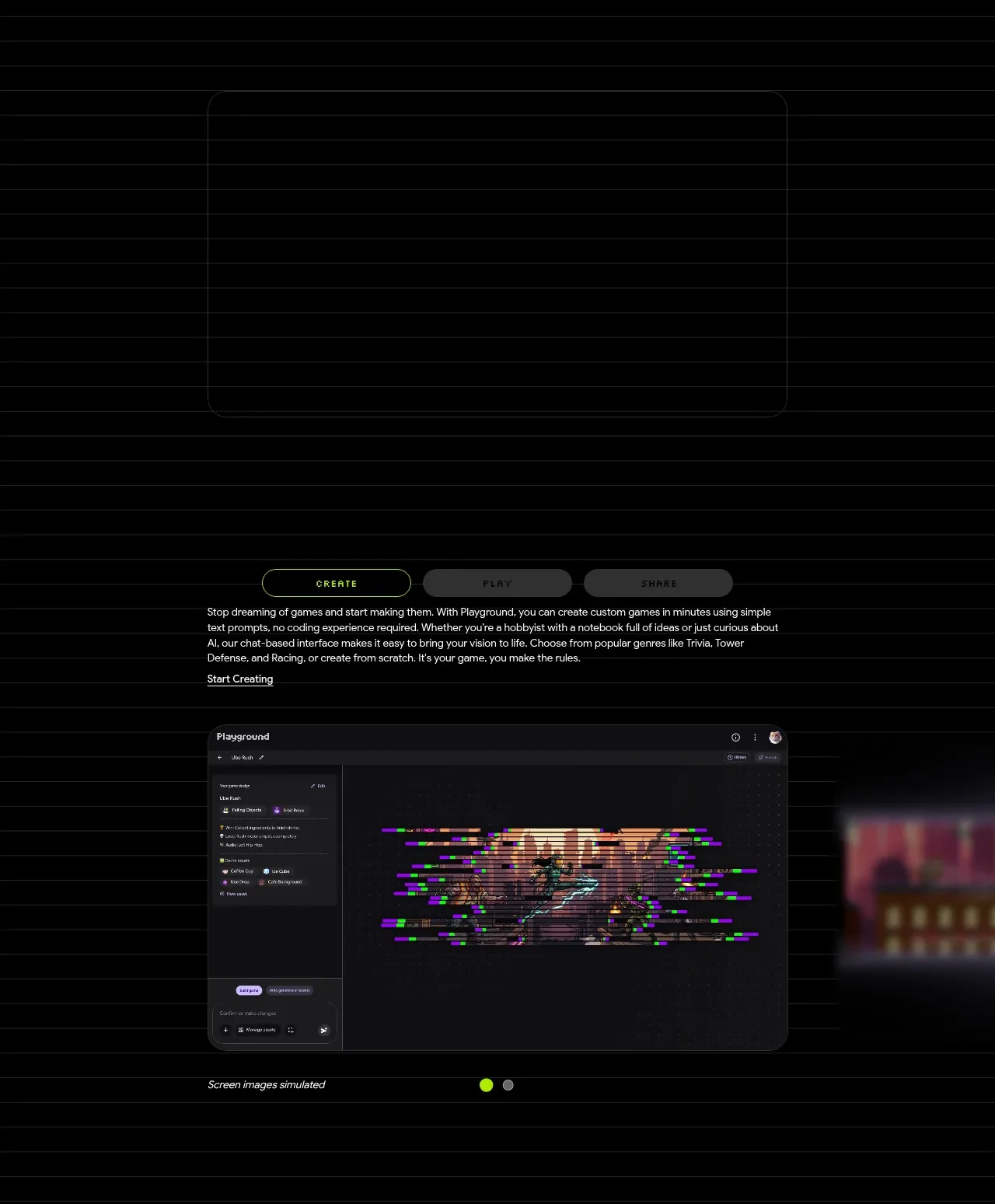 Create workflow showcase
Playground by Google Labs · Feature grid
Create workflow showcase
Playground by Google Labs · Feature grid
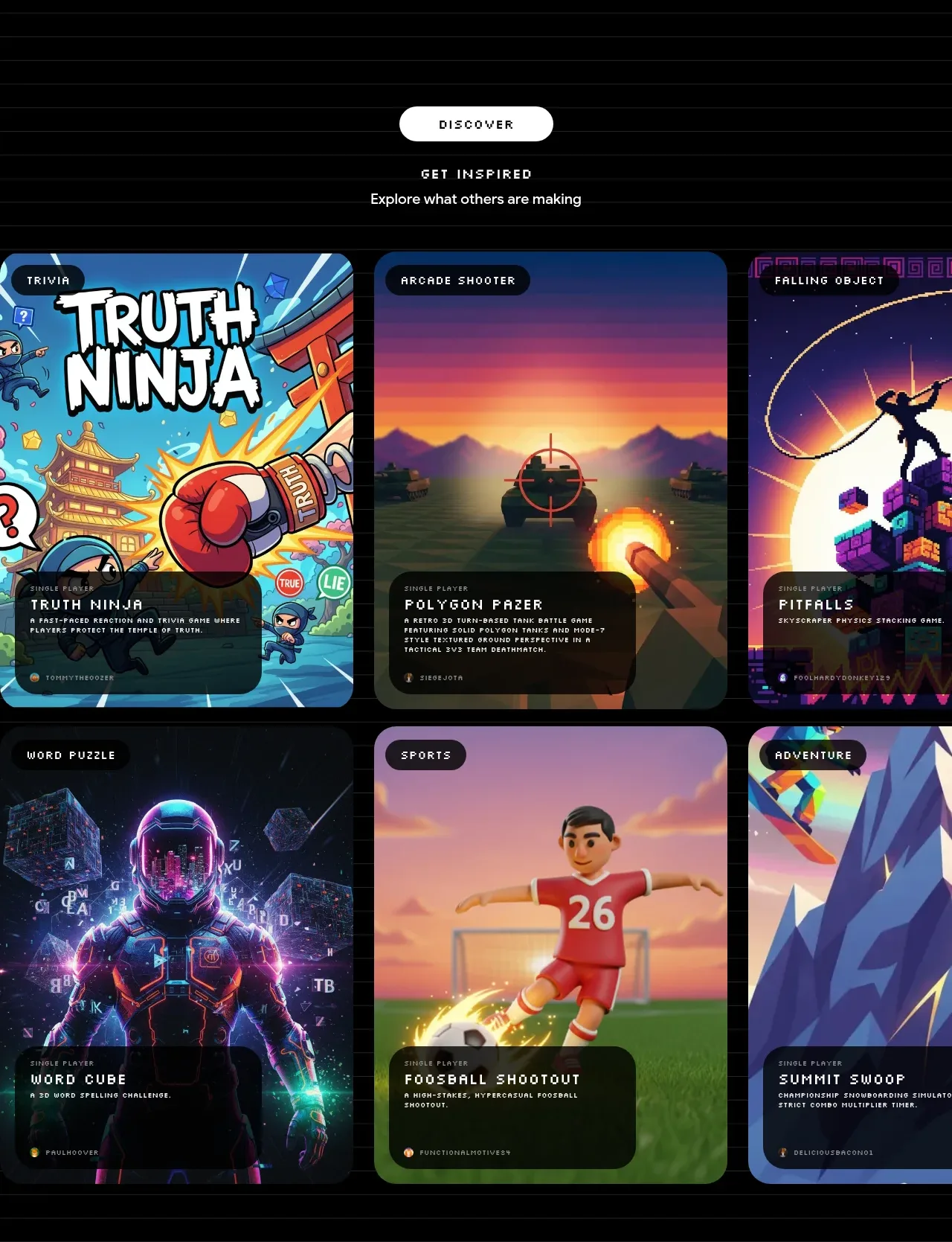 Discover inspiration gallery
Playground by Google Labs · Gallery
Discover inspiration gallery
Playground by Google Labs · Gallery
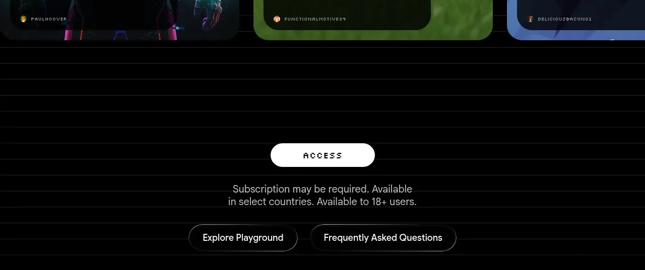 Access conversion block
Playground by Google Labs · Call to action
Access conversion block
Playground by Google Labs · Call to action
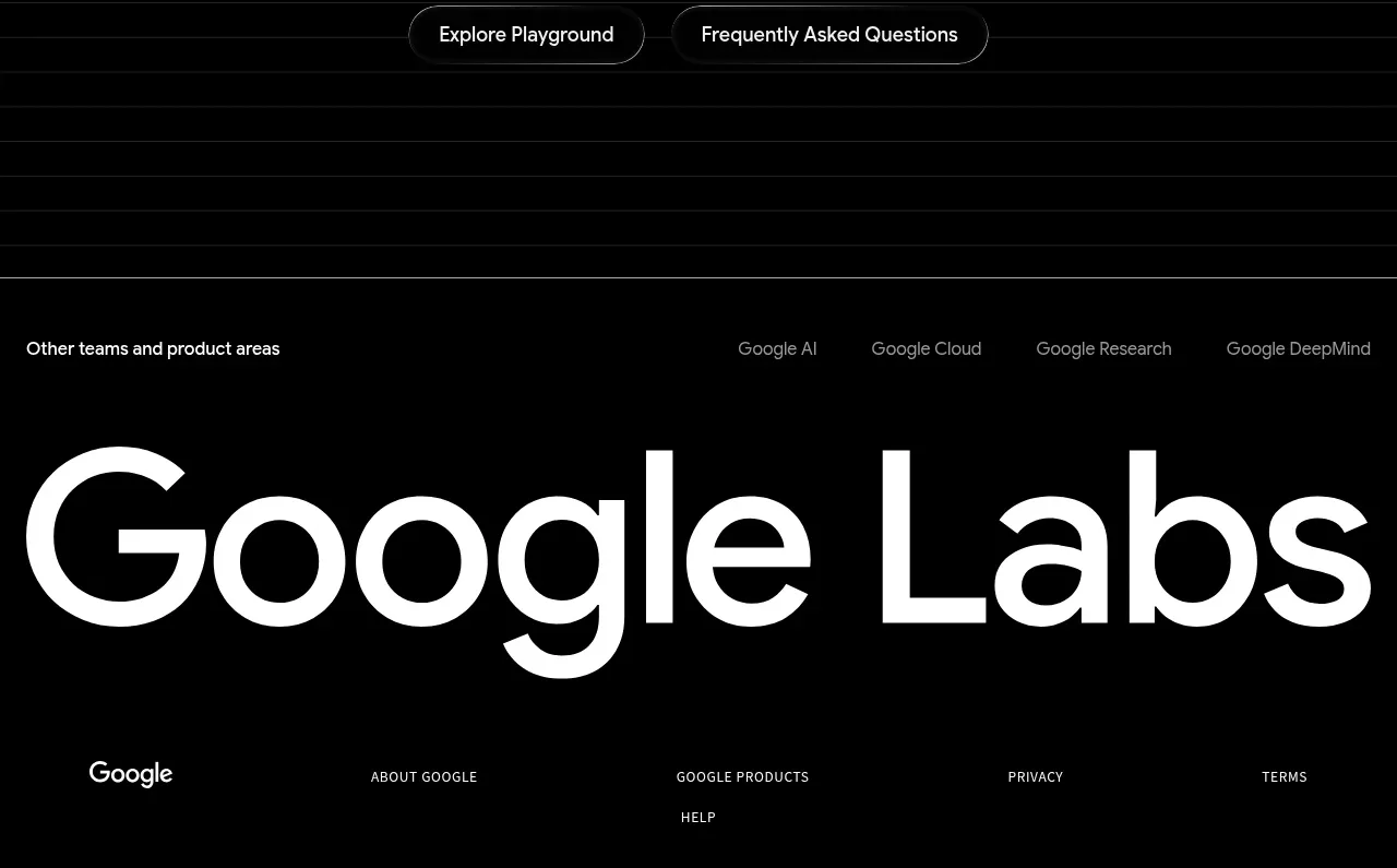 Labs ecosystem footer
Playground by Google Labs · Footer
Labs ecosystem footer
Playground by Google Labs · Footer