 kage
kage
requesteagle.tokarev.work
Design analysis
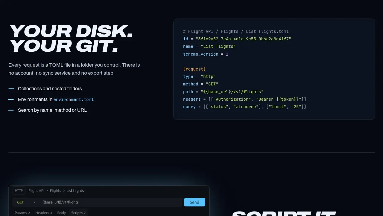
A split editorial feature explains a practical workflow on the left and pairs it with a dark syntax-highlighted code panel on the right. The contrast between prose and code makes the section easy to scan for technical audiences.
Prompt preview
## Reference images

Study these alongside the description below: hierarchy, rhythm, spacing, colour. Build for the product you are asked about, using this design language.

- Component: https://kage-design-assets.t3.tigrisfiles.io/components/request-eagle/fb8c7e5d-6253-47fd-b840-135fd368731b-1791612076-4.webp
- Full page it was cut from: https://kage-design-assets.t3.tigrisfiles.io/screenshots/request-eagle/fb8c7e5d-6253-47fd-b840-135fd368731b-1791612032869-full.webp
- Component on Kage: https://kage.design/component/request-eagle-feature-grid-2

## Before you start
Ask what workflow or file format is central to the user's product and what code example would be safe and useful for its audience. Apply the principles below to that product.

Build a two-column technical feature section on a near-black background. Put an oversized two-line italic heading and concise supporting paragraph on the left, followed by three short checkmarked benefits. Put a dark code panel on the right, aligned near the top of the text block, with a navy surface around `#0d1625`, a subtle `#1d2a3d` border, 8–10px radius, and restrained syntax colors such as blue `#8fd7f5`, green `#b8d989`, and amber `#e6bf74`.

Use a max-width around 860px, a 44/56 split, 40–64px column gap, and 96–120px vertical padding. Headings use heavy condensed italic uppercase display type; body copy is 14–16px with 1.6 line-height; code uses 12–14px monospaced type. Add a slim cyan dash before each benefit. On mobile, stack the code below the copy and preserve horizontal scrolling inside the code block.

Never use logos, product names, copy, illustrations, or imagery from the reference.
More components

 Studios and output grid
Hypervibe · Feature grid
Studios and output grid
Hypervibe · Feature grid
 Continuity and memory grid
Hypervibe · Feature grid
Continuity and memory grid
Hypervibe · Feature grid
 Voice collaboration section
Hypervibe · Feature grid
Voice collaboration section
Hypervibe · Feature grid
 Core workspace feature section
Hypervibe · Feature grid
Core workspace feature section
Hypervibe · Feature grid
 Agent orchestration section
Hypervibe · Feature grid
Agent orchestration section
Hypervibe · Feature grid

 How it works: connected research tools
Lune · Feature grid
How it works: connected research tools
Lune · Feature grid