kage
kage
requesteagle.tokarev.work

Design analysis
A dark, high-contrast developer-tool landing page uses oversized italic display headlines, thin outlined type, and cyan-blue geometric accents to establish a fast, technical tone. The page shifts from a dense hero and product screenshot into an angled cyan statement band, then alternates spacious benchmark, code, and feature sections with paired screenshots or code panels; it closes with a centered download call to action and a bright footer band.
Prompt preview
## Reference images

Study these alongside the description below: hierarchy, rhythm, spacing, colour. Build for the product you are asked about, using this design language.

- Full page: https://kage-design-assets.t3.tigrisfiles.io/screenshots/request-eagle/fb8c7e5d-6253-47fd-b840-135fd368731b-1791612032869-full.webp
- Above the fold: https://kage-design-assets.t3.tigrisfiles.io/screenshots/request-eagle/fb8c7e5d-6253-47fd-b840-135fd368731b-1791612029878.webp
- Design on Kage: https://kage.design/designs/request-eagle-landing-page

## Before you start
Ask the user what they are building, who it is for, and what brand assets they already have, including product name, colours, typefaces, logo, and imagery. Wait for their answers before designing. Apply the system below to their product, not to the reference product, and write original copy for their audience.

## Page structure
- **Top navigation:** Place a compact brand mark and name at the left, restrained utility links in the middle/right, and a bright primary download or action button at the far right.
- **Hero:** Use a very dark full-width field with oversized two-line display typography, mixing a solid italic headline with an outlined second line. Add a short explanatory paragraph, paired primary and secondary actions, faint horizontal light streaks, and a large dark product/interface image below the copy.
- **Angled statement band:** Transition from the hero with a large cyan-blue panel cut by diagonal top and bottom edges. Fill it with oversized black solid and outlined statement typography that may extend beyond the viewport for an intentionally cropped poster-like effect.
- **Performance section:** Return to the dark background with a large left-aligned speed headline, a short explanatory paragraph, and two full-width horizontal comparison bars. Use the accent colour for the product result and muted gray for the comparison result, with a small expandable methodology note underneath.
- **File-based workflow section:** Use a two-column row: a text block with a large headline, short explanation, and three concise bullet points on the left; a rounded dark code panel showing a representative configuration file on the right.
- **Scripting section:** Reverse the visual order. Put a large application screenshot or editor panel on the left and a text block on the right with a headline, supporting copy, and three bullets. Keep the divider and surrounding space generous.
- **Keyboard and variable workflow section:** Use the text block on the left and a layered dark application screenshot on the right. Explain shortcuts, Vim-style controls, completion, or generated values with a short three-item list.
- **CLI or automation section:** Reverse the pairing again, showing a code/terminal panel on the left and an explanatory headline and paragraph on the right. Keep this section more compact than the screenshot-led feature rows.
- **Themes/customisation section:** Pair a text block and small theme-selector buttons on the left with an interface screenshot on the right. Treat the theme options as outlined pills or angular rectangular controls, with one cyan-filled active option.
- **Final CTA:** Create a centered dark closing panel with a small product symbol or abstract mark, faint horizontal streaks, a huge stacked italic headline, a short platform/support statement, and primary plus source/build actions.
- **Footer:** End with a full-width cyan-blue band. Use a huge dark product/category title, a thin dark divider, a small technical attribution at left, and compact documentation/community links aligned to the right.

## Design language
- Build hierarchy with extreme scale contrast: use compact utility text, readable 16–18px body copy, and very large uppercase display headlines with tight line-height and italic forward slant.
- Pair a heavy geometric italic sans for statements with a neutral sans for body copy and a monospace face for code, timings, and technical labels.
- Keep the main canvas near-black navy, approximately `#050912` to `#0a1220`; use cool off-white `#eef2f7` for major type and muted blue-gray `#aab5c5` for supporting copy.
- Reserve an electric sky blue, approximately `#78d0f5` or `#82d4f4`, for buttons, bars, large transition bands, active controls, and footer surfaces. Use it sparingly so actions and structural transitions carry the colour.
- Treat outlined typography as a recurring graphic device: use thin blue-gray strokes, transparent fills, uppercase letters, and occasional oversized cropping rather than adding decorative illustrations.
- Use diagonal clipped edges on major colour bands and buttons to create motion. Buttons should be angular or subtly skewed rectangles, with uppercase bold italic labels and no pill-shaped treatment.
- Keep cards and code panels dark, slightly lighter than the page, with restrained 1px borders, small corner radii around 6–10px, and very soft blue glows around interface screenshots. Avoid heavy shadows.
- Alternate section rhythm down the page: begin with a dense, dramatic hero; use a bold graphic interruption; then move through spacious two-column feature rows, thin dividers, code examples, and image-led demonstrations before returning to a centered CTA.
- Make technical evidence visible: use realistic but original API screens, response data, TOML/JSON snippets, terminal commands, timing labels, and benchmark bars. Keep screenshots subordinate to the headline rather than letting them become generic decoration.
- Use thin horizontal rules and faint cyan light streaks as the main background detail. Keep large empty dark areas so the typography and screenshots have room to register.
- Where motion is implemented, animate streaks and clipped bands subtly, reveal feature rows on scroll, and animate comparison bars from zero; keep the interface screenshots and headline readable without motion.

## Never
- Do not reuse the reference product's logos, wordmarks, product name, copy, illustrations, photography, screenshots, code samples, icon sets, or exact brand assets.
- Do not present the result as Request Eagle or imply affiliation with it.
- Do not turn the layout into a literal clone; preserve the design principles while adapting the sections, content, imagery, and interaction to the user's product.
Components from this page
All components
 Compact dark navigation bar
Request Eagle · Navigation
Compact dark navigation bar
Request Eagle · Navigation
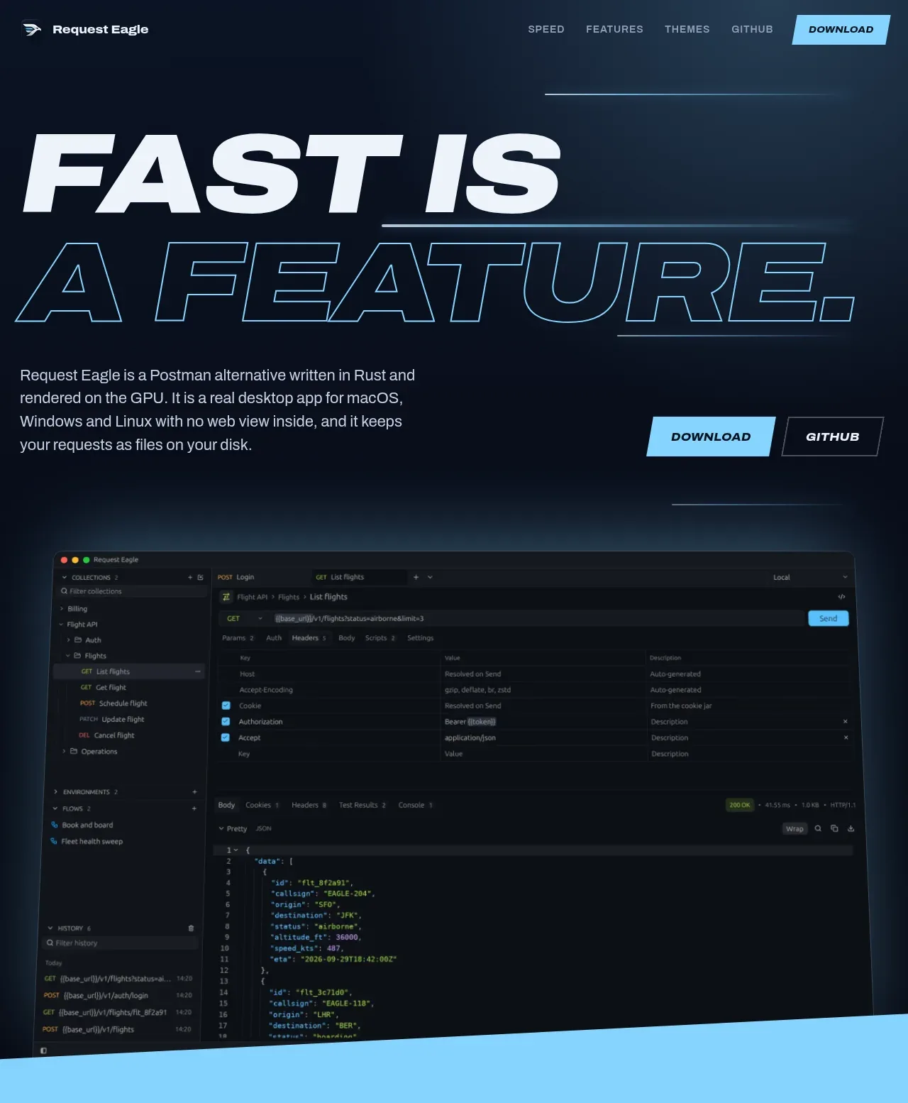 Oversized speed hero with product preview
Request Eagle · Hero
Oversized speed hero with product preview
Request Eagle · Hero
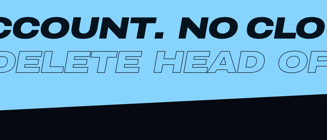 Speed and reliability statement
Request Eagle · Feature grid
Speed and reliability statement
Request Eagle · Feature grid
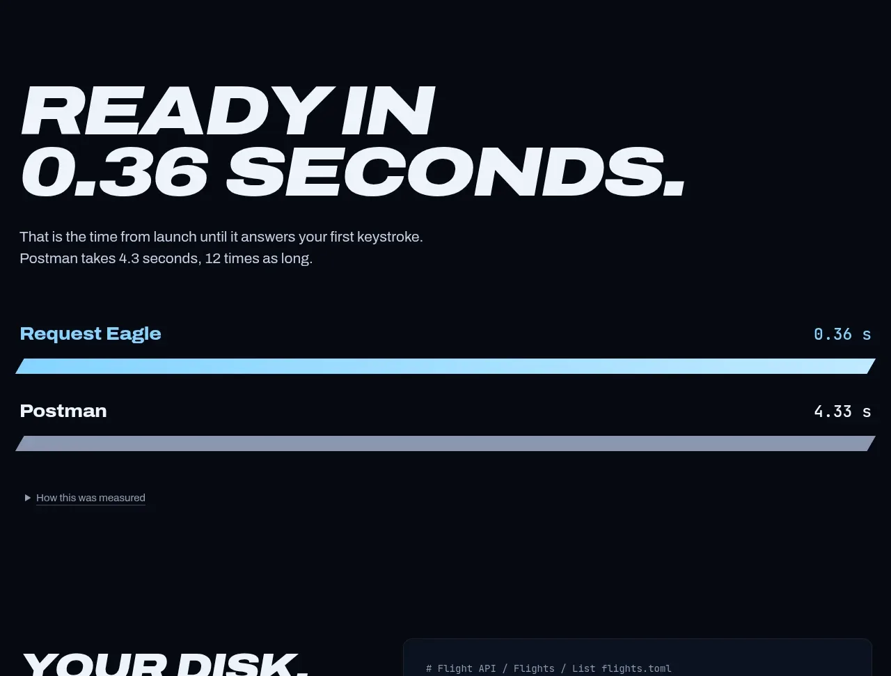 Performance comparison chart
Request Eagle · Chart
Performance comparison chart
Request Eagle · Chart
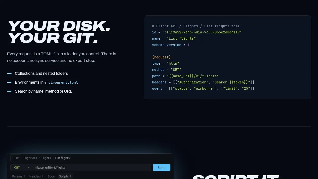 Collections and request format
Request Eagle · Feature grid
Collections and request format
Request Eagle · Feature grid
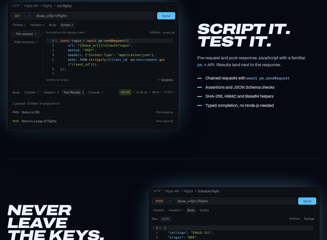 Script testing feature
Request Eagle · Feature grid
Script testing feature
Request Eagle · Feature grid
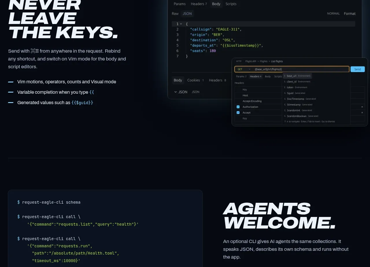 Keyboard-first editing feature
Request Eagle · Feature grid
Keyboard-first editing feature
Request Eagle · Feature grid
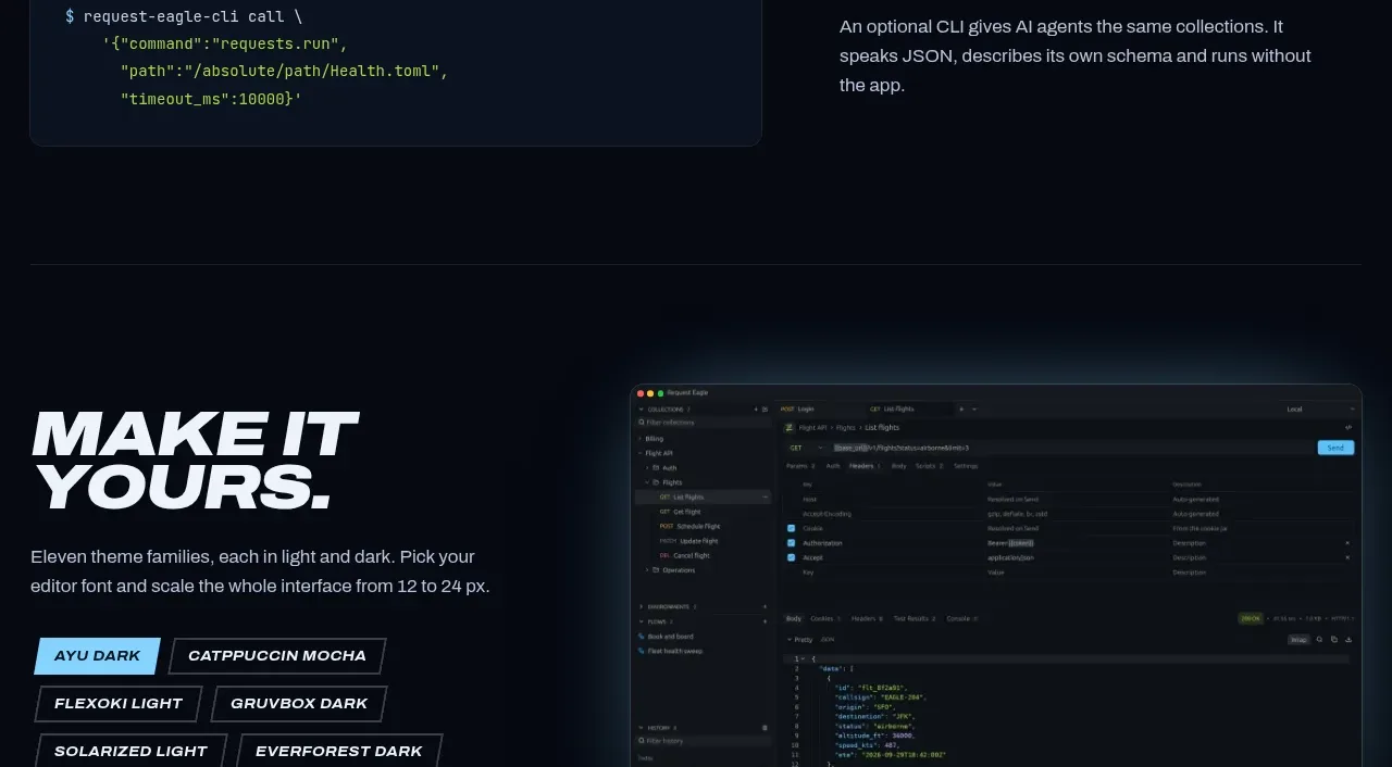 CLI and agent integration
Request Eagle · Feature grid
CLI and agent integration
Request Eagle · Feature grid
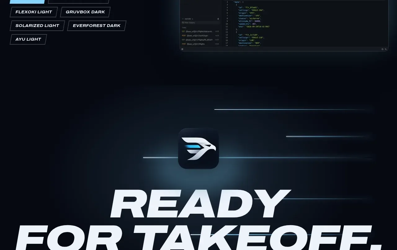 Theme customization showcase
Request Eagle · Feature grid
Theme customization showcase
Request Eagle · Feature grid
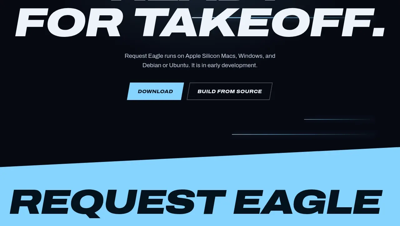 Final download call to action
Request Eagle · Call to action
Final download call to action
Request Eagle · Call to action
 Bright utility footer
Request Eagle · Footer
Bright utility footer
Request Eagle · Footer