 kage
kage
requesteagle.tokarev.work
Design analysis
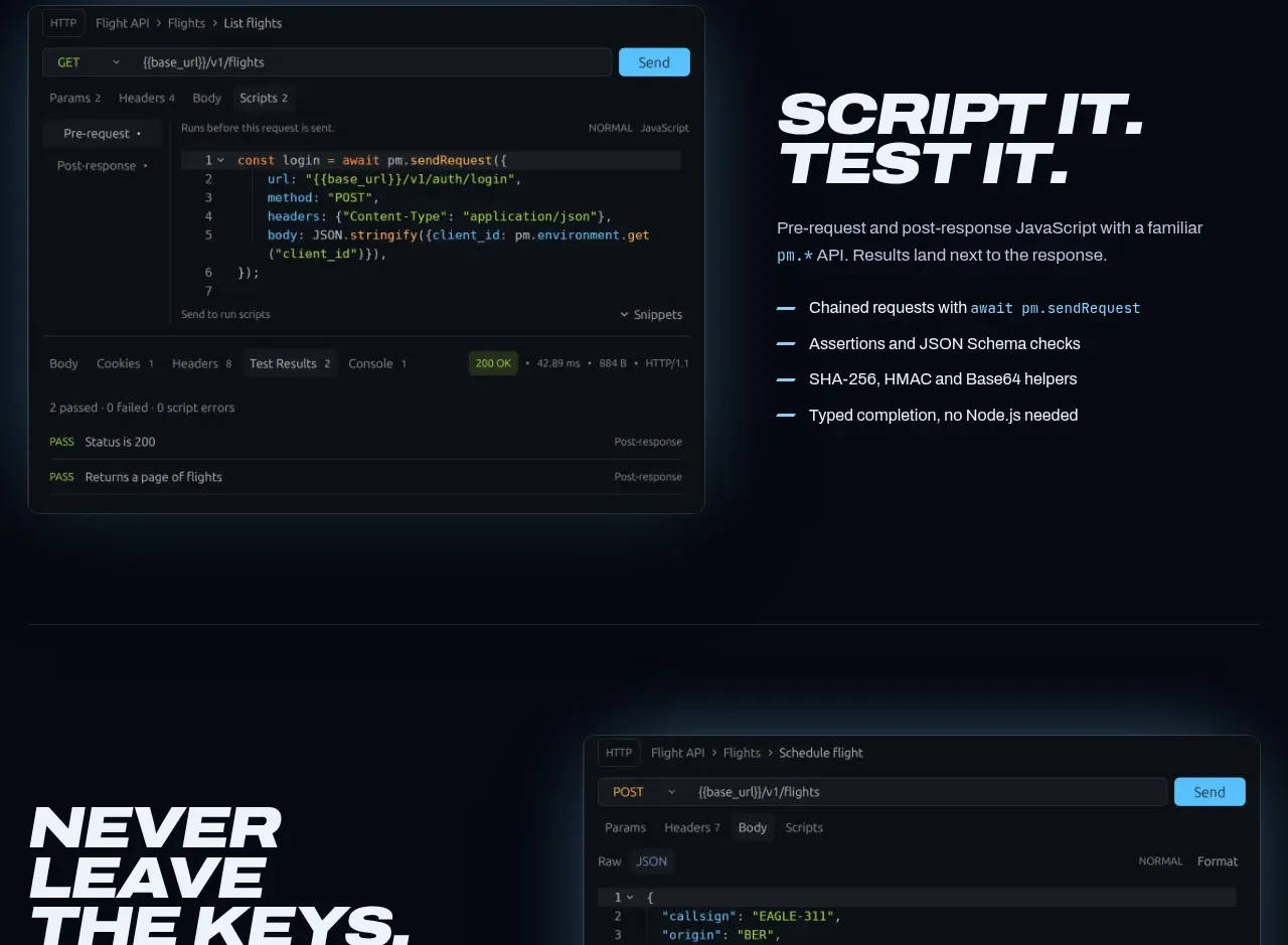
This alternating feature places an application screenshot beside a concise benefit list, demonstrating a familiar scripting workflow and keeping the page visually varied. The visual and text share a common vertical rhythm and glow treatment.
Prompt preview
## Reference images

Study these alongside the description below: hierarchy, rhythm, spacing, colour. Build for the product you are asked about, using this design language.

- Component: https://kage-design-assets.t3.tigrisfiles.io/components/request-eagle/fb8c7e5d-6253-47fd-b840-135fd368731b-1791612076-5.webp
- Full page it was cut from: https://kage-design-assets.t3.tigrisfiles.io/screenshots/request-eagle/fb8c7e5d-6253-47fd-b840-135fd368731b-1791612032869-full.webp
- Component on Kage: https://kage.design/component/request-eagle-feature-grid-3

## Before you start
Ask what automation, scripting, or integration capability the user's product should highlight and what interface screenshot or diagram can demonstrate it. Apply the principles below to that product.

Create an alternating two-column feature section on a deep navy background. Place a wide dark product UI visual on the left and a text block on the right. Give the visual a thin cool border, 8px radius, and soft cyan bloom around its edges; it should feel like a real tool preview without becoming a decorative illustration. On the right, use a large two-line italic uppercase heading, a short paragraph, and four compact bullet points, each preceded by a short cyan rule.

Use a 48/52 column split, align the visual and text around their optical centers, and provide 96px or more vertical padding. Keep type hierarchy strong: 52–72px display heading, 15px body, 13–14px bullets, with muted copy around `#aab5c4` and light text around `#edf3fa`. Use thin separators between major page bands. Stack image above text on mobile and keep the screenshot’s essential controls visible.

Never use logos, product names, copy, illustrations, or imagery from the reference.
More components

 Studios and output grid
Hypervibe · Feature grid
Studios and output grid
Hypervibe · Feature grid
 Continuity and memory grid
Hypervibe · Feature grid
Continuity and memory grid
Hypervibe · Feature grid
 Voice collaboration section
Hypervibe · Feature grid
Voice collaboration section
Hypervibe · Feature grid
 Core workspace feature section
Hypervibe · Feature grid
Core workspace feature section
Hypervibe · Feature grid
 Agent orchestration section
Hypervibe · Feature grid
Agent orchestration section
Hypervibe · Feature grid

 How it works: connected research tools
Lune · Feature grid
How it works: connected research tools
Lune · Feature grid