 kage
kage
requesteagle.tokarev.work
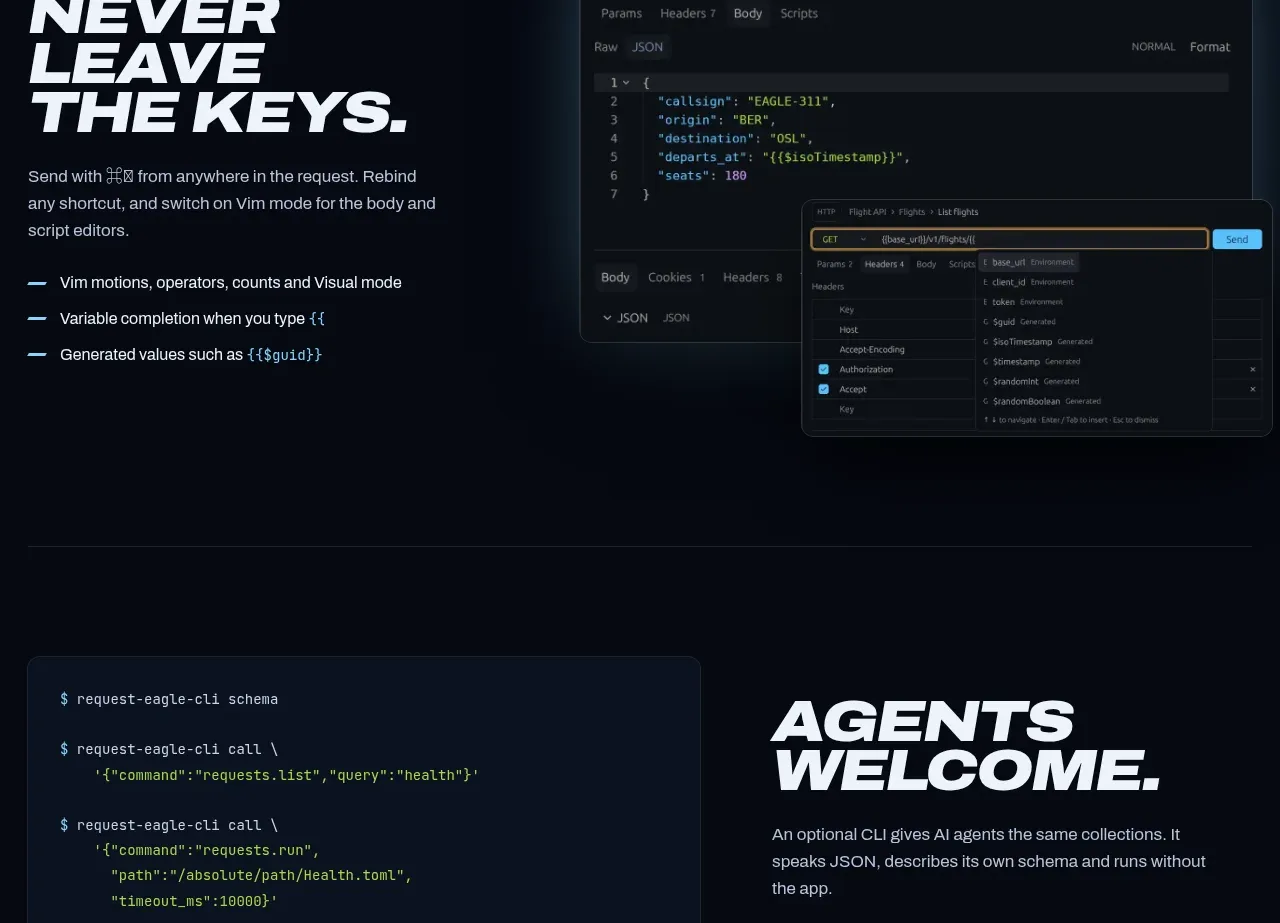
Design analysis
A second alternating feature focuses on keyboard efficiency, combining a left text narrative with a layered editor preview on the right. The asymmetry and overlapping UI reinforce speed and power-user control.
Prompt preview
## Reference images

Study these alongside the description below: hierarchy, rhythm, spacing, colour. Build for the product you are asked about, using this design language.

- Component: https://kage-design-assets.t3.tigrisfiles.io/components/request-eagle/fb8c7e5d-6253-47fd-b840-135fd368731b-1791612076-6.webp
- Full page it was cut from: https://kage-design-assets.t3.tigrisfiles.io/screenshots/request-eagle/fb8c7e5d-6253-47fd-b840-135fd368731b-1791612032869-full.webp
- Component on Kage: https://kage.design/component/request-eagle-feature-grid-4

## Before you start
Ask which expert workflow, shortcut system, or productivity advantage defines the user's product and what visual proof can support it. Apply the principles below to that product.

Build a dark alternating feature section with text on the left and a layered application/editor preview on the right. The headline should be an assertive two- or three-line italic uppercase phrase, followed by a short paragraph and three benefit bullets with cyan dash markers. The right visual should use one main rounded screenshot plus a smaller overlapping panel to communicate depth and customization.

Use background `#060b14`, surfaces `#0c1523`, borders `#203044`, bright accent `#80d5f5`, and off-white text `#f2f5f9`. Keep the main content within 860px, use a 42/58 split, and allow the visual to extend slightly beyond its column while remaining clipped safely. Apply 90–120px vertical padding, 16px body line-height, and monospaced details inside UI previews. Include subtle hover/focus states for interactive-looking controls, but do not make the whole screenshot a fake control.

Never use logos, product names, copy, illustrations, or imagery from the reference.
More components

 Studios and output grid
Hypervibe · Feature grid
Studios and output grid
Hypervibe · Feature grid
 Continuity and memory grid
Hypervibe · Feature grid
Continuity and memory grid
Hypervibe · Feature grid
 Voice collaboration section
Hypervibe · Feature grid
Voice collaboration section
Hypervibe · Feature grid
 Core workspace feature section
Hypervibe · Feature grid
Core workspace feature section
Hypervibe · Feature grid
 Agent orchestration section
Hypervibe · Feature grid
Agent orchestration section
Hypervibe · Feature grid

 How it works: connected research tools
Lune · Feature grid
How it works: connected research tools
Lune · Feature grid