 kage
kage
requesteagle.tokarev.work
Design analysis
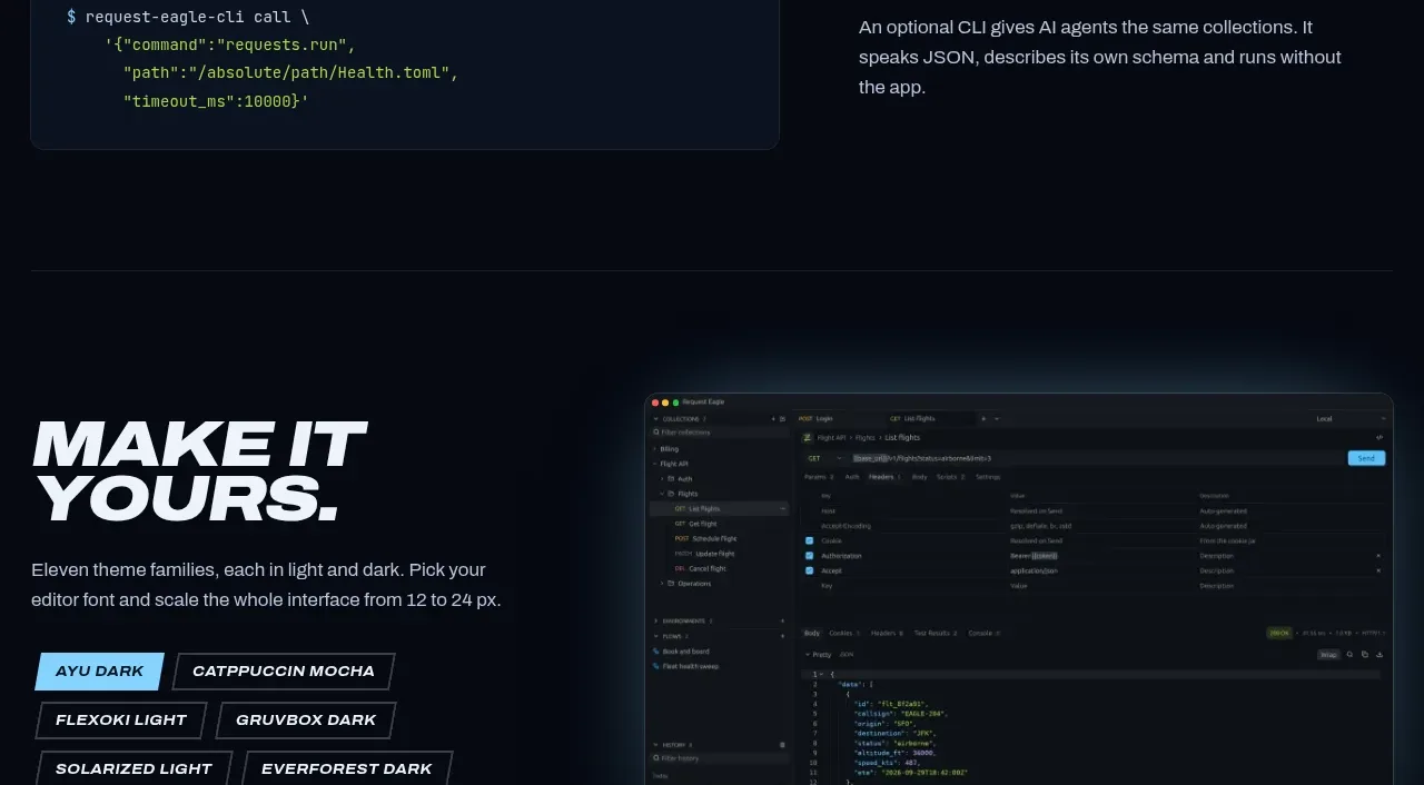
A compact split feature introduces a command-line interface on the left and explains its value on the right. The code block gives the concept tangible implementation detail while the text preserves the page's strong editorial rhythm.
Prompt preview
## Reference images

Study these alongside the description below: hierarchy, rhythm, spacing, colour. Build for the product you are asked about, using this design language.

- Component: https://kage-design-assets.t3.tigrisfiles.io/components/request-eagle/fb8c7e5d-6253-47fd-b840-135fd368731b-1791612077-7.webp
- Full page it was cut from: https://kage-design-assets.t3.tigrisfiles.io/screenshots/request-eagle/fb8c7e5d-6253-47fd-b840-135fd368731b-1791612032869-full.webp
- Component on Kage: https://kage.design/component/request-eagle-feature-grid-5

## Before you start
Ask whether the user's product has a CLI, API, agent interface, or automation surface, and what safe example best explains it. Apply the principles below to that product.

Create a compact two-column developer feature on a dark navy page. Use a rounded code terminal panel on the left with a nearly black blue surface, thin border, monospaced text, and a restrained palette of cyan, green, and amber syntax accents. On the right, place a large italic uppercase heading, a short explanation, and enough whitespace to make the section feel intentional rather than dense.

Use a 48/52 split, 64–96px vertical padding, and consistent 20px internal panel padding. Keep terminal text 12–14px with a 1.55 line-height and allow horizontal scroll on small screens. The right heading should be 48–68px desktop and 34–44px mobile. Separate the band with a very subtle horizontal rule and preserve the dark, technical atmosphere.

Never use logos, product names, copy, illustrations, or imagery from the reference.
More components

 Studios and output grid
Hypervibe · Feature grid
Studios and output grid
Hypervibe · Feature grid
 Continuity and memory grid
Hypervibe · Feature grid
Continuity and memory grid
Hypervibe · Feature grid
 Voice collaboration section
Hypervibe · Feature grid
Voice collaboration section
Hypervibe · Feature grid
 Core workspace feature section
Hypervibe · Feature grid
Core workspace feature section
Hypervibe · Feature grid
 Agent orchestration section
Hypervibe · Feature grid
Agent orchestration section
Hypervibe · Feature grid

 How it works: connected research tools
Lune · Feature grid
How it works: connected research tools
Lune · Feature grid