 kage
kage
requesteagle.tokarev.work
Design analysis
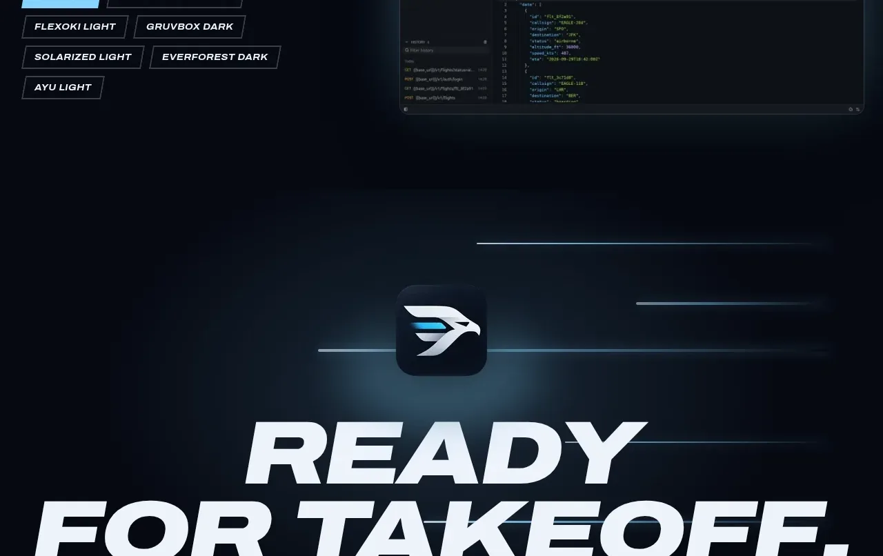
The theme section pairs customization controls and descriptive copy with a large product preview, then uses compact outlined chips as selectable options. It communicates flexibility through interaction-like affordances rather than a dense feature list.
Prompt preview
## Reference images

Study these alongside the description below: hierarchy, rhythm, spacing, colour. Build for the product you are asked about, using this design language.

- Component: https://kage-design-assets.t3.tigrisfiles.io/components/request-eagle/fb8c7e5d-6253-47fd-b840-135fd368731b-1791612077-8.webp
- Full page it was cut from: https://kage-design-assets.t3.tigrisfiles.io/screenshots/request-eagle/fb8c7e5d-6253-47fd-b840-135fd368731b-1791612032869-full.webp
- Component on Kage: https://kage.design/component/request-eagle-feature-grid-6

## Before you start
Ask what users can customize in the product, which options deserve emphasis, and what preview can demonstrate those choices. Apply the principles below to that product.

Build a two-column customization showcase on a deep navy background. Put a bold italic uppercase heading and brief explanatory copy on the left, followed by a compact group of selectable rectangular chips. Use one filled cyan chip for the active choice and dark transparent chips with thin gray borders for inactive choices. Place a large dark UI preview on the right with a faint glow and rounded frame.

Use a 42/58 layout, 80–110px vertical padding, and align the chip group to the text column. Chips should be 12–13px uppercase bold text, 10–14px horizontal padding, 6–8px gaps, and clipped/slanted corners rather than pills. Add keyboard-focus outlines and a clear selected state; if implemented interactively, update the preview theme without shifting layout. Use `#080d17`, `#0e1725`, `#7fd4f5`, `#9aa7b8`, and `#eef3f8` as an approximate palette.

Never use logos, product names, copy, illustrations, or imagery from the reference.
More components

 Studios and output grid
Hypervibe · Feature grid
Studios and output grid
Hypervibe · Feature grid
 Continuity and memory grid
Hypervibe · Feature grid
Continuity and memory grid
Hypervibe · Feature grid
 Voice collaboration section
Hypervibe · Feature grid
Voice collaboration section
Hypervibe · Feature grid
 Core workspace feature section
Hypervibe · Feature grid
Core workspace feature section
Hypervibe · Feature grid
 Agent orchestration section
Hypervibe · Feature grid
Agent orchestration section
Hypervibe · Feature grid

 How it works: connected research tools
Lune · Feature grid
How it works: connected research tools
Lune · Feature grid