 kage
kage
storyshort.ai
Design analysis
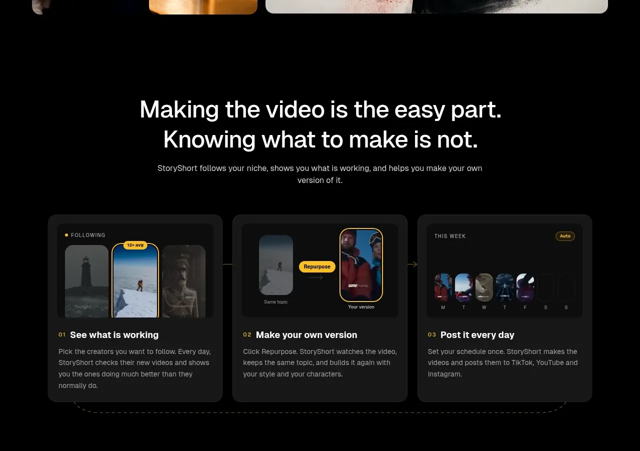
A problem-led heading introduces three dark cards that explain the repeatable workflow: find what works, create a version, and publish consistently.
Prompt preview
## Reference images

Study these alongside the description below: hierarchy, rhythm, spacing, colour. Build for the product you are asked about, using this design language.

- Component: https://kage-design-assets.t3.tigrisfiles.io/components/storyshort-ai/c734da75-ded5-4c81-9b78-0aa9ae185a47-1791551952-3.webp
- Full page it was cut from: https://kage-design-assets.t3.tigrisfiles.io/screenshots/storyshort-ai/c734da75-ded5-4c81-9b78-0aa9ae185a47-1791551915904-full.webp
- Component on Kage: https://kage.design/component/storyshort-feature-grid

## Before you start
Ask what the user's product workflow is, what the three most important user actions are, and what evidence or UI states can demonstrate each action.

Create a dark workflow section with a centered two-line headline, short supporting copy, and a three-column card row. Each card should have a small numbered eyebrow, a compact UI mockup or illustrative placeholder at the top, a bold 16–18px title, and 2–3 lines of explanatory text. Use charcoal cards (#171717) on black, 14–18px radius, subtle 1px borders (#242424), and consistent internal padding. Keep the three steps visually equal while allowing the mockups to differ. Use a faint connector line or shared baseline only if it improves sequence comprehension. Add hover elevation and a restrained border-color transition.

Never: use the reference's logo, product name, copy, illustrations, imagery, or exact UI screenshots.
More components

 Studios and output grid
Hypervibe · Feature grid
Studios and output grid
Hypervibe · Feature grid
 Continuity and memory grid
Hypervibe · Feature grid
Continuity and memory grid
Hypervibe · Feature grid
 Voice collaboration section
Hypervibe · Feature grid
Voice collaboration section
Hypervibe · Feature grid
 Core workspace feature section
Hypervibe · Feature grid
Core workspace feature section
Hypervibe · Feature grid
 Agent orchestration section
Hypervibe · Feature grid
Agent orchestration section
Hypervibe · Feature grid

 How it works: connected research tools
Lune · Feature grid
How it works: connected research tools
Lune · Feature grid