kage
kage
storyshort.ai

Design analysis
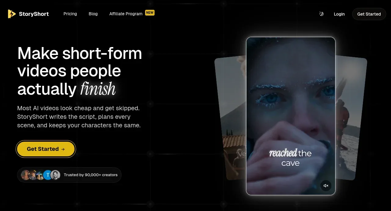
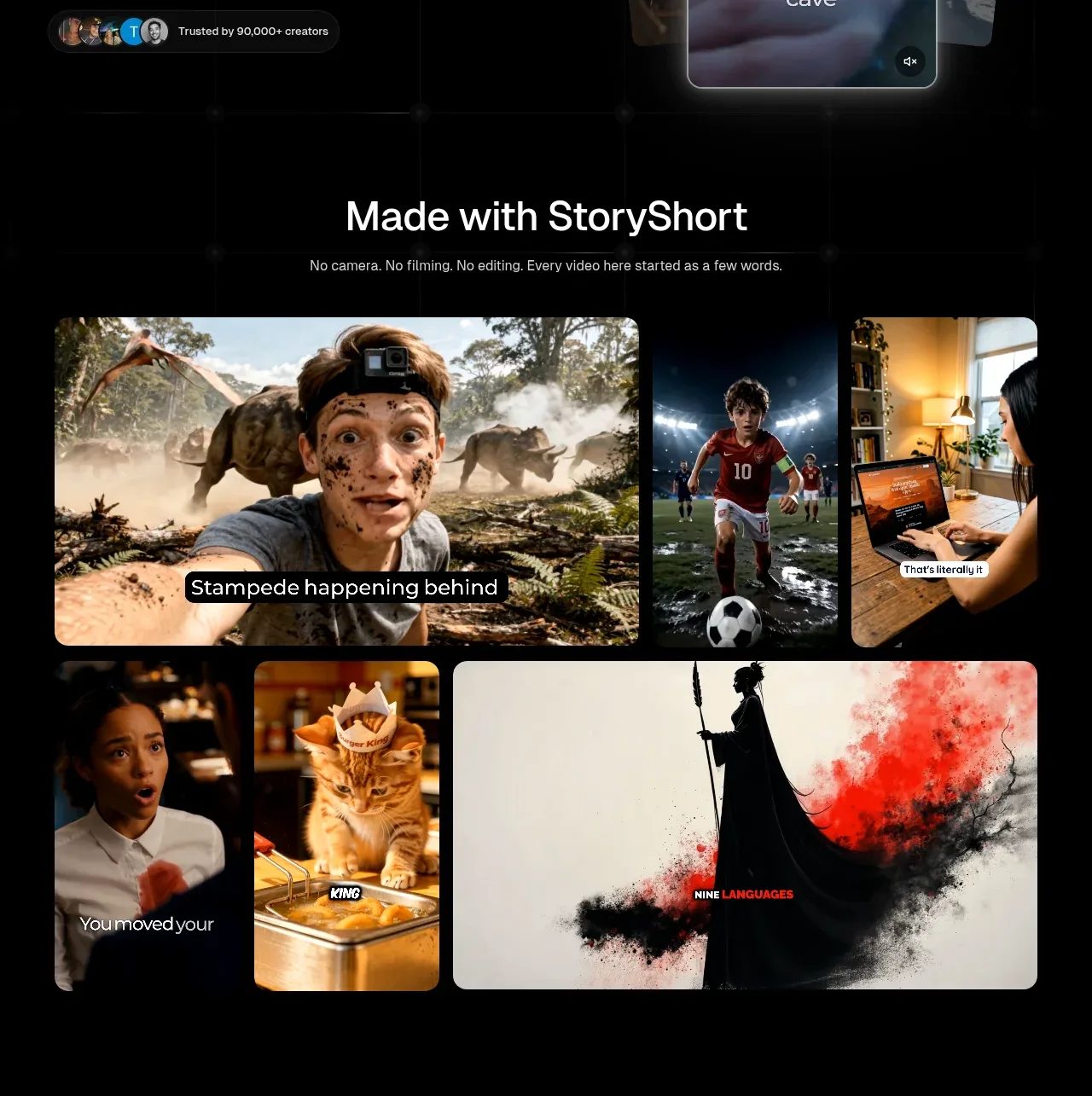
A long-scroll dark landing page for an AI short-form video generator that leans entirely on the product's own output: full-bleed cinematic video thumbnails with burned-in captions act as the primary visual texture, framed in near-black chrome with a single warm yellow accent for CTAs and highlights. The rhythm alternates between image-heavy proof sections (galleries, movie-poster pairs) and bento-style feature grids where dark UI mockups float on soft-bordered cards, punctuated by oversized centred statements — including a deliberately skewed, doubled CTA headline as a signature typographic moment. Sections compress into an accordion FAQ and a dense, multi-column footer that stretches the quiet black canvas to the page end.
Prompt preview
## Reference images

Study these alongside the description below: hierarchy, rhythm, spacing, colour. Build for the product you are asked about, using this design language.

- Full page: https://kage-design-assets.t3.tigrisfiles.io/screenshots/storyshort-ai/c734da75-ded5-4c81-9b78-0aa9ae185a47-1791551915904-full.webp
- Above the fold: https://kage-design-assets.t3.tigrisfiles.io/screenshots/storyshort-ai/c734da75-ded5-4c81-9b78-0aa9ae185a47-1791551910342.webp
- Design on Kage: https://kage.design/designs/storyshort-landing-page

# Build a dark, cinematic long-scroll landing page for an AI video-generation product

## Before you start
Ask the user:
- What product are you building and what does it do in one sentence?
- Who is it for (creators, marketers, developers, consumers)?
- What brand assets exist — name, logo, primary accent colour, and any font preferences?
Wait for the answers. Everything below is a design language to apply to *their* product, not a recreation of the reference.

## Page structure
1. **Top nav** — slim dark bar: logo left, three or four text links centre-left (one with a small accent "NEW" pill), theme toggle, log-in link and a small outlined CTA button right. Stays visually quiet against the black page.
2. **Hero (split)** — left column: a 3–4 line headline in large white sans with one italic serif word for emphasis, a 2–3 sentence muted grey sub-paragraph, a pill-shaped yellow CTA button, and a social-proof row (overlapping avatar circles + "trusted by" caption). Right column: a tilted stack of phone-shaped video frames with a dark cinematic still, caption overlay and mute icon — the product's output shown as physical-feeling media.
3. **Output gallery ("Made with …")** — centred section heading plus one-line sub-copy, then a masonry-like grid of 4–6 large cinematic video thumbnails with burned-in caption text, cropped at various aspect ratios. Pure proof-of-work; no feature copy.
4. **Three-step process** — big two-line centred statement headline, one sub-paragraph, then a row of three dark UI-mockup cards (feed view, repurpose action, weekly calendar) connected by a dotted line, each with a numbered label (01/02/03), a short title and 2–3 lines of grey body copy.
5. **Feature statement + bento grid** — large centred headline admitting a problem, one sub-paragraph, then a bordered container split into one wide feature card ("same face in every scene") over a 4-across strip of video stills with timestamps, and below it a 3-column row of smaller cards, each with heading, short copy and a compact mockup (portrait video, schedule list, file-to-shot diagram).
6. **Two-poster showcase** — centred headline with one accent-yellow highlighted phrase, sub-copy, then two large movie-poster-style video cards side by side with play buttons. A breather section: almost no chrome, imagery does the talking.
7. **"What happens when you click generate"** — heading + sub-copy, then a bento cluster: two wide cards side by side (from-scratch vs. repurpose, each with a product-UI screenshot), a 3-column row of small cards (editor, voice picker, captions), and a full-width workflow diagram — stacked mockup panels (script, voice, video model) wired by thin lines to a central logo mark and an output video card.
8. **Format gallery ("Every kind of video you post")** — heading + sub-copy, then an asymmetric image grid of 4–5 labelled tiles (Faceless Stories, Long Form, AI ASMR, Brainrot, UGC Ads), each tile a full-bleed still with a label and one-line caption.
9. **FAQ** — centred heading, then a narrow single-column stack of 6–7 accordion rows, thin dark bordered bars with chevrons.
10. **Final CTA** — a deliberately playful centred headline with the same line repeated and slightly skewed/offset in a darker tone, a one-line sub-copy, and a pill CTA button. Sits on near-black with a subtle radial glow.
11. **Footer** — logo + copyright + language selector left; several link columns (resources, product pages, legal, social) with one accent "NEW" pill; below it a very dense 3–4 column index of dozens of small text links. All on the same black, tiny grey type.

## Design language
- **Canvas and colour**: near-black page background (#0a0a0a–#111), cards at #141414–#1a1a1a with 1px borders in #2a2a2a. One saturated accent — warm yellow (#f5c518–#ffd54a range) — reserved strictly for CTAs, highlighted words, "NEW" pills and small UI states. Body text is light grey (#9a9a9a), headings pure white. Nothing else introduces colour except the product imagery itself.
- **Type**: one geometric sans throughout (Inter-like), with a single italic serif or italic sans word inside headlines for emphasis. Scale jumps hard: hero headline ~56–72px, section statements ~40–48px, card titles ~18–20px, body 14–15px, footer links 12–13px. Section headlines are centred; card copy is left-aligned.
- **Rhythm down the page**: alternate loud image-proof sections with quiet text+bento sections so no two adjacent sections have the same density. Image galleries are full-bleed and tight-cropped; feature sections are boxed in bordered cards with generous padding. Use the doubled/skewed repeated headline once, near the bottom, as a signature moment.
- **Cards and borders**: radius 12–16px on cards, 999px on buttons and pills. Shadows are nearly absent — depth comes from border contrast and slightly lighter card fills on black. Dotted connector lines link process cards and workflow nodes.
- **Imagery rules**: media thumbnails are 16:9 or 9:16 crops with caption-style overlay text baked in, giving the page its texture. UI mockups are rendered as dark-mode screenshots in miniature, never as flat grey wireframes.
- **Interaction/motion**: hover states on gallery tiles (slight scale or play-button reveal), accordions that expand smoothly, CTA buttons with a subtle brightness shift. Keep motion understated; the imagery is the show.
- **Trust and proof**: social proof sits directly under the hero CTA (avatars + count). Product output appears before any feature explanation — show, then tell.

## Never
- Do not use the reference product's name, logo, wordmark, tagline, or any of its headline copy.
- Do not reuse its example video thumbnails, captions, movie-poster titles, or illustrated characters.
- Do not copy its FAQ questions or footer link lists verbatim — write ones that fit the user's product.
- Never present the result as the reference product; it is a design language applied to the user's own brand.
Components from this page
All components
 Minimal product navigation
storyshort.ai · Navigation
Minimal product navigation
storyshort.ai · Navigation
 Short-form video promise hero
storyshort.ai · Hero
Short-form video promise hero
storyshort.ai · Hero
 Made-with showcase gallery
storyshort.ai · Gallery
Made-with showcase gallery
storyshort.ai · Gallery
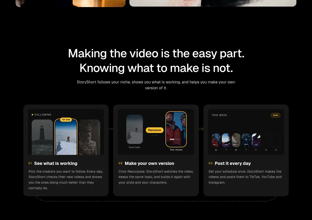 Three-step content workflow
storyshort.ai · Feature grid
Three-step content workflow
storyshort.ai · Feature grid
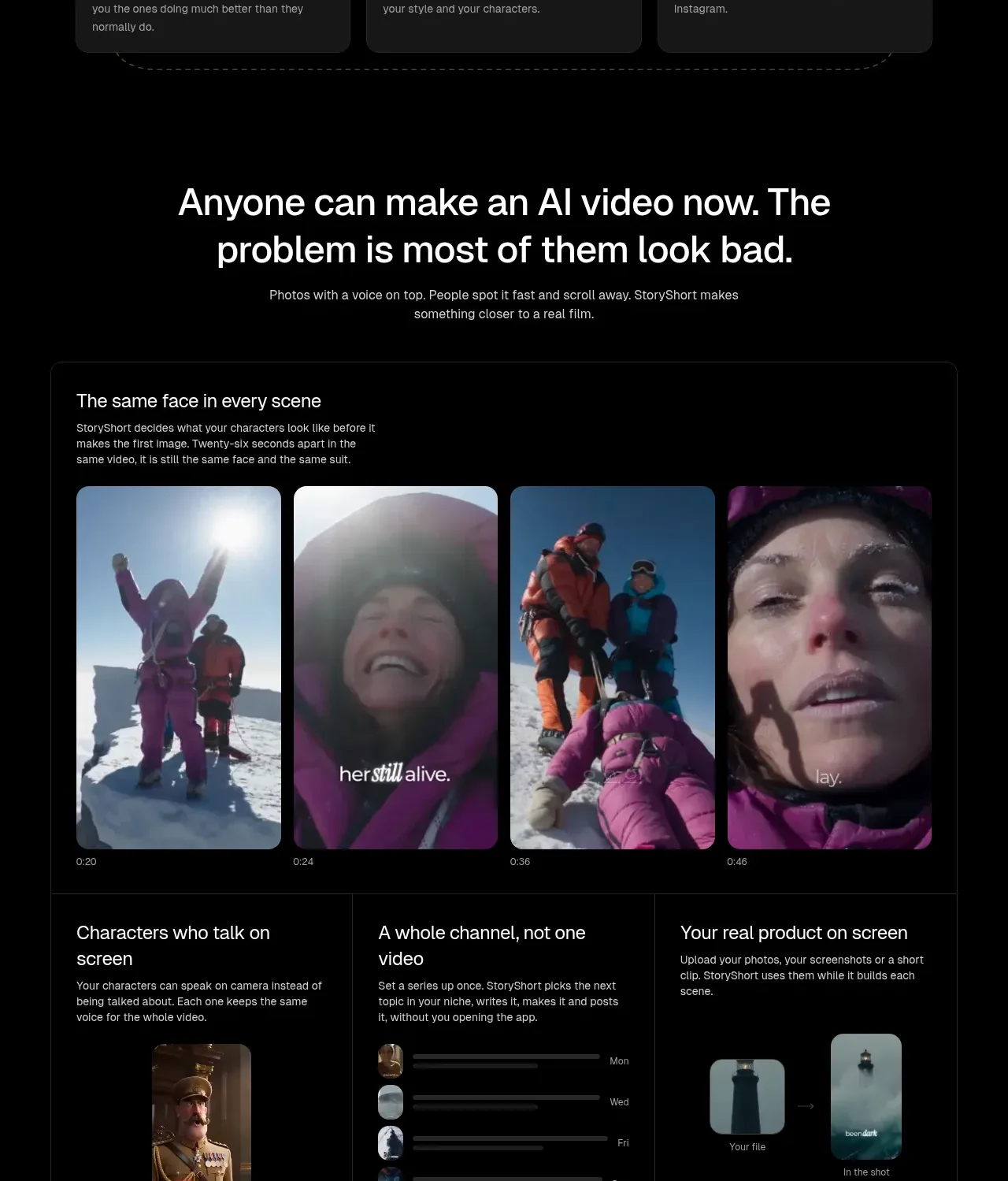 Product capability proof panel
storyshort.ai · Feature grid
Product capability proof panel
storyshort.ai · Feature grid
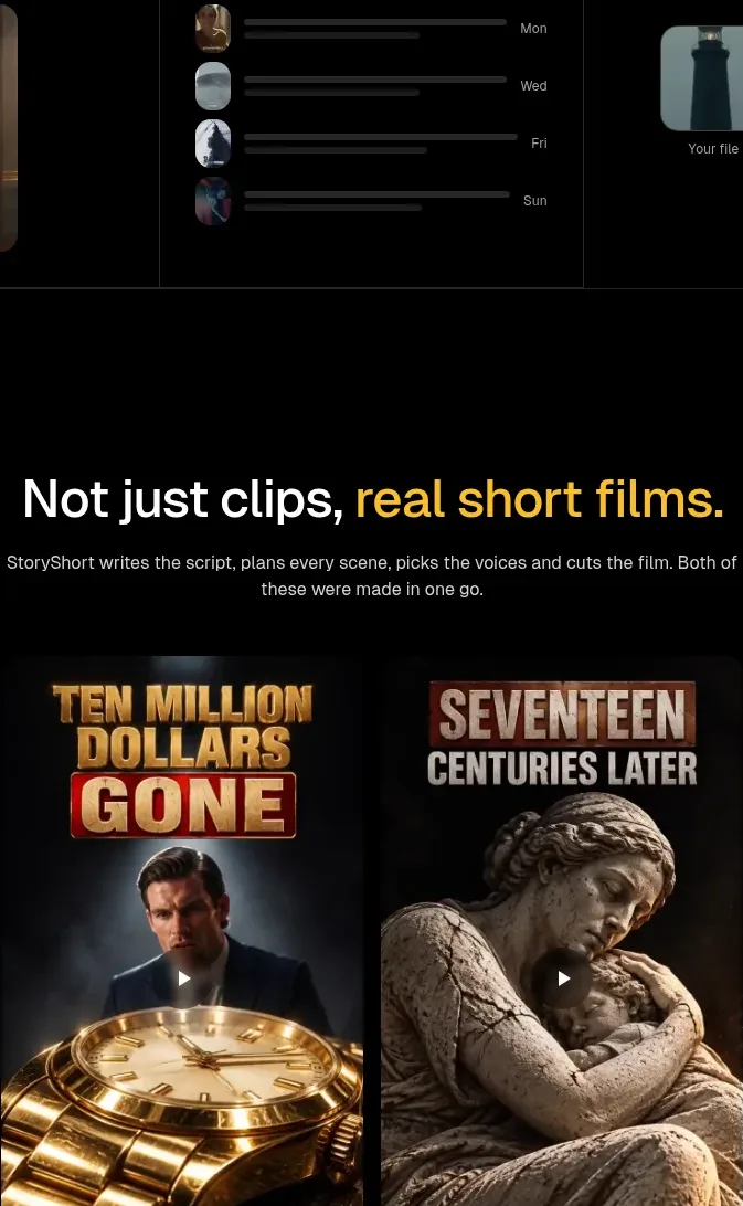 Short-film examples
storyshort.ai · Gallery
Short-film examples
storyshort.ai · Gallery
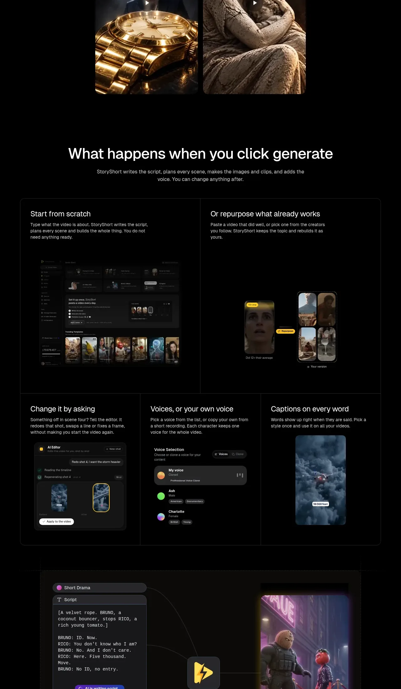 Generate-and-edit workflow
storyshort.ai · Feature grid
Generate-and-edit workflow
storyshort.ai · Feature grid
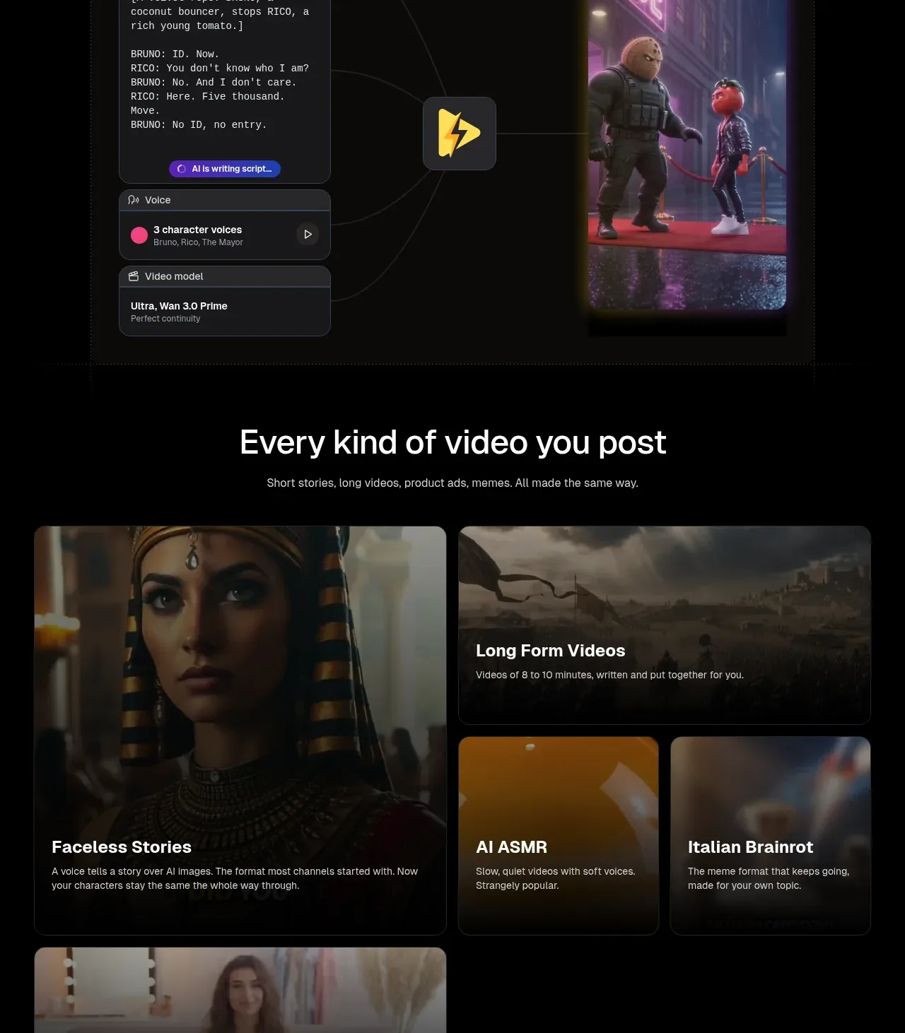 Video format library
storyshort.ai · Feature grid
Video format library
storyshort.ai · Feature grid
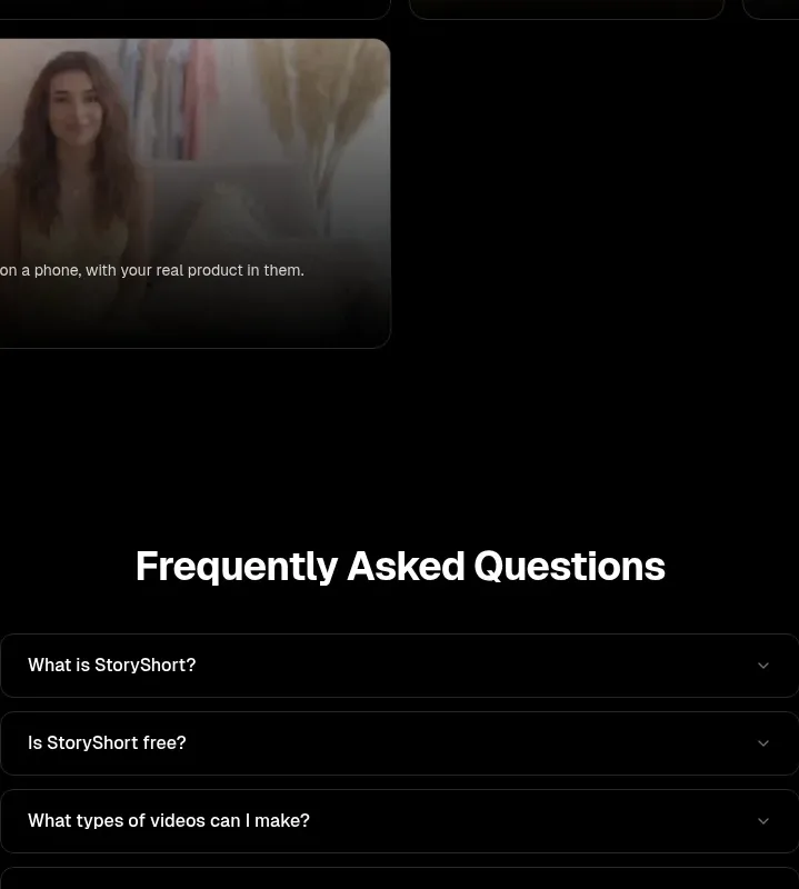 Frequently asked questions
storyshort.ai · FAQ
Frequently asked questions
storyshort.ai · FAQ
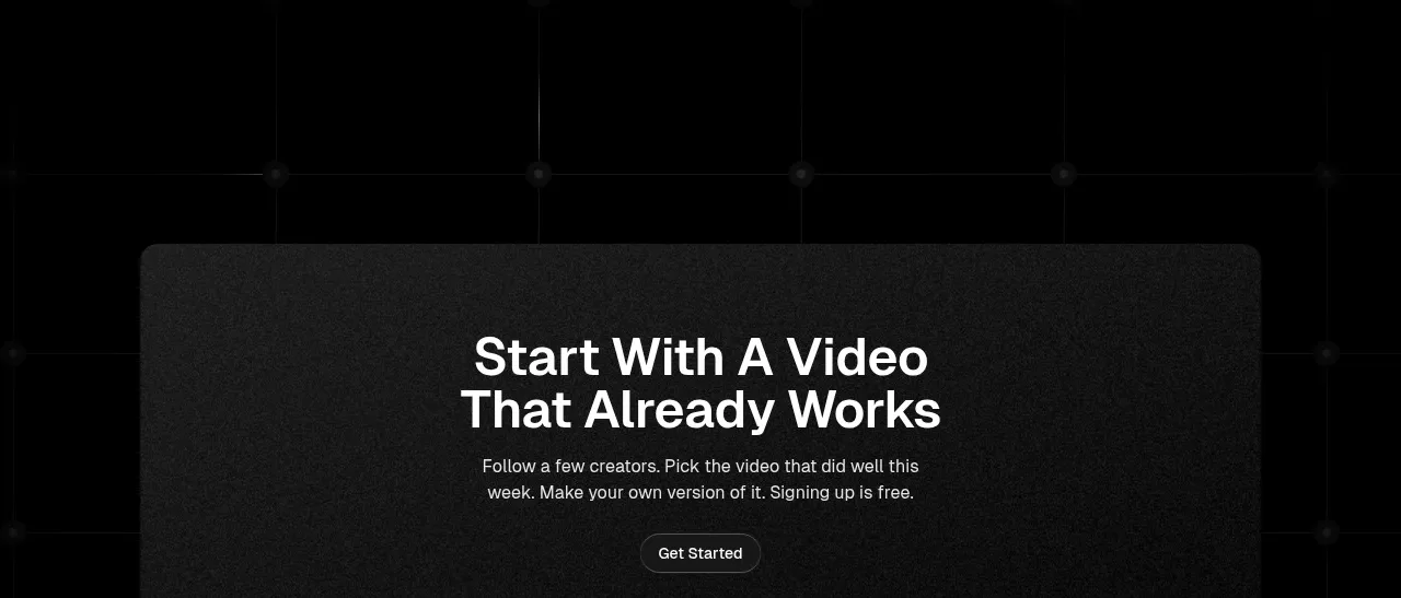 Start with a proven input CTA
storyshort.ai · Call to action
Start with a proven input CTA
storyshort.ai · Call to action
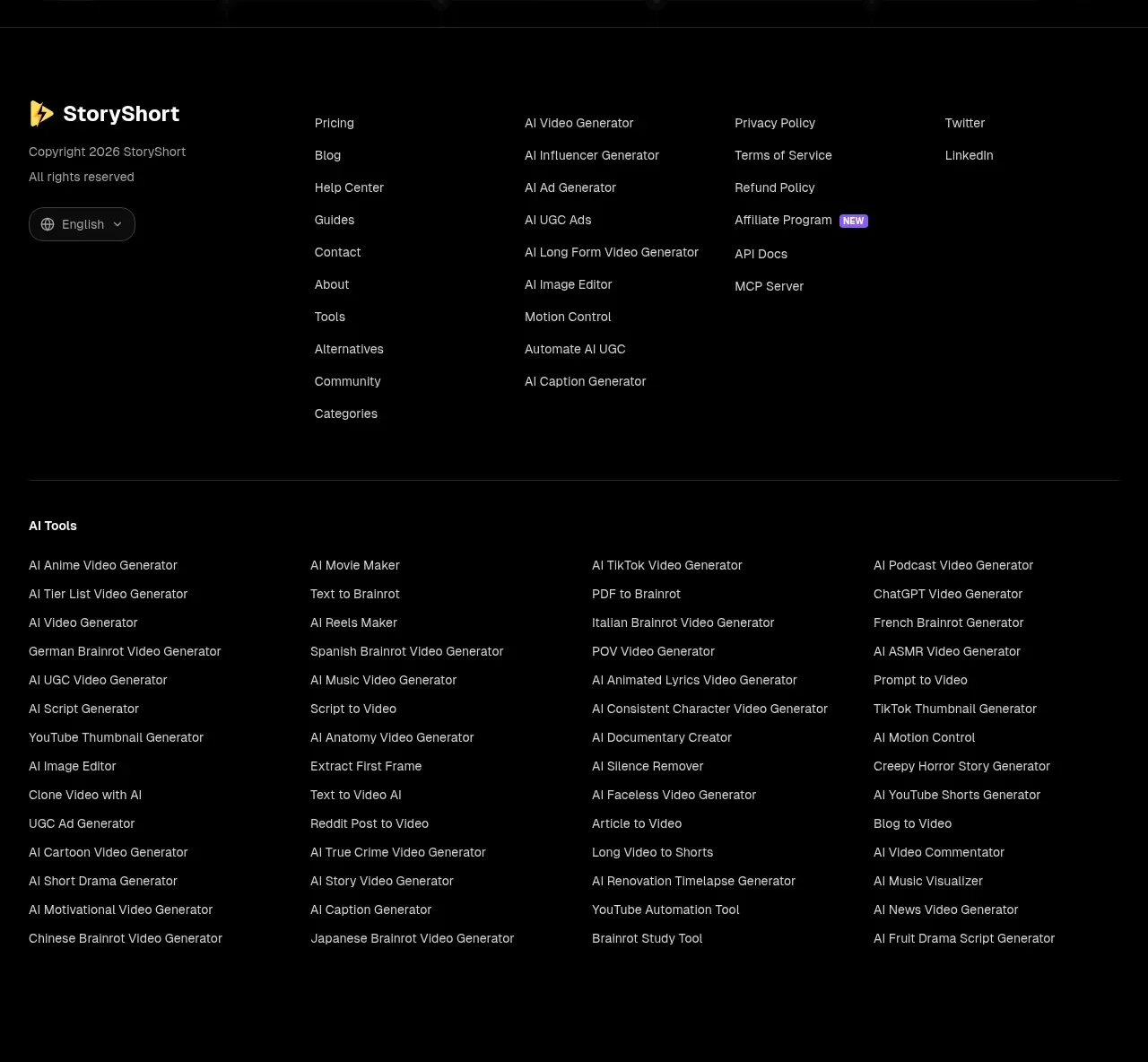 Multi-column resource footer
storyshort.ai · Footer
Multi-column resource footer
storyshort.ai · Footer