 kage
kage
storyshort.ai
Design analysis
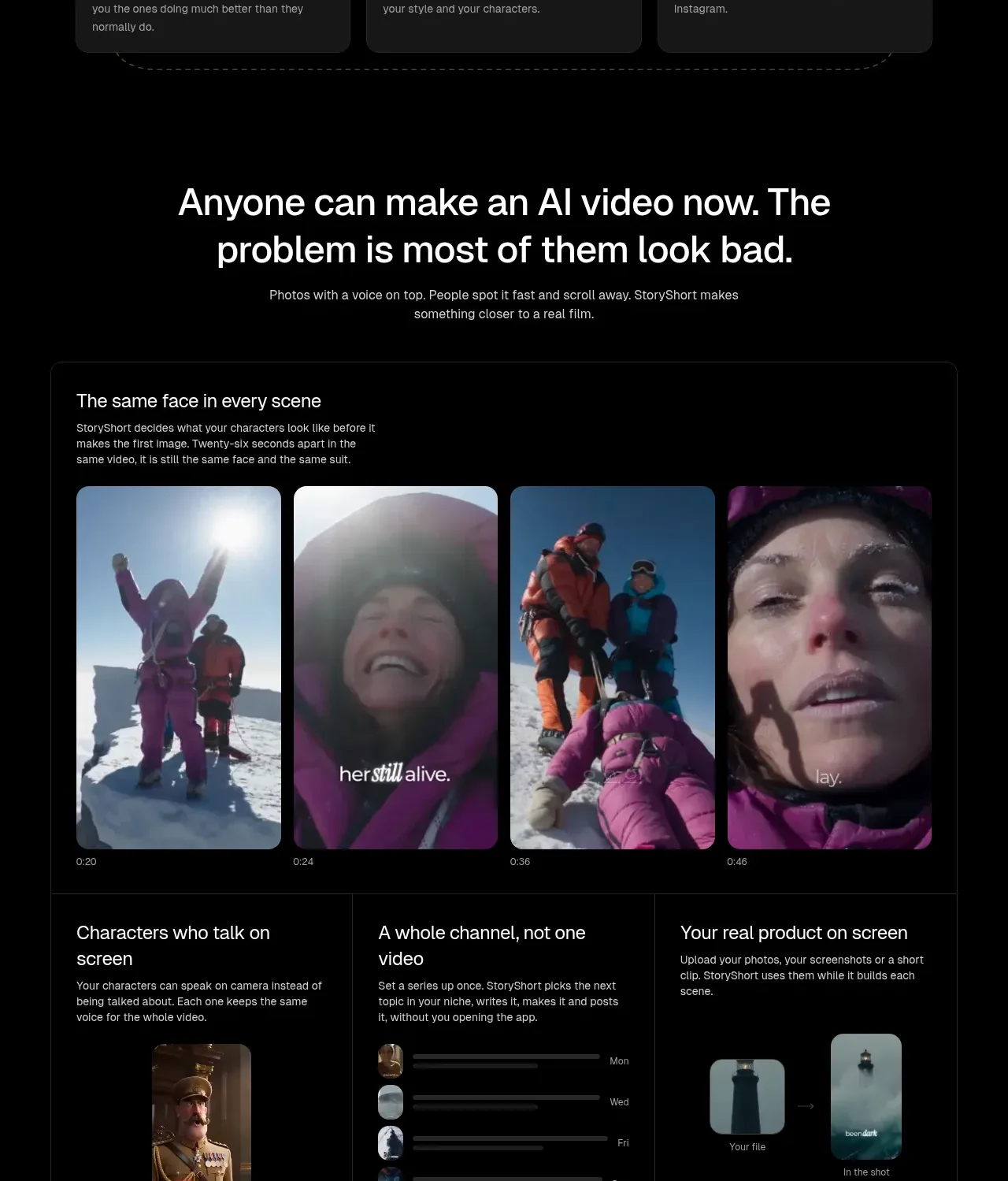
This section frames a central product problem and then presents a bordered multi-part panel showing stable characters, spoken characters, channel-scale output, and product-in-scene examples.
Prompt preview
## Reference images

Study these alongside the description below: hierarchy, rhythm, spacing, colour. Build for the product you are asked about, using this design language.

- Component: https://kage-design-assets.t3.tigrisfiles.io/components/storyshort-ai/c734da75-ded5-4c81-9b78-0aa9ae185a47-1791551952-4.webp
- Full page it was cut from: https://kage-design-assets.t3.tigrisfiles.io/screenshots/storyshort-ai/c734da75-ded5-4c81-9b78-0aa9ae185a47-1791551915904-full.webp
- Component on Kage: https://kage.design/component/storyshort-feature-grid-2

## Before you start
Ask what weak alternatives users currently tolerate, what the product does better, and which 3–4 capabilities deserve visual proof. Adapt the panel to that product's strongest evidence.

Build a proof-oriented dark section. Start with a centered, assertive heading around 34–42px and a concise explanation. Under it, create one large bordered container (#202020) with a top media strip of four equal portrait examples and a lower row of three capability columns. Each column gets a title, short body copy, and a small contextual visual or UI mockup. Use 16px internal spacing, thin separators, black/charcoal surfaces, and 12–16px rounded corners. Ensure captions remain readable over media using gradients or solid lower overlays. The layout should communicate consistency, scale, and real-world use rather than merely decorate.

Never: use the reference's logo, product name, copy, illustrations, imagery, or exact example assets.
More components

 Studios and output grid
Hypervibe · Feature grid
Studios and output grid
Hypervibe · Feature grid
 Continuity and memory grid
Hypervibe · Feature grid
Continuity and memory grid
Hypervibe · Feature grid
 Voice collaboration section
Hypervibe · Feature grid
Voice collaboration section
Hypervibe · Feature grid
 Core workspace feature section
Hypervibe · Feature grid
Core workspace feature section
Hypervibe · Feature grid
 Agent orchestration section
Hypervibe · Feature grid
Agent orchestration section
Hypervibe · Feature grid

 How it works: connected research tools
Lune · Feature grid
How it works: connected research tools
Lune · Feature grid