 kage
kage
storyshort.ai
Design analysis
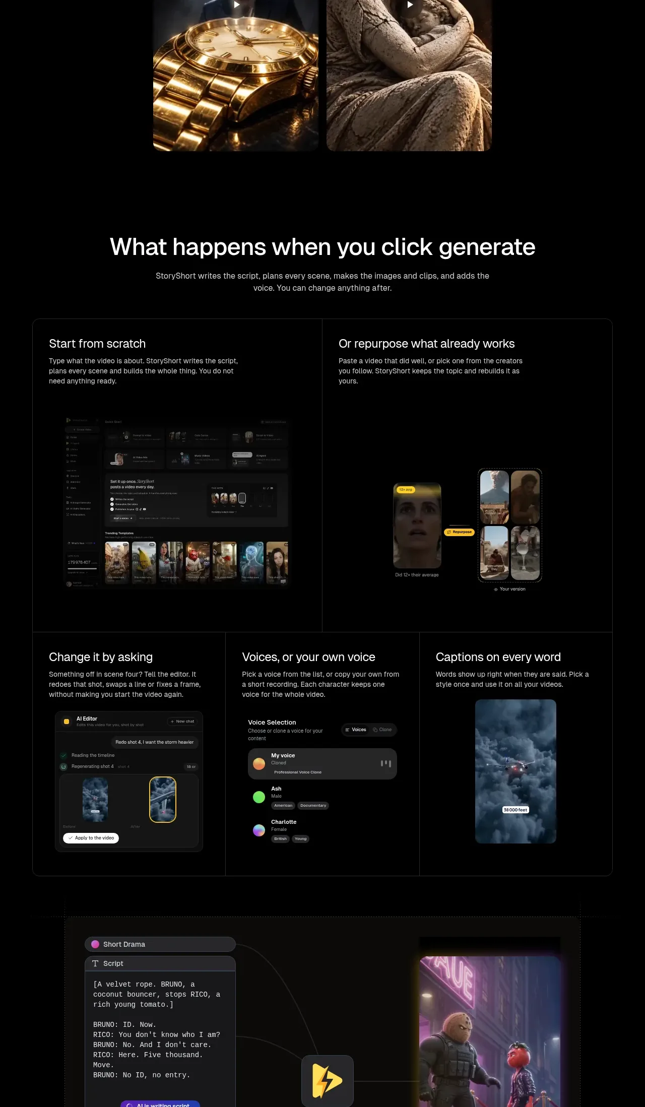
A large bordered feature panel explains generation from scratch or repurposing, followed by editing controls for revisions, voices, and captions, and finishes with a visual flow from inputs to a generated video.
Prompt preview
## Reference images

Study these alongside the description below: hierarchy, rhythm, spacing, colour. Build for the product you are asked about, using this design language.

- Component: https://kage-design-assets.t3.tigrisfiles.io/components/storyshort-ai/c734da75-ded5-4c81-9b78-0aa9ae185a47-1791551953-6.webp
- Full page it was cut from: https://kage-design-assets.t3.tigrisfiles.io/screenshots/storyshort-ai/c734da75-ded5-4c81-9b78-0aa9ae185a47-1791551915904-full.webp
- Component on Kage: https://kage.design/component/storyshort-feature-grid-3

## Before you start
Ask what inputs users provide, what the system generates automatically, and which controls they can change afterward. Ask whether the product is best represented by UI mockups, diagrams, or both.

Build a dark, structured product workflow section. Lead with a centered heading and supporting copy. Use a large rounded bordered panel (#202020) divided into a two-column top area for two starting paths, then a three-column bottom area for editing controls. Each area needs a clear title, 2–3 lines of copy, and a believable but simplified UI mockup. Below or beside it, show a visual pipeline from input settings to a finished output with thin connector lines and a highlighted central product node. Use charcoal surfaces, 1px dividers, 12–16px radius, 24–32px padding, white hierarchy text, and muted gray labels. Make the controls feel editable with pills, selected states, and subtle hover/focus treatments.

Never: use the reference's logo, product name, copy, illustrations, imagery, or exact interface screenshots.
More components

 Studios and output grid
Hypervibe · Feature grid
Studios and output grid
Hypervibe · Feature grid
 Continuity and memory grid
Hypervibe · Feature grid
Continuity and memory grid
Hypervibe · Feature grid
 Voice collaboration section
Hypervibe · Feature grid
Voice collaboration section
Hypervibe · Feature grid
 Core workspace feature section
Hypervibe · Feature grid
Core workspace feature section
Hypervibe · Feature grid
 Agent orchestration section
Hypervibe · Feature grid
Agent orchestration section
Hypervibe · Feature grid

 How it works: connected research tools
Lune · Feature grid
How it works: connected research tools
Lune · Feature grid