 kage
kage
storyshort.ai
Design analysis
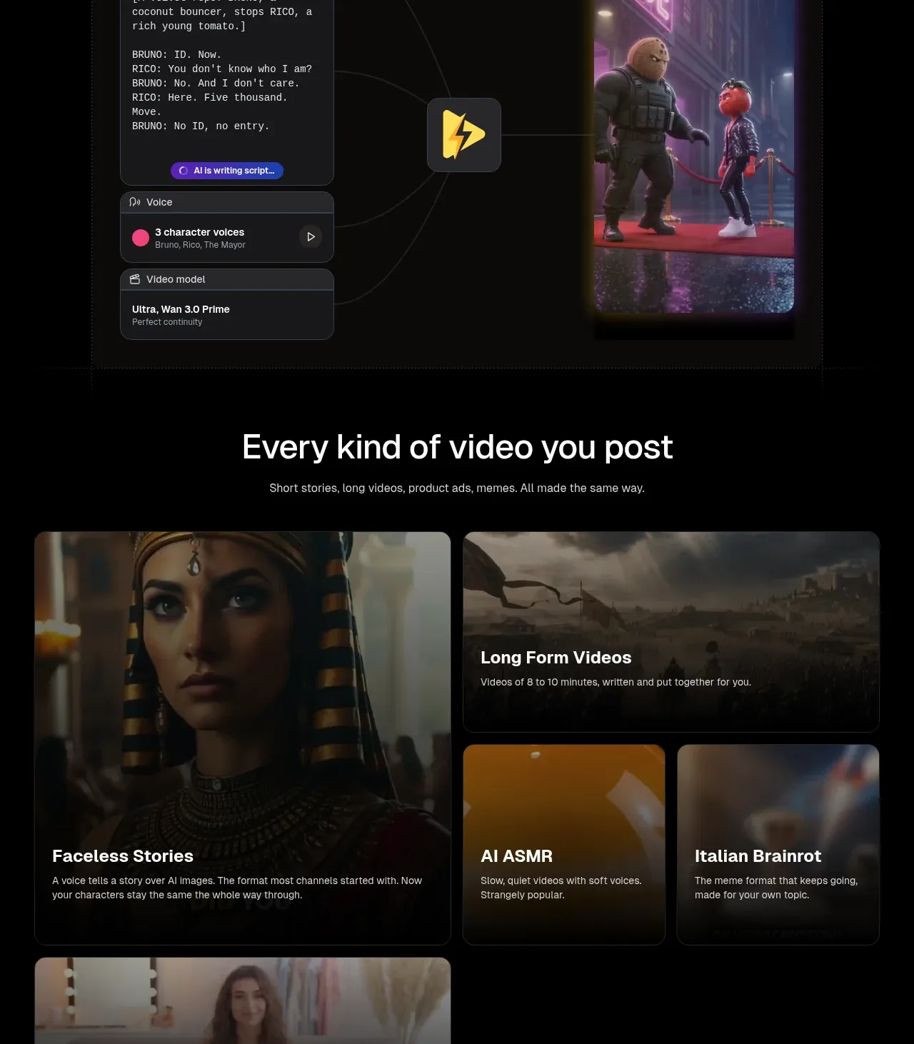
A heading introduces a responsive set of media-backed cards for different video formats, with one large featured tile and smaller supporting tiles arranged in an asymmetric grid.
Prompt preview
## Reference images

Study these alongside the description below: hierarchy, rhythm, spacing, colour. Build for the product you are asked about, using this design language.

- Component: https://kage-design-assets.t3.tigrisfiles.io/components/storyshort-ai/c734da75-ded5-4c81-9b78-0aa9ae185a47-1791551954-7.webp
- Full page it was cut from: https://kage-design-assets.t3.tigrisfiles.io/screenshots/storyshort-ai/c734da75-ded5-4c81-9b78-0aa9ae185a47-1791551915904-full.webp
- Component on Kage: https://kage.design/component/storyshort-feature-grid-4

## Before you start
Ask which content formats the user's product supports and which one should be the featured use case. Ask for the intended content tone and image treatment.

Create a dark media card grid with a centered 32–40px heading and one-line supporting copy. Use an asymmetric responsive layout: a large featured card spanning two rows or columns, a wide card beside it, two compact cards below, and another wide card at the bottom. Each card uses a background image or video with a dark gradient overlay, 12–16px radius, subtle border, and text anchored near the bottom-left. Titles should be 16–20px bold; descriptions 12–14px muted white. Keep card heights intentional and ensure text remains legible across varied imagery. On mobile, stack cards while preserving the featured card's prominence.

Never: use the reference's logo, product name, copy, illustrations, imagery, or exact category labels.
More components

 Studios and output grid
Hypervibe · Feature grid
Studios and output grid
Hypervibe · Feature grid
 Continuity and memory grid
Hypervibe · Feature grid
Continuity and memory grid
Hypervibe · Feature grid
 Voice collaboration section
Hypervibe · Feature grid
Voice collaboration section
Hypervibe · Feature grid
 Core workspace feature section
Hypervibe · Feature grid
Core workspace feature section
Hypervibe · Feature grid
 Agent orchestration section
Hypervibe · Feature grid
Agent orchestration section
Hypervibe · Feature grid

 How it works: connected research tools
Lune · Feature grid
How it works: connected research tools
Lune · Feature grid