 kage
kage
together.ai
Design analysis
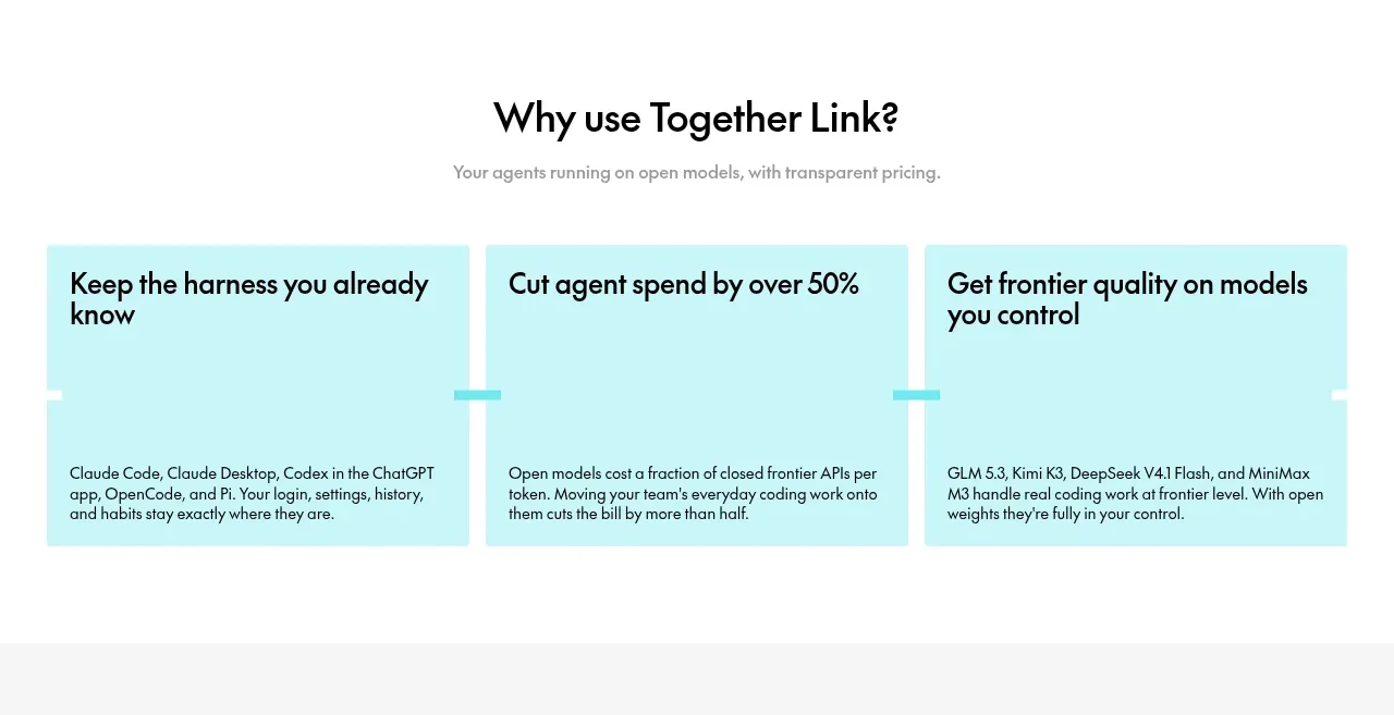
A short centered section heading introduces three equal aqua benefit cards, each pairing a bold claim with explanatory text.
Prompt preview
## Reference images

Study these alongside the description below: hierarchy, rhythm, spacing, colour. Build for the product you are asked about, using this design language.

- Component: https://kage-design-assets.t3.tigrisfiles.io/components/together-link/c83e90db-1751-48ac-9cb1-70c29bd77b17-1791612068-2.webp
- Full page it was cut from: https://kage-design-assets.t3.tigrisfiles.io/screenshots/together-link/c83e90db-1751-48ac-9cb1-70c29bd77b17-1791612038251-full.webp
- Component on Kage: https://kage.design/component/together-link-feature-grid

## Before you start
Ask what the user's product benefits and proof points are, then apply this structure to those benefits.

Build a three-column benefit grid inside a centered max-width container. Begin with a centered heading and one muted supporting sentence, followed by equal-height cards. Each card should use a pale aqua background around `#c9f4f4`, black text, a bold 18–20px title, and compact body copy anchored toward the lower portion of the card. Separate cards with a small consistent gutter, use 0–4px corners or a restrained 4px radius, and let the cards feel like one graphic band. On mobile, stack them vertically. Keep the language outcome-focused and make the three claims scannable before the details.

Never: use logos, product names, copy, illustrations, or imagery from the reference.
More components

 Studios and output grid
Hypervibe · Feature grid
Studios and output grid
Hypervibe · Feature grid
 Continuity and memory grid
Hypervibe · Feature grid
Continuity and memory grid
Hypervibe · Feature grid
 Voice collaboration section
Hypervibe · Feature grid
Voice collaboration section
Hypervibe · Feature grid
 Core workspace feature section
Hypervibe · Feature grid
Core workspace feature section
Hypervibe · Feature grid
 Agent orchestration section
Hypervibe · Feature grid
Agent orchestration section
Hypervibe · Feature grid

 How it works: connected research tools
Lune · Feature grid
How it works: connected research tools
Lune · Feature grid