kage
kage
together.ai
Design analysis
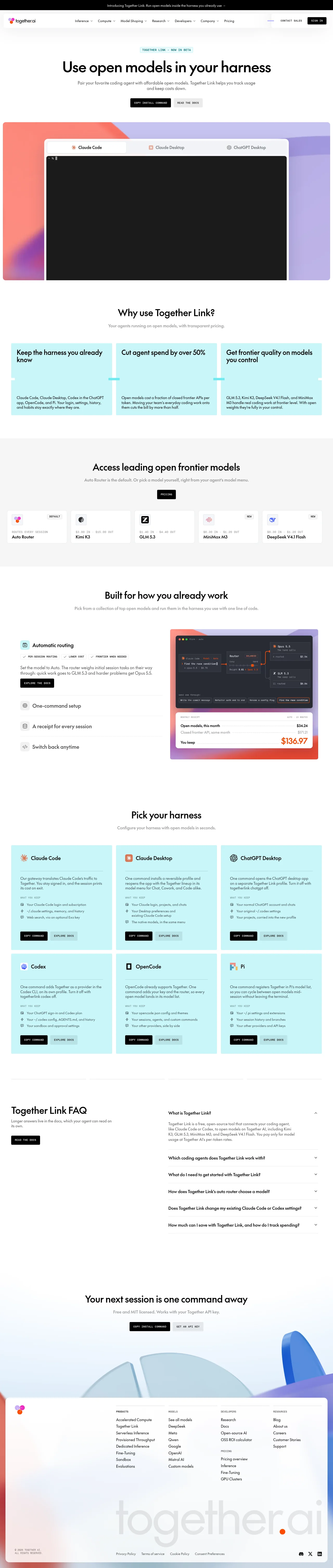
A spacious developer-tool landing page uses a white canvas, near-black geometric sans typography, and small uppercase mono labels to establish a precise technical tone. The page develops from a centered hero and large terminal demo into cyan benefit cards, a muted model catalogue, a split feature walkthrough, a dense six-card harness grid, FAQ rows, and a soft gradient CTA/footer; repeated thin borders, compact buttons, and restrained radius keep the long page cohesive.
Prompt preview
## Reference images

Study these alongside the description below: hierarchy, rhythm, spacing, colour. Build for the product you are asked about, using this design language.

- Full page: https://kage-design-assets.t3.tigrisfiles.io/screenshots/together-link/c83e90db-1751-48ac-9cb1-70c29bd77b17-1791612038251-full.webp
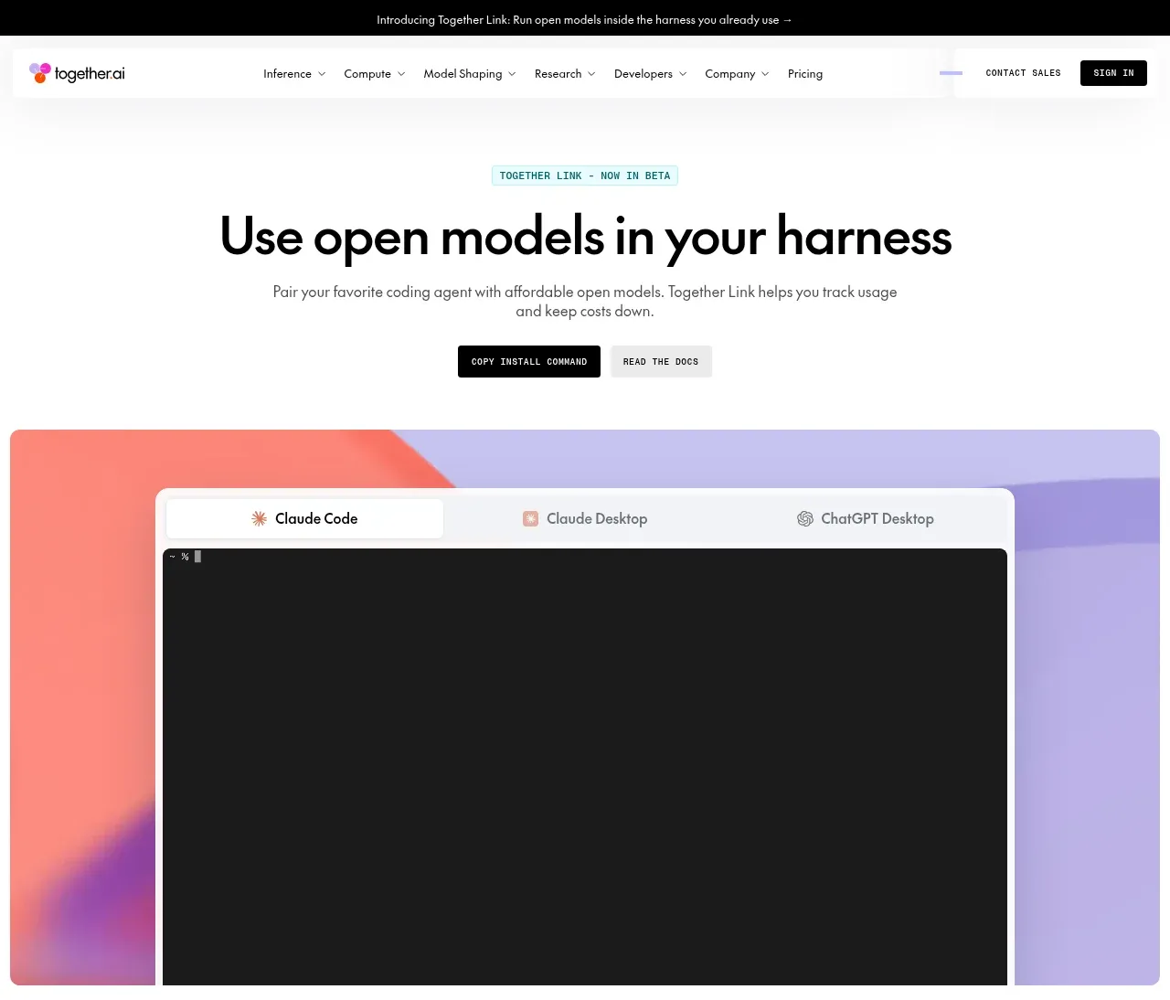
- Above the fold: https://kage-design-assets.t3.tigrisfiles.io/screenshots/together-link/c83e90db-1751-48ac-9cb1-70c29bd77b17-1791612034044.webp
- Design on Kage: https://kage.design/designs/together-link-landing-page

## Before you start
Ask the user what they are building, who it is for, and which brand assets they already have (name, colours, and type). Wait for their answers before designing. Apply everything below to their product, not to the reference product.

## Page structure
1. **Announcement bar:** Add a very thin black strip at the top with one centered, small light sentence announcing a launch or notable update.
2. **Primary navigation:** Place a white navigation bar below it with a compact brand mark at left, several dropdown-style product links across the middle, and lightweight contact/sign-in actions at right. Keep it shallow and separated from the page by subtle shadow or border.
3. **Hero:** Center a small pale-teal uppercase eyebrow above a large bold one-line headline, a muted two-line supporting paragraph, and two compact buttons. Use generous white space before the main visual.
4. **Hero product visual:** Show a wide rounded browser/terminal mockup over an abstract coral, purple, and blue geometric gradient. Include a light tab strip and a large dark terminal area to communicate the product immediately.
5. **Benefits introduction:** On white, center a section heading and short muted subtitle, then place three equal cyan cards in one row. Each card has a bold short benefit title above a divider-like transition and a compact explanatory paragraph.
6. **Model catalogue section:** Shift to a very light gray background. Center the heading, subtitle, and a small pricing button, then show a horizontal row of compact white model tiles with tiny logos, labels, pricing metadata, and small DEFAULT or NEW badges.
7. **Workflow feature section:** Return to white and center a heading/subtitle. Below, use a two-column layout: a left vertical list of capabilities with the first item expanded into explanatory text and a small action button, and a right product illustration showing routing, usage, and savings inside a dark interface framed by a warm/cool gradient.
8. **Harness selection:** Add a centered heading and subtitle, followed by a three-column by two-row grid of pale cyan integration cards. Each card contains a product-neutral icon placeholder, title, divider, description, a small “what you keep” list, and paired action buttons.
9. **FAQ:** Separate the section with a thin horizontal rule. Use a two-column layout with a heading, short explanation, and docs button on the left; on the right, show one expanded accordion answer followed by several collapsed rows with chevrons and thin dividers.
10. **Final CTA:** Center a bold closing heading, muted subtitle, and two buttons over a very light blue/cool gradient field. Let a large abstract cropped geometric form emerge from the lower background.
11. **Footer panel:** Place a large white rounded footer panel over the gradient. Put a small brand mark at top-left, multi-column navigation links across the upper middle, a huge low-contrast oversized brand-text treatment in the lower area, legal links along the bottom, and small social controls at bottom-right.

## Design language
- Build hierarchy through scale and whitespace: use a heavy 44–56px desktop hero, 28–34px section headings, 16–18px card titles, and 12–14px supporting text; keep section intros centered and short.
- Use a restrained technical palette: white `#FFFFFF`, ink `#090909`, muted gray `#777777`, pale cyan `#C5F4F5`, soft gray section fill `#F6F6F6`, and accent gradients moving through coral `#FF766E`, lavender `#AAA4E8`, blue `#4D8CEB`, and pale sky `#EAF6FF`.
- Pair a rounded geometric sans for headlines and body copy with tiny uppercase monospaced labels for eyebrows, pricing metadata, badges, and button text. Use tight headline tracking and comfortable body leading.
- Keep the page mostly minimal and white, but change rhythm by section: airy hero, compact three-card benefits, dense model tiles, spacious split feature, dense integration grid, then a quiet FAQ and visual CTA/footer.
- Treat borders as hairlines in pale gray or white; use small 2–6px radii on controls and cards, with larger 8–12px radii only for major screenshots and footer panels. Avoid heavy shadows; use faint elevation for navigation and catalogue tiles.
- Make primary buttons black with white uppercase mono text, secondary buttons pale gray or translucent cyan, and keep controls short, rectangular, and compact rather than pill-shaped.
- Use abstract gradients and interface mockups as the main visual language instead of decorative illustration. Screenshots should have crisp dark surfaces, light chrome, and clear data hierarchy.
- Keep interactions understated: dropdown indicators in navigation, hover darkening or slight lift on cards and buttons, and FAQ rows that expand inline while preserving the thin-divider structure. Use gentle opacity/translate transitions rather than dramatic motion.
- On smaller screens, collapse navigation actions, stack the hero and feature layouts, turn horizontal tiles into scrollable or wrapped rows, and keep card padding and typography readable without losing the generous whitespace.

## Never
- Do not use the reference product’s logos, wordmarks, product names, copy, illustrations, photography, screenshots, or icon sets.
- Do not reproduce Together Link or present the result as that product.
- Create original brand assets, neutral interface examples, and product-specific content supplied by the user instead.
Components from this page
All components
 Announcement and primary navigation
Together Link · Navigation
Announcement and primary navigation
Together Link · Navigation
 Open-models harness hero
Together Link · Hero
Open-models harness hero
Together Link · Hero
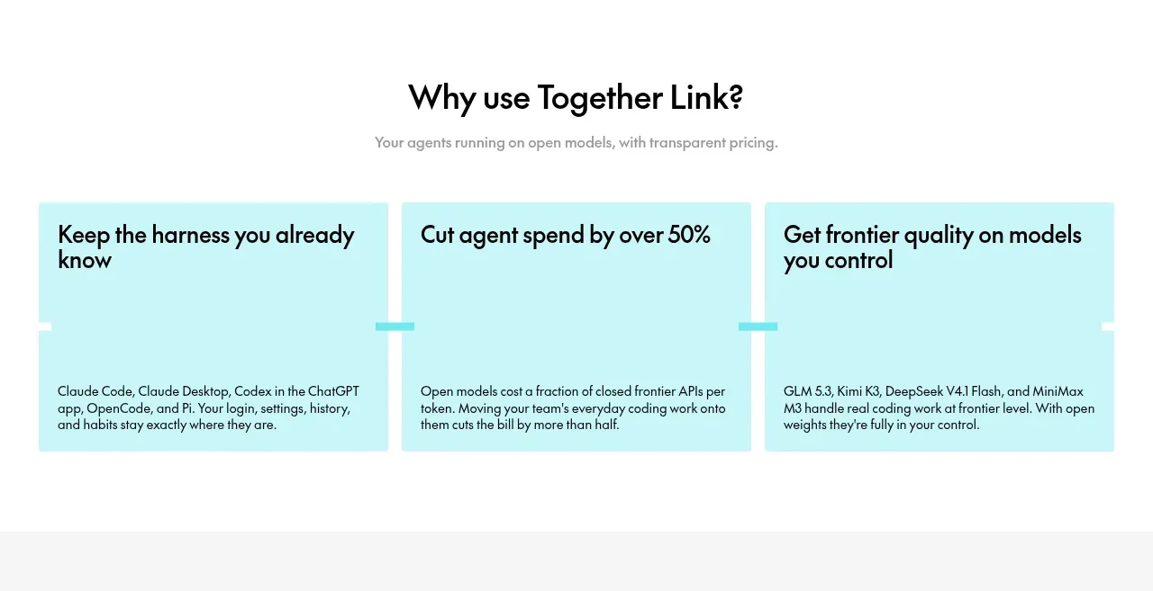 Why the product is useful
Together Link · Feature grid
Why the product is useful
Together Link · Feature grid
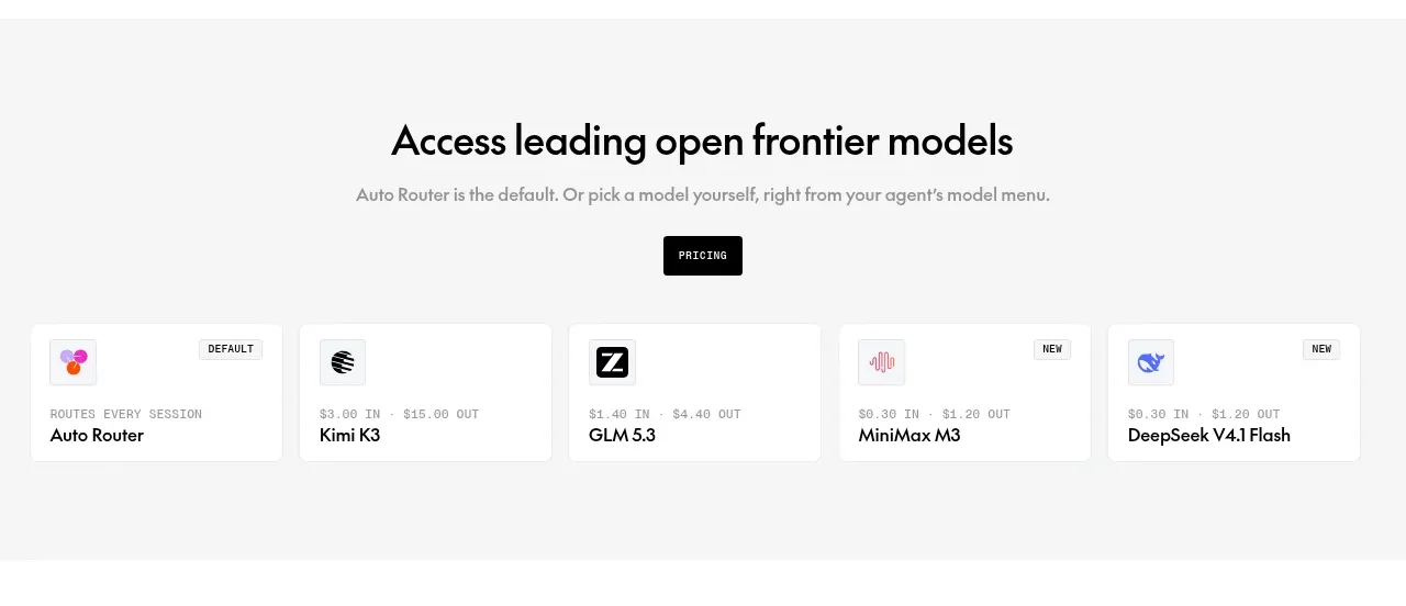 Model access and pricing strip
Together Link · Feature grid
Model access and pricing strip
Together Link · Feature grid
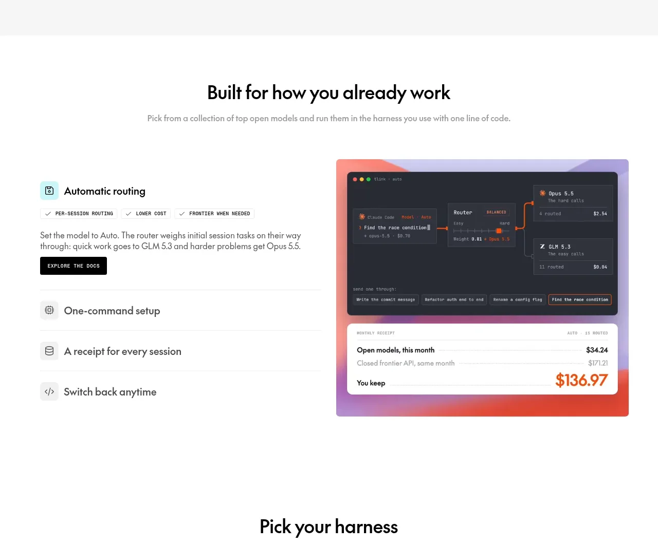 Workflow capabilities with product visual
Together Link · Feature grid
Workflow capabilities with product visual
Together Link · Feature grid
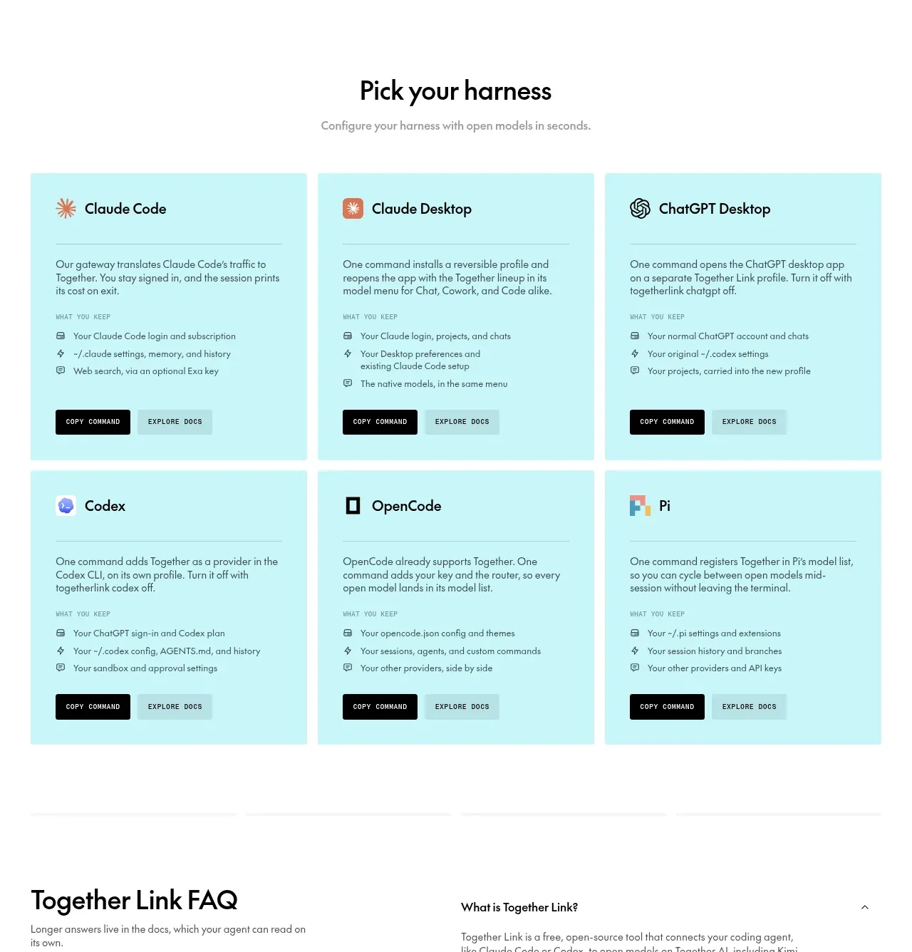 Harness setup cards
Together Link · Feature grid
Harness setup cards
Together Link · Feature grid
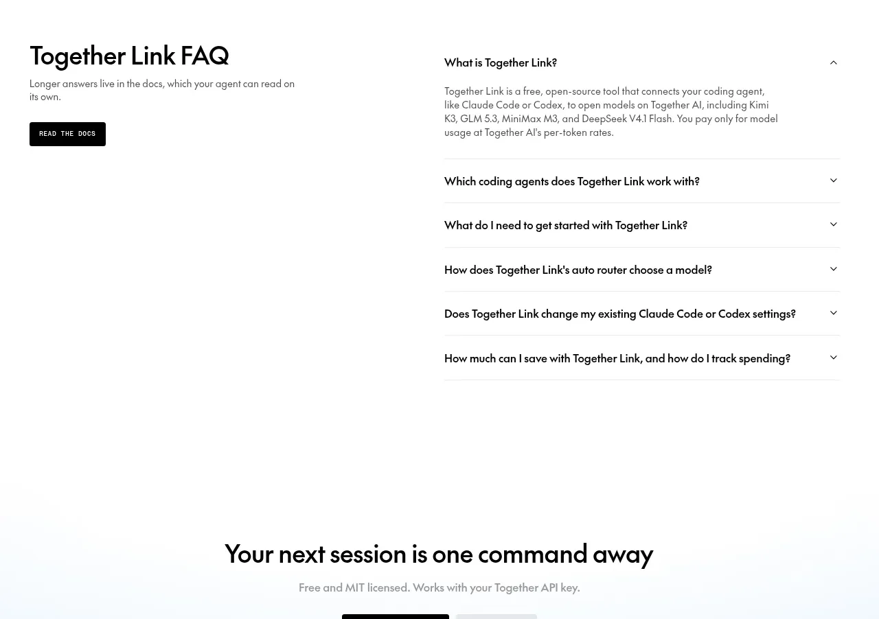 Product FAQ
Together Link · FAQ
Product FAQ
Together Link · FAQ
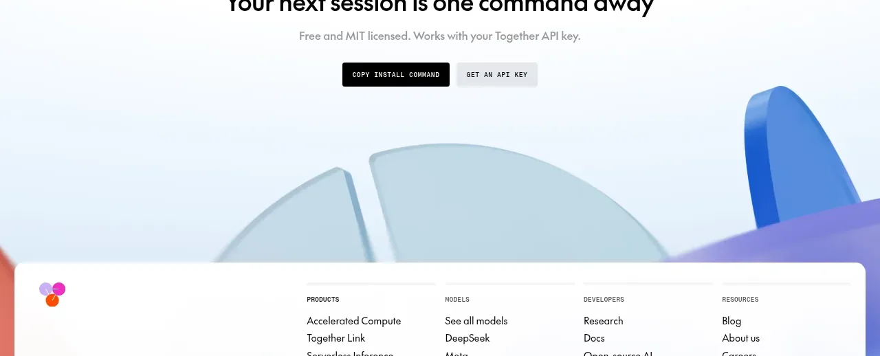 Next-session conversion CTA
Together Link · Call to action
Next-session conversion CTA
Together Link · Call to action
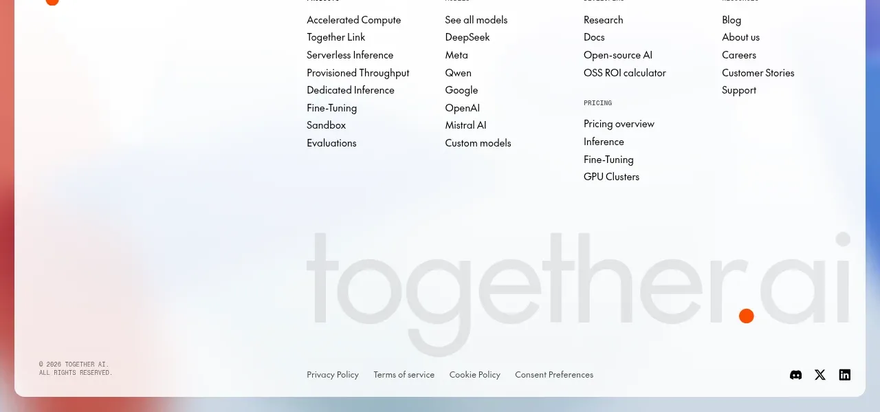 Multi-column site footer
Together Link · Footer
Multi-column site footer
Together Link · Footer