 kage
kage
together.ai
Design analysis
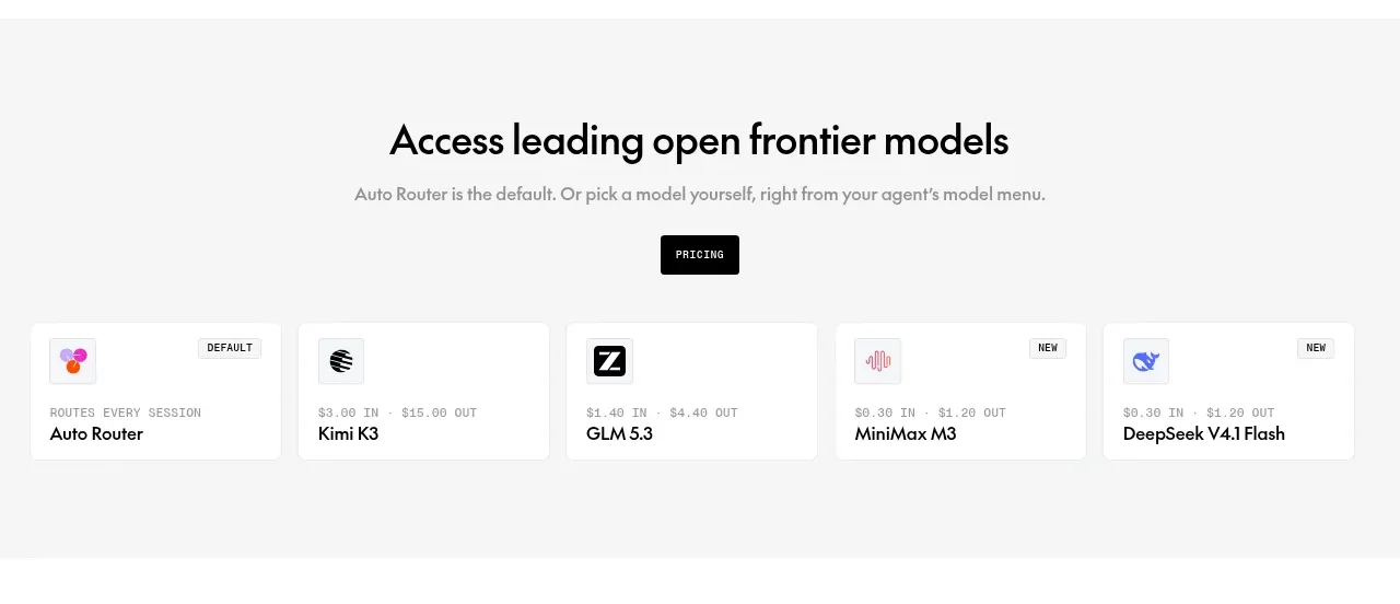
A light gray product section explains model access, offers a pricing action, and ends with a horizontal strip of compact model cards with labels and rates.
Prompt preview
## Reference images

Study these alongside the description below: hierarchy, rhythm, spacing, colour. Build for the product you are asked about, using this design language.

- Component: https://kage-design-assets.t3.tigrisfiles.io/components/together-link/c83e90db-1751-48ac-9cb1-70c29bd77b17-1791612069-3.webp
- Full page it was cut from: https://kage-design-assets.t3.tigrisfiles.io/screenshots/together-link/c83e90db-1751-48ac-9cb1-70c29bd77b17-1791612038251-full.webp
- Component on Kage: https://kage.design/component/together-link-feature-grid-2

## Before you start
Ask what models, plans, or selectable resources the user's product offers and what pricing action matters most, then adapt this pattern.

Create a pale neutral section, approximately `#f7f7f7`, with a centered heading, muted subtitle, and compact dark pricing button. Beneath it place a horizontally arranged row of five small white resource cards. Each card needs a tiny icon or abstract mark, optional badge, short label, and understated metadata; emphasize the default or recommended choice without overwhelming the row. Use 12–16px card padding, 4px radius, subtle `#e8e8e8` border, and a light shadow. Allow horizontal scrolling or a stacked arrangement on mobile. Keep the section informational, not dense, with ample whitespace around the row.

Never: use logos, product names, copy, illustrations, or imagery from the reference.
More components

 Studios and output grid
Hypervibe · Feature grid
Studios and output grid
Hypervibe · Feature grid
 Continuity and memory grid
Hypervibe · Feature grid
Continuity and memory grid
Hypervibe · Feature grid
 Voice collaboration section
Hypervibe · Feature grid
Voice collaboration section
Hypervibe · Feature grid
 Core workspace feature section
Hypervibe · Feature grid
Core workspace feature section
Hypervibe · Feature grid
 Agent orchestration section
Hypervibe · Feature grid
Agent orchestration section
Hypervibe · Feature grid

 How it works: connected research tools
Lune · Feature grid
How it works: connected research tools
Lune · Feature grid