 kage
kage
together.ai
Design analysis
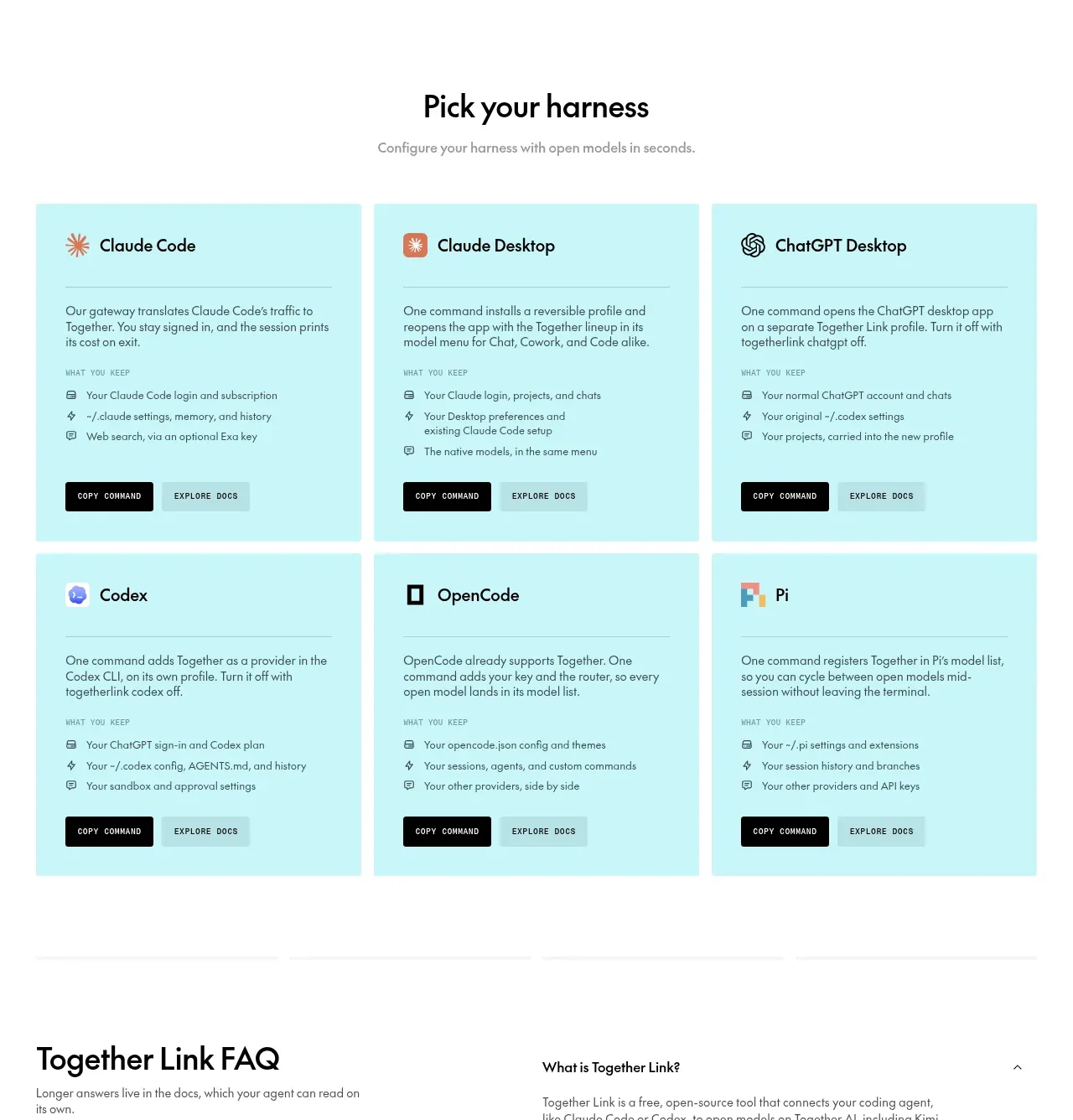
A centered heading leads into a six-card, two-row grid that explains how to connect different development environments, with repeated commands and documentation actions.
Prompt preview
## Reference images

Study these alongside the description below: hierarchy, rhythm, spacing, colour. Build for the product you are asked about, using this design language.

- Component: https://kage-design-assets.t3.tigrisfiles.io/components/together-link/c83e90db-1751-48ac-9cb1-70c29bd77b17-1791612069-5.webp
- Full page it was cut from: https://kage-design-assets.t3.tigrisfiles.io/screenshots/together-link/c83e90db-1751-48ac-9cb1-70c29bd77b17-1791612038251-full.webp
- Component on Kage: https://kage.design/component/together-link-feature-grid-4

## Before you start
Ask which environments, integrations, or setup paths the user's product supports, then use those as the card categories.

Create a centered integration section with a clear heading and muted subtitle, followed by a responsive three-column grid that becomes one column on mobile. Each pale aqua card should contain a small abstract icon, integration category title, divider, short explanation, a compact “what you keep” list with tiny line icons, and two actions at the bottom. Use `#c9f4f4` backgrounds, near-black text, muted teal-gray secondary text, 4px corners, 24px internal padding, and 12px grid gaps. Keep card heights consistent so the repeated action rows align. Use solid black primary buttons and translucent aqua secondary buttons, with visible hover and focus states. Make the card content modular so new integrations can be added without redesigning the grid.

Never: use logos, product names, copy, illustrations, or imagery from the reference.
More components

 Studios and output grid
Hypervibe · Feature grid
Studios and output grid
Hypervibe · Feature grid
 Continuity and memory grid
Hypervibe · Feature grid
Continuity and memory grid
Hypervibe · Feature grid
 Voice collaboration section
Hypervibe · Feature grid
Voice collaboration section
Hypervibe · Feature grid
 Core workspace feature section
Hypervibe · Feature grid
Core workspace feature section
Hypervibe · Feature grid
 Agent orchestration section
Hypervibe · Feature grid
Agent orchestration section
Hypervibe · Feature grid

 How it works: connected research tools
Lune · Feature grid
How it works: connected research tools
Lune · Feature grid