 kage
kage
zernio.link
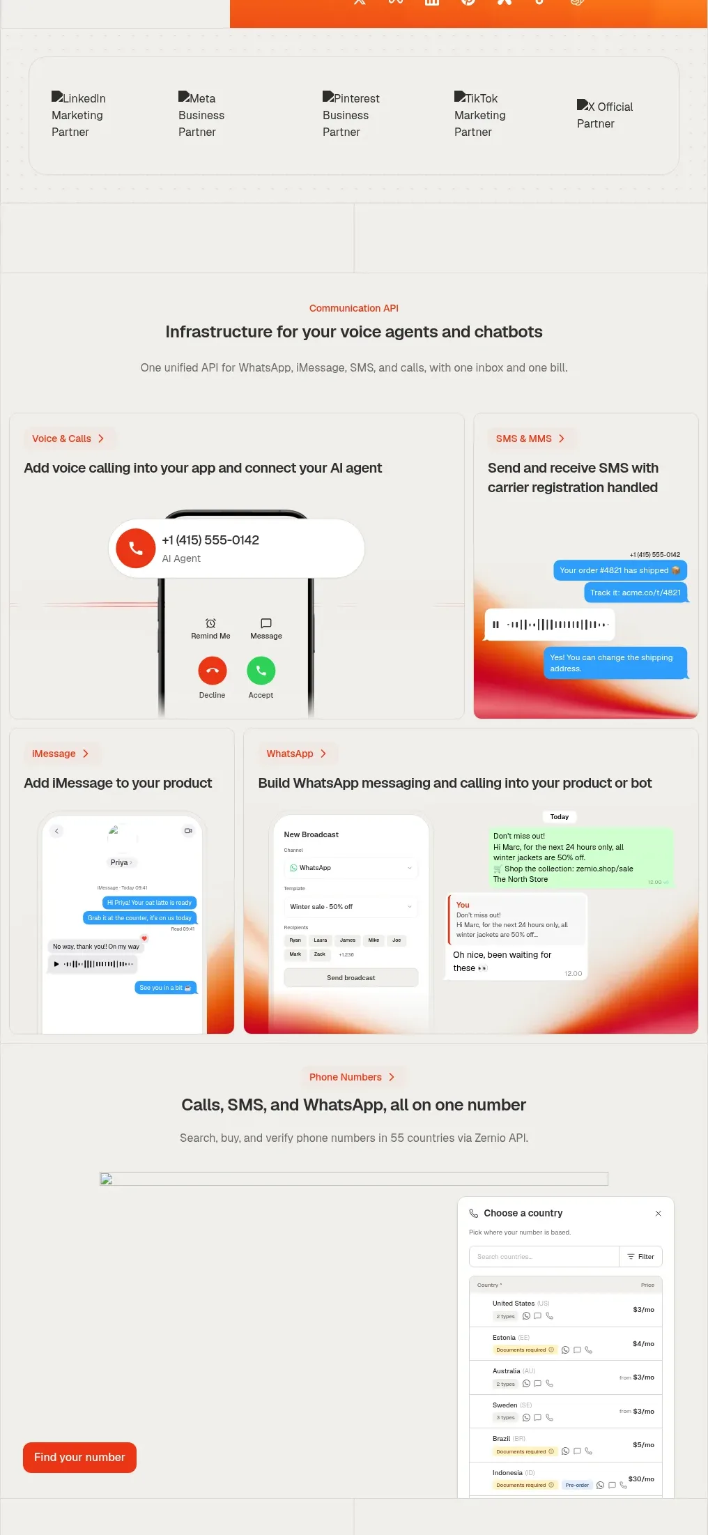
Design analysis
A communication API section uses a centered heading followed by a mosaic of bordered product cards for voice, SMS, messaging, and phone-number workflows.
Prompt preview
## Reference images

Study these alongside the description below: hierarchy, rhythm, spacing, colour. Build for the product you are asked about, using this design language.

- Component: https://kage-design-assets.t3.tigrisfiles.io/components/zernio/c501b537-d018-43e7-982b-563c0d4d1135-1791612291-6.webp
- Full page it was cut from: https://kage-design-assets.t3.tigrisfiles.io/screenshots/zernio/c501b537-d018-43e7-982b-563c0d4d1135-1791612175252-full.webp
- Component on Kage: https://kage.design/component/zernio-feature-grid-2

## Before you start
Ask what the user's product, audience, and brand are, then apply the following principles to that product rather than copying the reference.

Create a communication-platform feature section with a centered category label, heading, and supporting paragraph. Below it, use an asymmetric responsive card mosaic: two cards for voice and SMS in the first row, two cards for direct messaging and a broader messaging workflow in the second row, and a wide phone-number card below. Each card should have a small colored breadcrumb, a bold title, and an original interface mockup or abstract UI treatment occupying the lower half. Use consistent 1px borders #dfddd8, 10–14px corner radii, off-white #f5f4f1, dark #262522, muted gray #77746f, blue/green UI accents where semantically useful, and restrained orange-red highlights. Preserve equal gutters and align card baselines; collapse to one column on mobile.

Never: use logos, product names, copy, illustrations, or imagery from the reference.
More components

 Studios and output grid
Hypervibe · Feature grid
Studios and output grid
Hypervibe · Feature grid
 Continuity and memory grid
Hypervibe · Feature grid
Continuity and memory grid
Hypervibe · Feature grid
 Core workspace feature section
Hypervibe · Feature grid
Core workspace feature section
Hypervibe · Feature grid
 Voice collaboration section
Hypervibe · Feature grid
Voice collaboration section
Hypervibe · Feature grid
 Agent orchestration section
Hypervibe · Feature grid
Agent orchestration section
Hypervibe · Feature grid

 How it works: connected research tools
Lune · Feature grid
How it works: connected research tools
Lune · Feature grid