kage
kage
zernio.link

Design analysis
A long-form API marketing page uses a pale gray canvas, fine structural borders, compact sans-serif typography, and orange-red accents to organize a dense sequence of product modules. The hero is spacious and centered with a stepped orange glow at its base; below it, the page shifts into bordered feature panels, logo and testimonial strips, media-rich channel cards, and a dark enterprise/developer interlude before returning to light testimonials, FAQ, and a quiet conversion footer. Repeated narrow red eyebrow labels, restrained radii, minimal shadows, and code/UI mockups create a technical but approachable rhythm.
Prompt preview
## Reference images

Study these alongside the description below: hierarchy, rhythm, spacing, colour. Build for the product you are asked about, using this design language.

- Full page: https://kage-design-assets.t3.tigrisfiles.io/screenshots/zernio/c501b537-d018-43e7-982b-563c0d4d1135-1791612175252-full.webp
- Above the fold: https://kage-design-assets.t3.tigrisfiles.io/screenshots/zernio/c501b537-d018-43e7-982b-563c0d4d1135-1791612171871.webp
- Design on Kage: https://kage.design/designs/zernio-landing-page

## Before you start
Ask the user what they are building, who it is for, and what brand assets they already have—brand name, colours, typefaces, logo or other visual assets. Wait for their answers before designing. Apply everything below to their product, not to the reference product.

## Page structure
1. **Announcement bar and navigation:** Begin with a slim orange-red announcement strip, then a restrained light navigation row with a small brand mark at left, compact dropdown links, and two right-aligned actions: a quiet secondary button and a filled primary button.
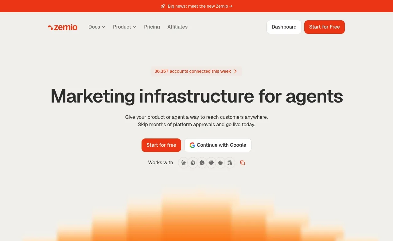
2. **Hero:** Use a large centered headline, a short two-line explanation, paired CTAs, and a small “works with” compatibility row. Keep generous empty space around the copy and end the hero with a wide stepped orange-to-red glow made from soft rectangular bands.
3. **Customer logo strip:** Follow the hero with a centered social-proof sentence and a horizontally divided row of muted customer logos; use thin borders and a subtle orange active underline on selected cells.
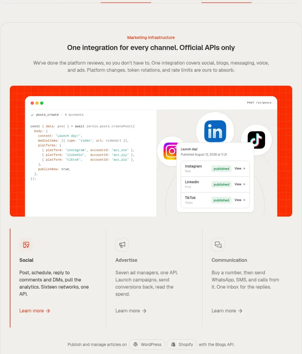
4. **Unified integration feature panel:** Place a large rounded, lightly bordered container with a small orange eyebrow, centered heading, supporting copy, and a prominent orange-framed code/product mockup. Under the mockup, use three equal vertical feature columns for social, advertising, and communication, followed by a small integrations note and a testimonial quote band.
5. **Social API section:** Introduce a centered eyebrow and heading for the social API, with a short description and a wide carousel-like row of four tall media cards. Keep the cards visibly framed and include understated left/right circular controls.
6. **Advertising API section:** Use a centered heading and description, then a split feature layout: a narrow left rail with three stacked capabilities—launch, moderate, report—and a larger right visual showing code, ad UI overlays, orange glow, and channel icons. Add a bordered partner/platform strip beneath.
7. **Communication API section:** Continue the light grid with a centered heading and supporting line, then arrange communication use cases as an asymmetric card mosaic: a large voice-and-calls card, a tall SMS/MMS card, two smaller iMessage and WhatsApp cards, and clear eyebrow labels in each card.
8. **Phone numbers section:** Add a centered phone-number heading and description, a wide understated product visual area with a country-selection panel aligned to the right, and a filled “find your number” CTA aligned toward the lower left.
9. **Customer stories section:** Create a bordered testimonial module with a heading row, a tabbed customer-logo strip, a large quote area, attribution, and a text link for reading the full story.
10. **Dark enterprise section:** Make a deliberate full-width transition to near-black. Use a thin grid and a large thin white orbital curve on the left, a compact connected-account metric card near its path, and an enterprise-scale message on the right with small capability icons and a sales CTA.
11. **Developer integration section:** Still in the dark theme, center an integration eyebrow and heading, then show a large browser/code panel with tab controls for SDKs, MCP, and CLI, a short “write it once” message and docs CTA on the left, code on the right, and language chips along the bottom.
12. **Builder testimonials:** Return to the pale light canvas with a centered builder-count eyebrow and heading. Show a multi-column grid of compact testimonial cards with names, roles, and short quotes; allow the grid to extend horizontally like a clipped carousel.
13. **FAQ:** Use a large bordered FAQ block. Put the “Frequently Asked Questions” heading in a wide left column and stack compact question rows with plus controls in the right column.
14. **Final CTA:** Leave generous whitespace around a centered final conversion headline, supporting line, orange primary button, and a row of small compliance/reliability badges.
15. **Footer:** Finish with a faint abstract translucent geometric mark above several evenly spaced link columns. Group links by product, integrations, agents, company, comparisons, and community, then add tiny legal/status text and a very large low-contrast outline wordform near the bottom edge.

## Design language
- Build hierarchy with a compact geometric sans-serif for labels and body copy, then scale the main headline to roughly 48–64px on desktop with tight line-height and heavy weight. Use short orange eyebrow labels, medium section headings, and small gray explanatory text rather than oversized paragraphs.
- Treat the page as a structural grid: use thin 1px lines around major containers and between columns, with occasional empty grid cells and horizontal rules to create a technical, editorial cadence.
- Start with an airy, pale warm-gray background around `#f3f2ee` or `#f5f4f0`; use near-black text around `#242321` and muted gray copy around `#77756f`.
- Use orange-red as the only strong accent, approximately `#f04422` to `#ff5a22`. Reserve it for CTAs, eyebrow labels, active rules, small links, and warm product glows rather than flooding whole sections.
- Create the hero and product visual energy with blurred orange gradients fading into red, approximately `#ff9a32`, `#ff5a1f`, and `#e92d16`, often behind crisp white UI or code surfaces.
- Switch to a near-black section around `#111010` for enterprise and developer credibility. Keep its borders charcoal, use white text sparingly, and let the same orange accent appear in small tabs, buttons, and code syntax.
- Keep cards mostly flat: 8–14px corner radii, hairline borders, minimal shadows, and occasional white elevated surfaces for controls. Avoid glossy glass effects; depth should come from borders, spacing, and embedded interface screenshots.
- Change rhythm down the page: spacious centered hero, denser bordered capability panels, asymmetric media mosaics, a high-contrast dark interlude, then compact testimonials and FAQ rows before opening back up for the final CTA.
- Use mock interfaces, code snippets, phone screens, and platform marks as the main visual language. Keep them crisp and product-specific to the user’s own product; pair them with soft gradient fields and restrained decorative geometry.
- Make interactions understated: filled orange buttons darken slightly on hover, outline/quiet controls gain a light fill, tabs use a thin orange active rule, cards can lift only subtly, and carousels use small circular arrow controls. Avoid dramatic motion; use slow opacity and gradient movement only where it supports the product visual.

## Never
- Do not copy the reference’s logos, wordmarks, product name, copy, illustrations, photography, platform marks, code content, or icon set.
- Do not present the result as Zernio or imply affiliation with it.
- Do not reuse its exact testimonial names, customer names, statistics, navigation labels, or claims.
- Replace all visual assets and content with original material for the user’s product while preserving the reusable layout logic and design language above.
Components from this page
All components
 Announcement bar and primary navigation
Zernio · Navigation
Announcement bar and primary navigation
Zernio · Navigation
 Marketing infrastructure hero
Zernio · Hero
Marketing infrastructure hero
Zernio · Hero
 Customer logo strip
Zernio · Logo cloud
Customer logo strip
Zernio · Logo cloud
 Unified API social integration feature
Zernio · Feature grid
Unified API social integration feature
Zernio · Feature grid
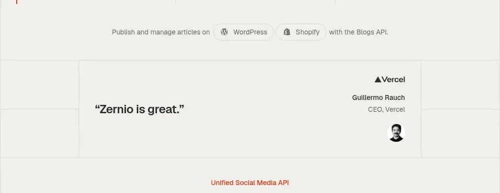 Social API showcase and testimonial
Zernio · Testimonials
Social API showcase and testimonial
Zernio · Testimonials
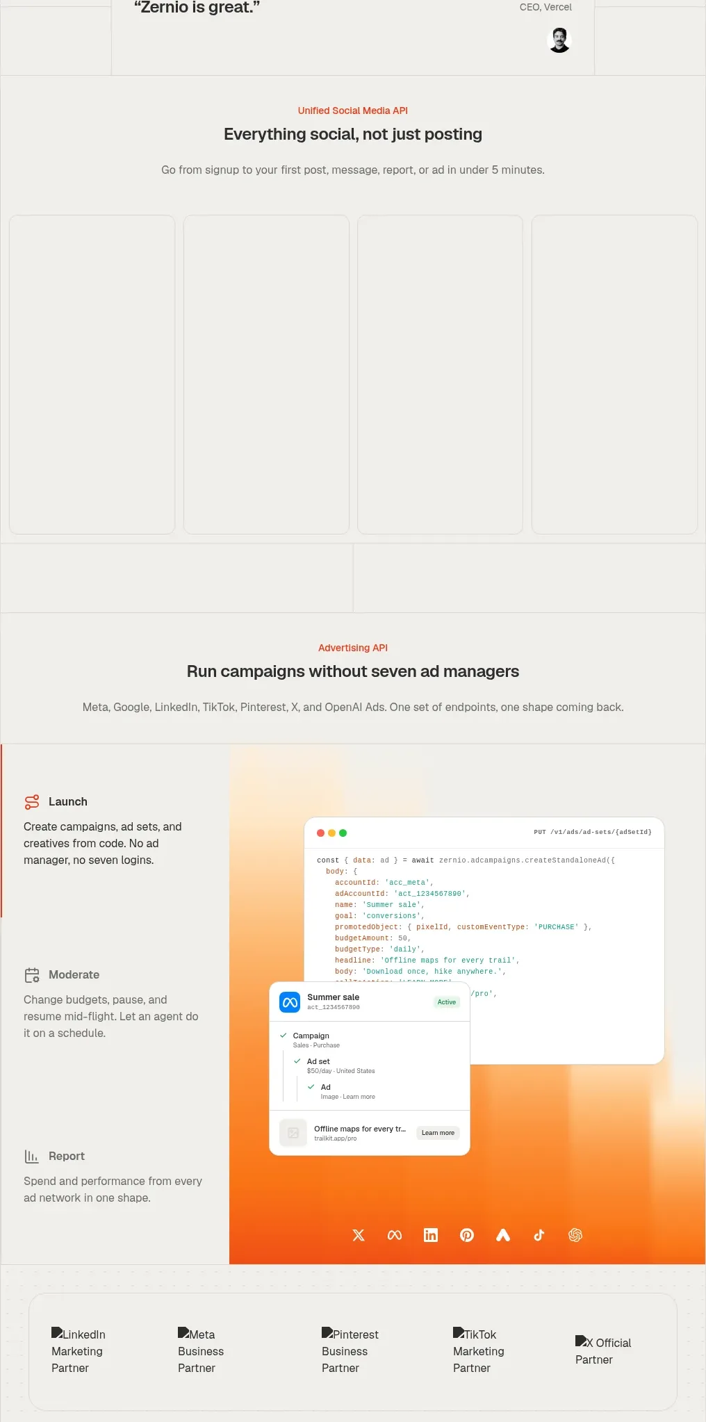 Social media campaign API showcase
Zernio · Gallery
Social media campaign API showcase
Zernio · Gallery
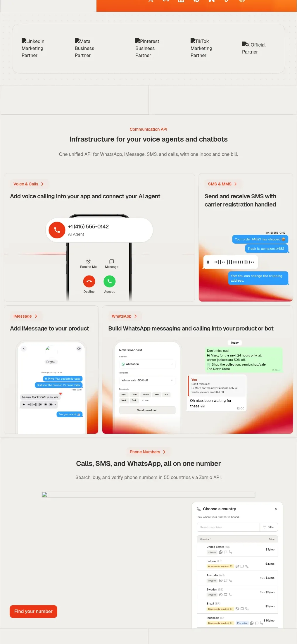 Voice, messaging, and phone-number features
Zernio · Feature grid
Voice, messaging, and phone-number features
Zernio · Feature grid
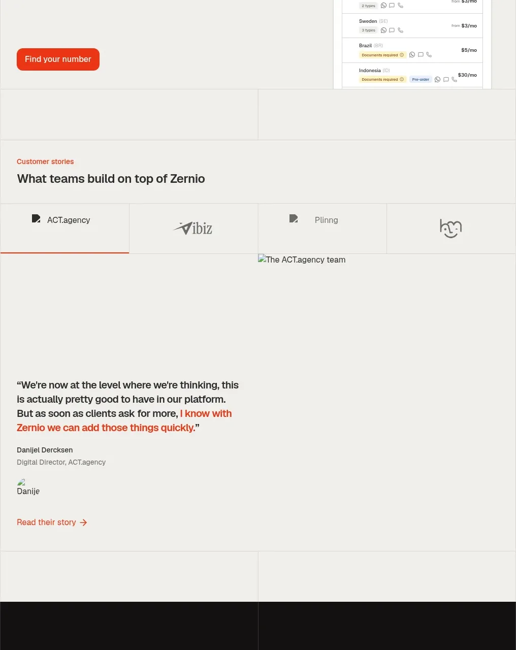 Customer stories
Zernio · Testimonials
Customer stories
Zernio · Testimonials
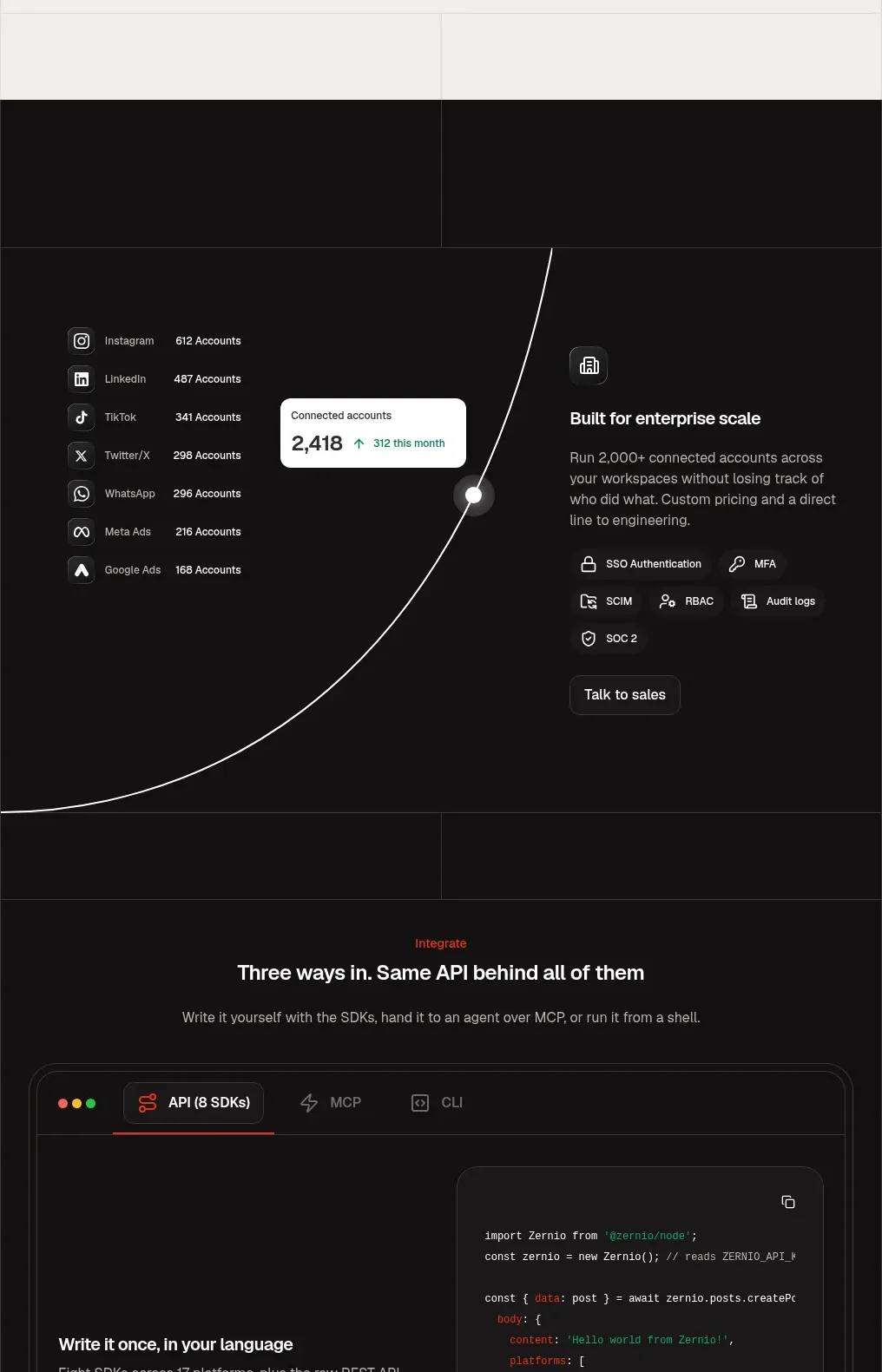 Enterprise scale and integration platform
Zernio · Feature grid
Enterprise scale and integration platform
Zernio · Feature grid
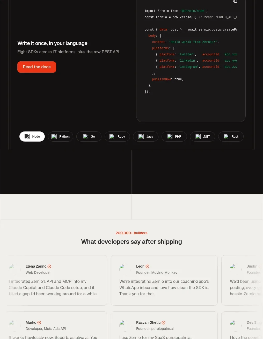 Developer integration code showcase
Zernio · Code block
Developer integration code showcase
Zernio · Code block
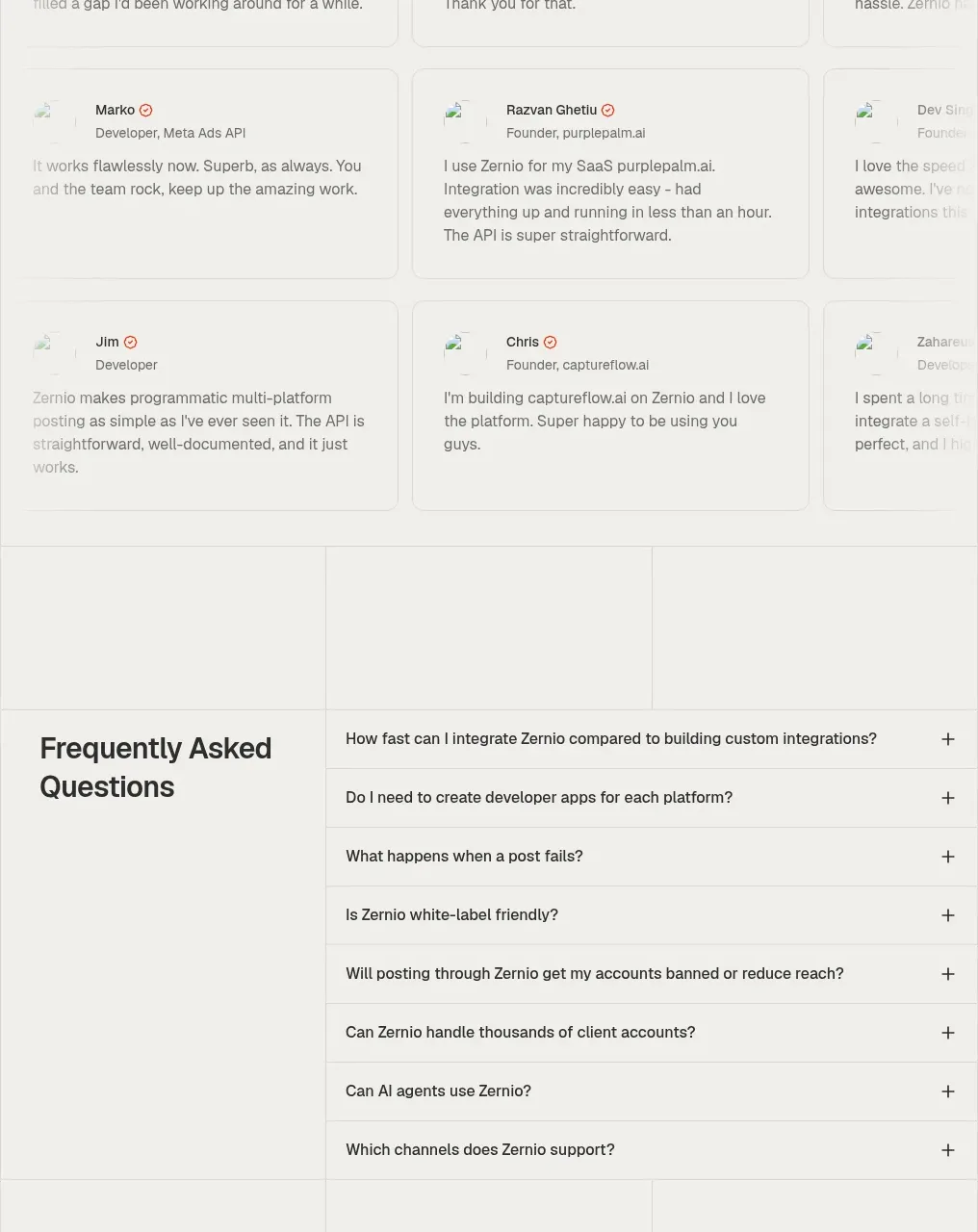 Developer testimonials grid
Zernio · Testimonials
Developer testimonials grid
Zernio · Testimonials
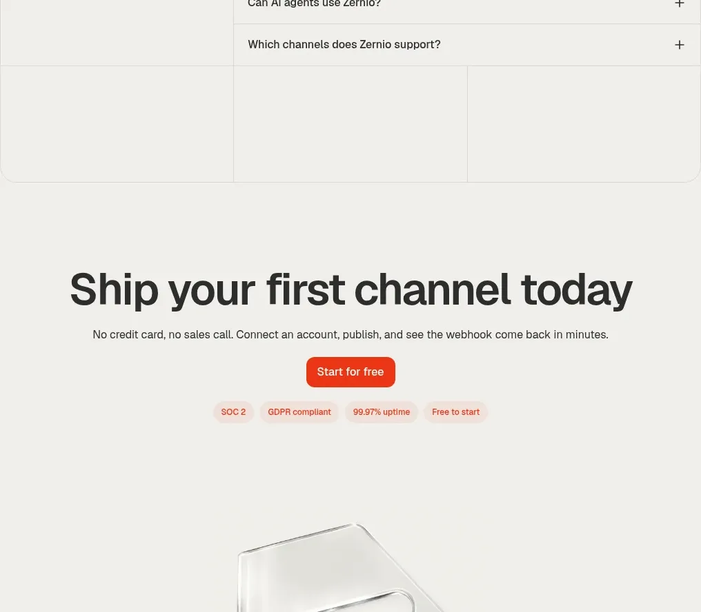 Frequently asked questions
Zernio · FAQ
Frequently asked questions
Zernio · FAQ