 kage
kage
zernio.link
Design analysis
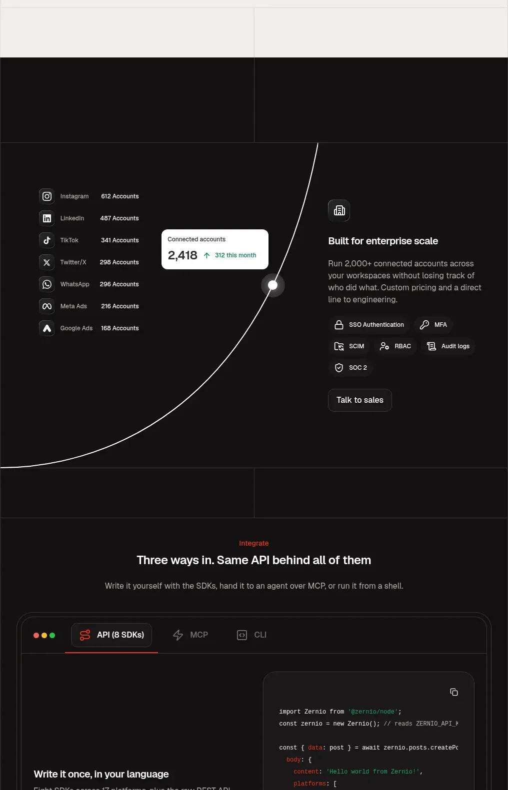
A dark, high-contrast band shifts the visual language and pairs a connected-account data visualization with an enterprise capability summary.
Prompt preview
## Reference images

Study these alongside the description below: hierarchy, rhythm, spacing, colour. Build for the product you are asked about, using this design language.

- Component: https://kage-design-assets.t3.tigrisfiles.io/components/zernio/c501b537-d018-43e7-982b-563c0d4d1135-1791612293-8.webp
- Full page it was cut from: https://kage-design-assets.t3.tigrisfiles.io/screenshots/zernio/c501b537-d018-43e7-982b-563c0d4d1135-1791612175252-full.webp
- Component on Kage: https://kage.design/component/zernio-feature-grid-3

## Before you start
Ask what the user's product, audience, and brand are, then apply the following principles to that product rather than copying the reference.

Create a dark enterprise section that provides a deliberate contrast to the preceding light sections. Use a near-black background around #111111 with very thin dark-gray grid lines. On the left, show a compact list of connected channels/accounts and a floating metric card; add a sweeping thin curve or connection path as a subtle systems graphic. On the right, place a small icon, an enterprise-scale heading, concise supporting copy, a row of security/compliance capability chips, and a dark secondary sales button. Keep text white or warm gray, reserve orange-red for tiny highlights, and give the overall panel generous vertical padding. Ensure the visualization remains accessible through labels rather than relying on color alone.

Never: use logos, product names, copy, illustrations, or imagery from the reference.
More components

 Studios and output grid
Hypervibe · Feature grid
Studios and output grid
Hypervibe · Feature grid
 Continuity and memory grid
Hypervibe · Feature grid
Continuity and memory grid
Hypervibe · Feature grid
 Core workspace feature section
Hypervibe · Feature grid
Core workspace feature section
Hypervibe · Feature grid
 Voice collaboration section
Hypervibe · Feature grid
Voice collaboration section
Hypervibe · Feature grid
 Agent orchestration section
Hypervibe · Feature grid
Agent orchestration section
Hypervibe · Feature grid

 How it works: connected research tools
Lune · Feature grid
How it works: connected research tools
Lune · Feature grid