kage
kage
axari.ai
Design analysis
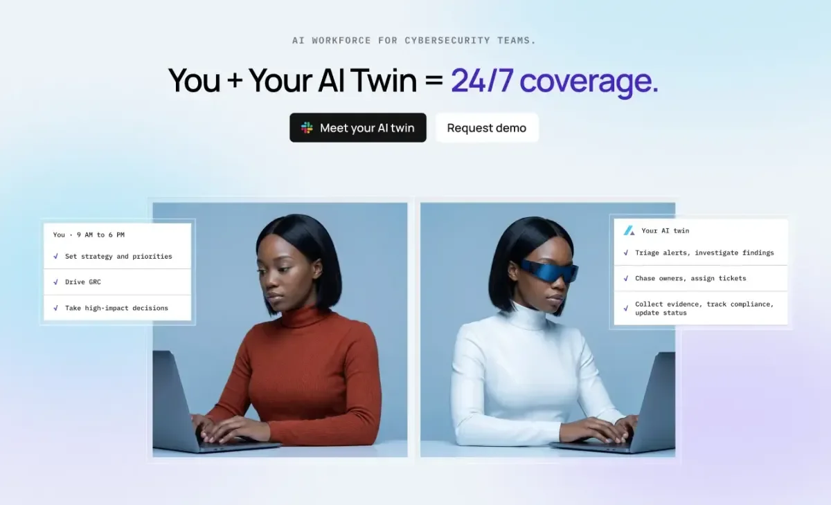
A 1200×630 social card built as a compressed hero: a centred monospace eyebrow, a two-tone headline that switches to indigo for the payoff phrase, and a pair of pill CTAs — all stacked in the top third. The bottom two thirds split into mirrored studio portraits of the same woman (rust sweater vs. white sweater and blue visor), each overlaid with a small white monospace checklist card labelling "You" versus "Your AI twin". The pale blue-to-lavender gradient and floating bordered cards give the photographic halves the feel of a product UI, so the human/AI contrast reads instantly even at thumbnail size.
Prompt preview
## Reference images

Study these alongside the description below: hierarchy, rhythm, spacing, colour. Build for the product you are asked about, using this design language.

- Screenshot: https://kage-design-assets.t3.tigrisfiles.io/screenshots/axari/64b25718-e6c1-4c53-a31f-192e1192325f-1789538611599.webp
- Design on Kage: https://kage.design/designs/axari-og-image

# 1200×630 social card — mirrored "human vs AI twin" composition

## Before you start
Ask the user what they are building, who it is for, and what brand assets they already have (product name, tagline, brand colours, fonts, logo file). Wait for the answers. Everything below is applied to their brand, not to the reference. If they have no brand assets, invent a neutral placeholder name and a single accent colour and note the placeholders clearly.

## Deliverable
Produce one social share card at exactly **1200×630 px** (1.91:1). Build it as a self-contained HTML file with a 1200×630 stage and render it to PNG (e.g. Playwright/Puppeteer screenshot, or an equivalent the agent has available); alternatively produce a standalone SVG. No external image requests except fonts the user provides; if no portrait photography is available, use simple flat illustration silhouettes or neutral photo placeholders so the composition still reads.

## Page structure
1. **Top third — headline block, centred.** A letter-spaced monospace uppercase eyebrow line in muted grey (~13–14px equivalent, tracking ~0.15em) naming the category. Below it, one large headline line (~64–72px, tight tracking, medium weight): plain near-black text for the setup clause, then the payoff phrase in the accent colour. Keep the whole line on a single row — this is a card, not a page.
2. **CTA row, centred under the headline.** Two pill buttons side by side: a dark (near-black) primary pill with a small icon + short label, and a white secondary pill with a hairline border and short label. They are decorative on a card; render them at realistic button proportions (~44px tall).
3. **Bottom two thirds — split portrait band.** Two equal portrait panels side by side with a small gutter (~12px), centred as a pair with comfortable side margins. Same subject/person in both (or mirrored placeholders): left panel = the human (warm accent clothing), right panel = the AI counterpart (cool/white clothing, one clearly synthetic cue such as a visor or glow). Panel backgrounds are soft photographic blue-grey, blending into the card gradient.
4. **Floating checklist cards.** Overlapping the outer edge of each portrait panel: a small white card (~280–320px wide, subtle border, faint shadow, ~8px radius). Left card header: "You · 9 AM to 6 PM" style label in monospace; right card header: the AI twin label with a tiny accent mark. Each card holds 3 checklist rows — a small check glyph and a short monospace task line, separated by hairline dividers. Tasks should mirror each other: human = strategy/decisions, AI = repetitive busywork.

## Design language
- **Canvas & background:** one continuous pastel gradient across the whole card — pale ice blue top-left through white centre to soft lavender/pink bottom-right (approx. `#dfeaf5` → `#f7f4f8` → `#e9d9ee`). Very low saturation; all contrast comes from type, the dark CTA and the portraits.
- **Hierarchy:** eyebrow (smallest, grey, mono) → headline (dominant, ~5× eyebrow size, two-tone black/accent) → CTA row → photographic proof band. Vertical rhythm: generous top padding (~48px), tight gaps between eyebrow/headline/CTAs (~16–20px), then a clear break before the portraits.
- **Type pairing:** a geometric grotesque (e.g. Inter/Manrope class) for headline and buttons, paired with a true monospace for the eyebrow, card labels and task lines. Monospace type is what makes the checklist cards read as "system output" — keep it. Headline weight ~500–600, sentence case, tight leading (~1.05).
- **Accent colour:** one saturated accent (reference uses indigo ~`#4f46e5` on the payoff phrase) plus a warm secondary (rust orange ~`#b0402a`) reserved for the human portrait's clothing so "human" and "AI" are colour-coded without labels.
- **Cards & surfaces:** white `#ffffff` cards, 1px light grey border (~`#e4e4e7`), very soft shadow (`0 6px 20px rgba(0,0,0,.06)`), small radius (6–10px). Check marks in near-black; task text ~12px mono, dark grey.
- **Static by nature:** no motion, no hover states — this is a fixed image. Ensure nothing important sits within ~40px of any edge (safe zone for link previews).

## Never
- Do not use the Axari name, wordmark, logo, headline copy, checklist wording, Slack mark, or the reference photography. Use the user's own brand and copy, or clearly generic placeholders (e.g. "Your Product", "Task one"). Do not recreate the same woman/portraits — use the user's assets or abstract placeholders. Do not present the output as Axari's card.