kage
papermark.com
Design analysis
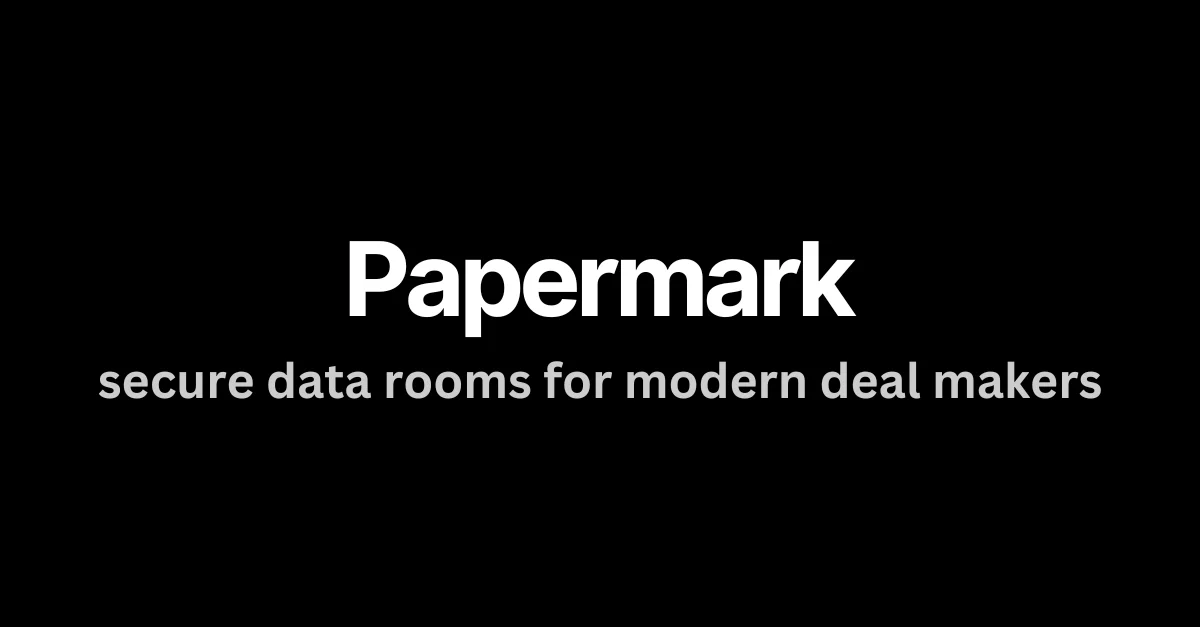
A typographic-only social card: on a flat near-black 1200×630 canvas, a single centred stack pairs a heavy white grotesque wordmark with a lowercase mid-gray tagline, sitting slightly above true centre. Hierarchy is carried entirely by scale (roughly 3:1) and value contrast — no imagery, borders or gradients appear anywhere. The all-lowercase secondary line and very large empty margins give the card a quiet, editorial confidence that survives thumbnail-size rendering.
Prompt preview
## Reference images

Study these alongside the description below: hierarchy, rhythm, spacing, colour. Build for the product you are asked about, using this design language.

- Screenshot: https://kage-design-assets.t3.tigrisfiles.io/screenshots/papermark-data-rooms/be62d723-3967-45d7-8fc2-a9225fc08b68-1792994480468.webp
- Design on Kage: https://kage.design/designs/papermark-data-rooms-og-image

## Before you start
Ask the user what product they are building, who it is for, and which brand assets they already have (name, exact brand colours, typeface, whether a logo exists). Wait for the answers before producing anything. Everything below is applied to their product and brand, not to the reference.

## Page structure
Produce a single 1200×630 social card image (HTML/CSS rendered to PNG, or a standalone SVG) with exactly three layers:

1. **Canvas**: full-bleed flat near-black background (#0a0a0a). No texture, no vignette, no gradient, no border.
2. **Text stack**, centred horizontally and optically just above true vertical centre (block spanning roughly 40–64% of canvas height):
   - Line 1 — product wordmark: bold neo-grotesque sans, white (#ffffff), ~110–130px, tracking about -1 to -2%.
   - Line 2 — tagline: same typeface at regular/medium weight, set entirely in lowercase, cool mid-gray (#a1a1a1), ~44–52px, sitting 24–40px below the wordmark, kept to one line of 4–8 words.
3. **Nothing else**: no logo mark, no product screenshot, no badge, no URL, no footer, no decorative element. Left and right safe margins of at least 15% keep the type breathing.

## Design language
- One focal point per card: the wordmark is the only visual event; every other decision supports it rather than competes with it.
- Build hierarchy with scale and value, not colour or ornament: the headline is roughly 3× the tagline's size, and the tagline is one clear step down in lightness — readable but clearly secondary.
- Use a single type family across both lines; do not pair a second face. Hierarchy comes from weight and size alone.
- Set the secondary line in lowercase and phrase it as a quiet statement rather than a slogan; this softens the heavy wordmark and gives the card an editorial tone.
- Strictly three colour values on the card: near-black ground (#0a0a0a), white foreground, mid-gray secondary. No accent colour, no outlines, no glow.
- Radius, borders, shadows and imagery are all absent — the restraint and negative space (well over half the canvas empty) are the design.
- If the user's brand is light-mode, keep the identical structure inverted: white ground, near-black wordmark, gray tagline, same scale and spacing.
- Export at exactly 1200×630 and check legibility at thumbnail size: the wordmark must still be readable at ~200px wide.

## Never
- Do not use the Papermark name, its wordmark, or its copy "secure data rooms for modern deal makers" or any close variant; write a tagline for the user's own product in their voice.
- Do not add stock imagery, screenshots, logos, gradients or decoration the reference does not have.
- Never present the result as Papermark or imply any affiliation.