kage
kage
cdn.sanity.io
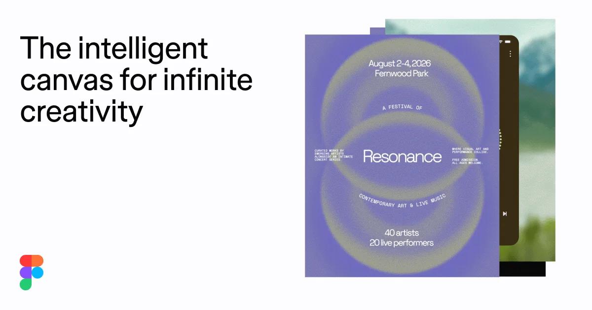
Design analysis
A 1200×630 social card split into two halves: a text column on a warm off-white field and a collaged stack of canvas artifacts on the right. The three-line headline is set near-black in a regular-weight grotesque with tight leading, sized large enough to read at thumbnail scale, while the brand mark sits small in the bottom-left corner as a quiet anchor. Density flips across the divide — airy negative space under the headline versus a tightly layered stack of a purple festival poster, a dark phone UI and a landscape photo that bleeds off the top edge, with overlap and colour contrast doing the work that borders and shadows normally would.
Prompt preview
## Reference images

Study these alongside the description below: hierarchy, rhythm, spacing, colour. Build for the product you are asked about, using this design language.

- Screenshot: https://kage-design-assets.t3.tigrisfiles.io/screenshots/figma-agent/15bc1a8e-31da-46e8-bae8-83f0f537d757-1791439334233.webp
- Design on Kage: https://kage.design/designs/figma-agent-og-image

## Before you start
Ask the user what they are building, who it is for, and what brand assets they already have (name, logo, colours, typeface). Wait for the answers before designing. Everything below is applied to *their* product — the reference composition is a layout lesson, not a brand to copy.

## Page structure
Produce a single static social card image at exactly **1200×630 px** (build it as HTML/CSS rendered to PNG, or as SVG). Layout from edge to edge:

1. **Background field** — one flat warm off-white surface covering the full canvas. No gradients, no texture, no border.
2. **Headline block (left half)** — a short 2–3 line product tagline, sentence case, left-aligned, starting ~48 px from the left edge and ~64 px from the top. It is the dominant element and occupies roughly the left 45% of the card, with the bottom-left quadrant left intentionally empty.
3. **Brand mark (bottom-left corner)** — the user's logo or wordmark, small (~40 px tall), placed at the same left margin near the bottom edge (~48 px from the bottom). It anchors the empty corner without competing with the headline.
4. **Artifact stack (right half)** — a collage of 3 overlapping rectangular panels occupying the right ~50% and nearly the full height, with the backmost panel bleeding off the top edge:
   - Back layer: a photographic or image-filled panel (use a placeholder image or abstract gradient) in a cool green/blue tone.
   - Middle layer: a dark rounded-corner UI mock (a phone or app fragment) peeking out on the right side.
   - Front layer: a tall flat poster/artwork panel in one saturated accent colour, sharp corners, roughly 380×520 px, vertically centred — the brightest, highest-contrast object on the card. Fill it with placeholder artwork (e.g. concentric blurred rings) plus 3–4 tiny typographic labels and one centred title so it reads as a real designed artifact.
   - Panels overlap by generous amounts (30–80 px); no drop shadows — layering is communicated by overlap and colour contrast alone.

## Design language
- **Split composition**: text owns the left half, imagery owns the right half; they barely touch. One message, one visual, no competing zones.
- **Hierarchy by scale**: the tagline is the largest element (~68–76 px), the artifact title is mid-scale (~40 px), micro-labels are tiny (~10–11 px uppercase). Only one large thing on the card.
- **Type**: a single grotesque sans throughout (e.g. Inter or the user's brand sans). Headline in regular or medium weight — not bold — with tight line-height (~1.05) and near-zero letter-spacing. Artifact labels in uppercase mono or condensed caps at very small sizes for texture.
- **Colour**: warm off-white field (#F4F3F0), near-black text (#1E1E1E), one saturated accent for the front artifact (a mid violet like #8478D8 works; substitute the user's brand accent), plus one cool secondary tone in the back layer (#6E8F6E greens / #7BA3B8 blues). No more than four hues on the card.
- **Depth without shadows**: express layering through overlap order and tonal contrast; keep corners sharp on flat panels, rounded (~24 px radius) only on device/app mocks.
- **Whitespace as structure**: reserve the entire bottom-left quadrant as empty field — it balances the dense right half and makes the card breathe at thumbnail size.
- **Static card**: no motion, no hover states; everything must survive being scaled down to ~600 px wide in a feed.

## Never
- Do not use Figma's logo, wordmark, product name, tagline copy, or the specific Resonance poster artwork/text from the reference.
- Do not imitate Figma's brand colours or reproduce their illustrations or photography.
- Never present the result as Figma or suggest endorsement; the card carries the user's own placeholder branding and copy.