kage
kage
Design analysis
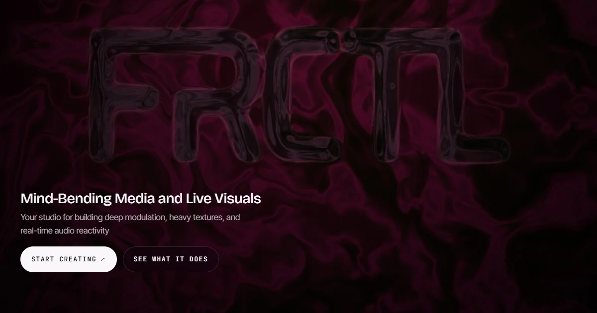
A 1200×630 social card built on a single full-bleed molten-crimson fluid texture that acts as both background and hero. The oversized FRCTL wordmark is rendered as glossy, tubular 3D letterforms in near-tonal dark reds, so it reads as sculpted texture rather than a logo lockup — it fills the top ~60% and dissolves into the maroon swirl behind it. All legible content is anchored bottom-left in one column: a ~40px white sans headline, a muted two-line subhead, then two pill CTAs whose monospace uppercase labels and hard white/dark contrast snap against the soft organic artwork. The tonal artwork stays quiet and dark so the small white type carries all the contrast, giving the card one clear focal hierarchy from texture → wordmark → headline → actions.
Prompt preview
## Reference images

Study these alongside the description below: hierarchy, rhythm, spacing, colour. Build for the product you are asked about, using this design language.

- Screenshot: https://kage-design-assets.t3.tigrisfiles.io/screenshots/frctl/efc5e4da-8aee-4318-90b9-30bc64b85ea1-1790488955439.webp
- Design on Kage: https://kage.design/designs/frctl-og-image

# Build a 1200×630 social card (Open Graph image)

## Before you start
Ask the user what product or project the card is for, who it is for, and what brand assets they already have (name, tagline, colours, type). Wait for the answers. Everything below is applied to *their* brand with placeholder copy — never reproduce the reference brand.

## Deliverable
Produce a single **1200×630 px** image — e.g. an HTML/CSS file sized 1200×630 (then screenshot it to PNG with a headless browser) or a standalone SVG. No interactivity needed; design it as one static frame.

## Page structure
Top to bottom, one canvas:

1. **Full-bleed background (100% of canvas):** one dark, organic, generative-looking texture — layered radial/conic gradients with turbulence or an SVG filter can fake a molten/fluid look. It must cover edge to edge with no visible seam or vignette break.
2. **Hero wordmark zone (top ~8% to ~60% of height):** the brand name set enormous (spanning ~85% of the width) as a tone-on-tone 3D treatment — dark, glossy, low-contrast against the background so it reads as sculpted texture, not a logo stamp. Achieve the embossed/wet look with layered text-shadows, subtle inner highlights, and a slight blur or gradient fill close in hue to the background.
3. **Text block (bottom-left, starting ~62% of height):** a narrow left-aligned column (~55% width) with the headline in solid white at ~40px, then a two-line supporting sentence at ~20px in ~60%-opacity white.
4. **CTA row (~80% of height):** two pill buttons side by side — one solid light pill with dark text, one translucent dark pill with a hairline border and light text. Both use monospace, uppercase, letter-spaced labels; the primary may carry a small ↗ glyph.

Keep a consistent inset of ~64px on the left and bottom; nothing critical within the outer 5% of any edge, since social platforms crop unpredictably.

## Design language
- **One artwork carries the card.** The background texture is the hero; don't add cards, grids, borders or extra illustration. Everything else sits on top of it.
- **Tone-on-tone focal element.** The big wordmark differs from the background by material (gloss, depth, highlights), not by hue or contrast — keep its fill within ~15% lightness of the backdrop so it feels embedded in the texture.
- **Contrast budget.** Let the artwork stay dark and quiet; spend all high contrast on the small text. Headline pure white (#FFFFFF), subhead white at 55–65% opacity, buttons the only hard light/dark flips.
- **Palette:** near-black maroon shadows (#0A0004), deep crimson/maroon mids (#3A0A18–#5C0F24), magenta-crimson highlights (#8B1A3F), white (#FFFFFF) for text. Swap hues to the user's brand but keep the dark, tonal, single-hue-family approach.
- **Type pairing:** a neutral geometric sans (Inter/Helvetica-like) for headline and subhead in regular-to-medium weight, tight leading (~1.15); a monospace face for button labels, uppercase, ~0.15em letter-spacing, small size (~14px). Scale gap is large: ~40px headline vs ~20px subhead vs ~14px labels.
- **Shape language:** fully-rounded pills for buttons (radius = height/2), everything else soft-edged and organic — no visible rectangles, dividers or cards.
- **Left-aligned single column.** All readable content shares one left edge; vertical rhythm is tight (8–12px between subhead lines, ~24px headline→subhead, ~32px subhead→buttons).
- **Legibility safeguard:** if the user's texture is busy, add a subtle bottom-anchored darkening scrim (linear gradient to ~35% black) behind the text zone rather than outlines or shadows on the text itself.

## Never
- No use of the reference brand name, its letterforms, its tagline copy or its exact artwork — substitute the user's name and real copy.
- No logos, stock illustrations, photos or icon sets from the reference.
- Never present the card as belonging to the reference product; it is a new card in the same compositional language.