kage
inflight.co
Design analysis
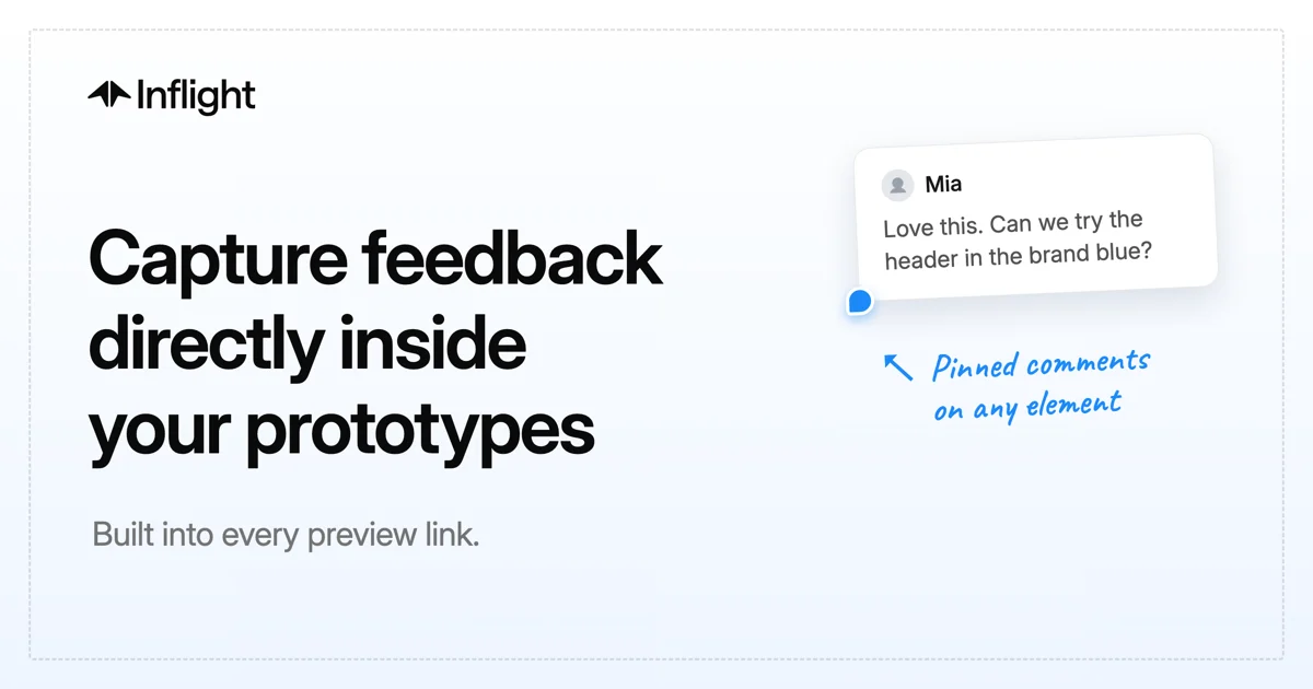
A 1200×630 share card built as a split composition: an oversized three-line headline in near-black anchors the left half while a floating white comment bubble with a blue pin and a handwritten blue annotation dramatises the product on the right. An inset dashed grey border frames the whole canvas like a specification sheet, and the off-white background keeps everything quiet except the blue accent. The only "imagery" is a real fragment of the product UI — a reviewer's comment card — which communicates the feature more efficiently than a screenshot would.
Prompt preview
## Reference images

Study these alongside the description below: hierarchy, rhythm, spacing, colour. Build for the product you are asked about, using this design language.

- Screenshot: https://kage-design-assets.t3.tigrisfiles.io/screenshots/inflight/d342f365-6f44-414a-982b-fb47c9579a5f-1792562710376.webp
- Design on Kage: https://kage.design/designs/inflight-og-image

# 1200×630 Open Graph social card

Produce a single social share card (e.g. an HTML/CSS document sized exactly 1200×630 that you render to `og-image.png`, or an equivalent standalone SVG) inspired by the composition described below. All branding, copy and artefacts must be placeholders invented for the user's product.

## Before you start
Ask the user:
1. What product is the card for, and what single sentence should the headline say?
2. Who is it for (audience/industry)?
3. What brand assets exist: product name, logo mark, primary accent colour, and preferred typeface?

Wait for the answers, then apply everything below to *their* product. If they have no brand assets, pick a neutral near-black/off-white base and one saturated accent derived from their product's domain.

## Page structure
Work on a fixed 1200×630 canvas. Keep all meaningful content inside a safe area of roughly 60px padding so no platform crop clips it.

1. **Frame** — Inset ~26px from every edge, a 1.5px dashed border in a pale cool grey (≈ #CBD6E2) frames the entire card, sitting on an off-white/pale blue-grey background (≈ #F6F9FC with a barely-there vertical gradient darkening a few percent toward the bottom).
2. **Brand row (top-left)** — At ~64px from the left, ~56px from the top: a small geometric logo mark followed by the product wordmark in bold, near-black text (~26px). This is the smallest full-colour element and reads as a signature, not a banner.
3. **Headline block (left half)** — Starting just below the vertical midpoint's upper edge, a three-line display headline in near-black (≈ #0B0E13), ~90px, weight 700–800, line-height ≈ 1.04, tracking ≈ −2%. Left-aligned, ragged-right, occupying ~55% of the width.
4. **Support line** — ~40px below the headline: one short grey sentence (≈ #6D7683), ~30px regular weight, stating the mechanism or benefit in plain words.
5. **Product artefact cluster (right half)** — The visual proof, built from actual UI fragments rather than a screenshot:
   - A white rounded card (radius ≈ 16px, padding ≈ 24–28px) with a layered soft shadow (`0 18px 40px rgba(15,23,42,0.12)` plus a tighter contact shadow), very slightly rotated (~−2°) so it feels placed, not pasted. Inside: a small circular avatar with a neutral person glyph, a bold name at ~22px, and a 2–3 line realistic comment at ~20px in muted dark grey.
   - Anchored at the card's lower-left corner: a small solid accent-blue pin dot (≈ #2E7FF3) with a tiny tail — the product's key gesture.
   - Below-right of the pin: a hand-drawn curved arrow in the same blue pointing back up at the pin, plus a two-line handwritten script label (~28px, italic-feeling marker style, also blue) explaining the artefact in the author's voice.

## Design language
- **Asymmetric split:** left half is typography, right half is a single illustrative artefact. Do not centre anything; the diagonal tension between headline and artefact is the composition.
- **One dominant accent:** everything is greyscale on off-white except one saturated blue (≈ #2E7FF3) reserved for the interactive gesture (pin, arrow, annotation). If the user's brand accent differs, use theirs everywhere blue appears here — and nowhere else.
- **Type pairing = two voices:** a crisp geometric/neo-grotesque sans (Inter/SF-class) carries the brand row, headline and UI text; a single handwritten script voice appears only for annotation, as if a reviewer marked up the card. Never mix more than these two voices.
- **Scale drama:** headline ≈ 90px vs. subline ≈ 30px vs. card body ≈ 20px — roughly a 9:3:2 step. Tight negative tracking on the big headline only; normal tracking everywhere smaller.
- **Paper-flat surfaces:** background and frame are flat; depth exists only on the artefact card via one soft, large-radius shadow. No gradients on text, no borders on the card beyond its shadow.
- **Spec-sheet framing:** the dashed inner border quietly signals "document/prototype under review" — keep it thin, pale, and non-competing.
- **Artefact realism:** the mock comment must read like a genuine product sentence (specific, short, actionable), because the copy itself sells the feature.

## Never
- No use of the reference product's name, logo, tagline, comment text or illustration style; invent placeholders for the user's product.
- No stock screenshots, photos, emoji clutter, badges, URLs or QR codes on the canvas.
- No more than one accent colour, no decorative gradients, no drop shadows on text.
- Don't crowd the frame: if content wants more room, cut copy, never shrink the headline below ~80px or break the safe-area padding.