kage
Design analysis
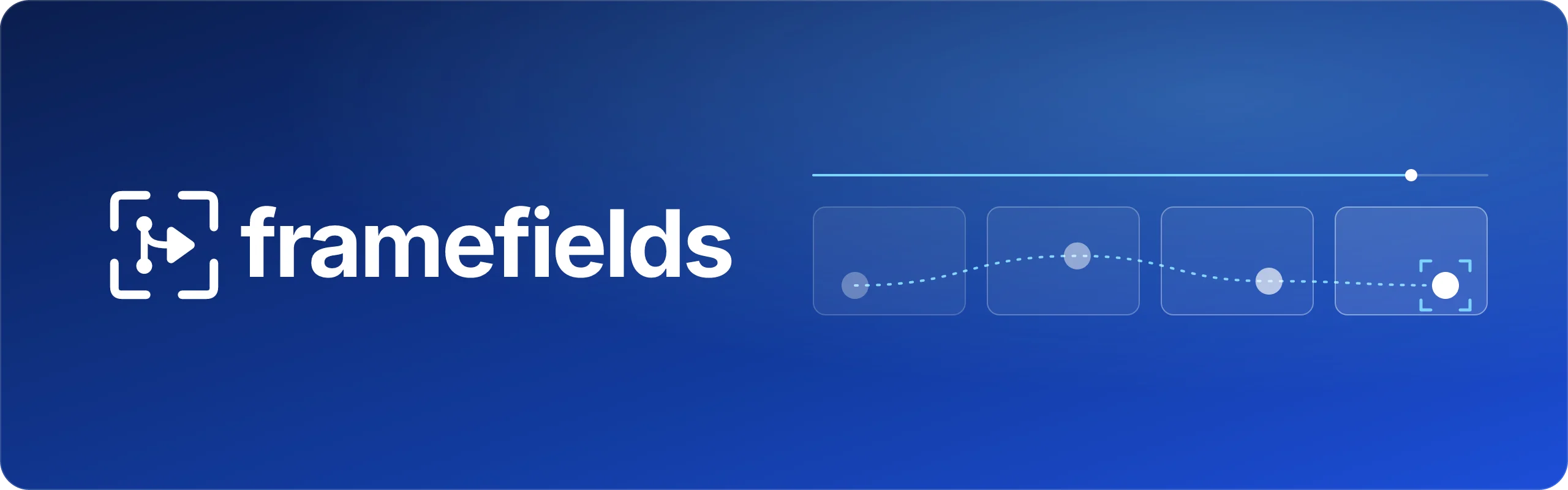
A 1200×630 social card built as a strict two-mass composition: the left third holds a white viewfinder-bracket logomark plus a heavy lowercase geometric-sans wordmark, while the right half is a single diagram that tells the whole product story — a thin timeline rail with a playhead at ~90%, four translucent glass frames beneath it, and a dotted light-blue keyframe curve weaving through them to end on a white dot inside selection brackets. The blue gradient field runs from near-black navy in the top-left to royal blue at the right, so the white type sits on the darkest zone and the airy line-work floats on the brightest. No tagline or secondary text exists; colour stays to three roles (blue field, white marks, one glass-blue hairline family), which keeps the card legible even at avatar scale.
Prompt preview
## Reference images

Study these alongside the description below: hierarchy, rhythm, spacing, colour. Build for the product you are asked about, using this design language.

- Screenshot: https://kage-design-assets.t3.tigrisfiles.io/screenshots/framefields/76b3f071-953e-4551-8d26-9f9c35dc4e51-1792476109380.webp
- Design on Kage: https://kage.design/designs/framefields-og-image

## Before you start
Ask the user:
- What product or project is this social card for, and what does it do in one sentence?
- Where will it be shared (X, Slack, LinkedIn, iMessage, docs unfurls) and what should a viewer take away in one glance?
- What brand assets exist: exact name/wordmark styling, a logo mark, brand colours as hex values, and a typeface?
Wait for the answers. Everything below is applied to *their* product and brand — the reference only supplies the composition and visual language.

## Output
Produce exactly one social card at **1200×630 px**, export-ready as PNG (ideally rendered at 2× for crispness). Recommended approach: a single self-contained `index.html` whose root is a 1200×630 div (inline SVG for the diagram), screenshotted to PNG — or a standalone SVG of the same dimensions. Use placeholder branding and copy throughout.

## Canvas composition
Work through the card in this order:

1. **Background field** — full-bleed diagonal gradient: near-black navy `#0a142f` in the top-left corner, warming to saturated royal blue `#1d4fd8`–`#2a63e8` toward centre-right and the bottom edge. If the export supports alpha, round the card corners (~28px radius) with transparent outside; otherwise keep square.
2. **Left identity block (~40% width, vertically centred, ~90px left margin)** — a white line-art logomark (~110px) followed by a ~28px lockup gap and the wordmark: lowercase, bold geometric sans, ~92–100px cap height, white, letter-spacing about -0.02em. No tagline, no URL, no subtitle.
3. **Right diagram (~50% width, vertically centred, ~90px right margin)** — one motif built from three layers:
   - **Timeline rail**: a 2px hairline in translucent blue (white-blue at ~45% opacity) spanning the diagram width, with a ~10px solid white-blue dot (the playhead) at ~90% along it.
   - **Frame row**: four equal rounded rectangles (~150×90px, 12px radius, ~28px gaps) directly under the rail. Glass treatment: fill `rgba(255,255,255,0.07)`, 1px border `rgba(150,180,255,0.45)`.
   - **Motion path**: a dotted 2px curve (~4px dots, ~8px gaps, `#a9c6ff`) weaving in a gentle sine through all four frames, with a small ~8px node dot marking each keyframe; the curve terminates inside the last frame on a ~16px solid white dot wrapped in four white corner brackets — a selection/focus reticle. This is the visual punchline, so give it the only solid-white fill on the right half.
4. **Balance rule** — the type mass on the left and the airy diagram on the right share the same vertical centreline. Everything else stays empty gradient: no other text, buttons, borders or decoration anywhere on the card.

## Design language
- **One idea per card**: the entire right half is a single diagram that metaphorises the product (here: timeline + keyframe curve = programmatic video). For the user's product, invent an equivalent single motif — but only one.
- **Two-mass hierarchy**: heavy white type on the left, light diagrammatic line-work on the right; no headline/body copy at all. Weight contrast does the focal work instead of text.
- **Colour discipline**: exactly three roles — a saturated blue gradient field (`#0a142f` → `#1d4fd8`), pure white for identity and the focal dot, and one translucent blue-glass family (`#a9c6ff` at 30–60% opacity) for hairlines, frames and the dotted path. Substitute the user's brand hue for the blue, keep the three-role structure.
- **Line-weight system**: 1px frame borders, 2px rail and dotted path, 8–16px solid dots; marks, brackets and icon strokes are uniform ~2.5px white with rounded caps.
- **Glass, not frost**: translucency plus a 1px light border plus 12px radius — no backdrop blur, no drop shadows, no glow.
- **Spacing**: ≥90px outer margins on all sides; equal gaps between the frames; the diagram's optical centre aligns exactly with the wordmark's baseline centre.
- **Type**: one family, one weight, one size. Lowercase wordmark, tight tracking, no shadows or outlines.
- **Legible at avatar scale**: assume the card is first seen ~200px wide. Every element must survive that: high white-on-blue contrast, no type below display scale, no detail thinner than 2px.

## Never
- Do not use the name "framefields", its viewfinder logomark, or its exact node-and-play glyph.
- Do not reproduce the timeline-frames-curve diagram verbatim; redraw an equivalent single-motif diagram built from the user's own product metaphor.
- No stock photography, illustrations, emoji, badges (e.g. "open source", star counts), or fake URLs and social handles.
- Never present the result as the reference product; all branding and copy are the user's own placeholders.