kage
kage
usenarrative.ai
Design analysis
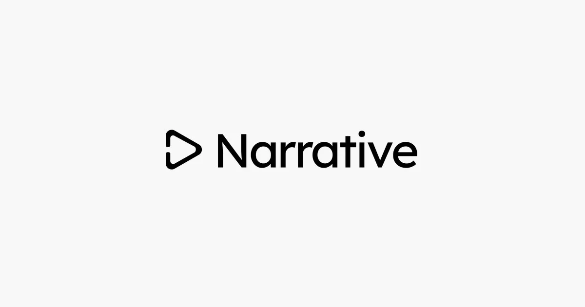
A brand-plate OG card that spends its entire 1200×630 budget on one gesture: a single black lockup centred in a warm off-white field, with roughly three-quarters of the canvas left as pure negative space. The lockup pairs an outlined, rounded-corner play triangle (with a small notch opening on its left edge) against a bold geometric sans wordmark at matched optical weight, so glyph and type read as one object rather than logo-plus-caption. There is no headline, URL, product shot or gradient — recognition is delegated entirely to silhouette and contrast, which keeps the card legible even at Slack- and iMessage thumbnail sizes.
Prompt preview
## Reference images

Study these alongside the description below: hierarchy, rhythm, spacing, colour. Build for the product you are asked about, using this design language.

- Screenshot: https://kage-design-assets.t3.tigrisfiles.io/screenshots/narrative/f968f8b5-fead-440a-ae40-e35260be0485-1789538530326.webp
- Design on Kage: https://kage.design/designs/narrative-og-image

# 1200×630 social card — wordmark-only "brand plate"

## Before you start
Ask the user (and wait for the answers before writing code):
1. What product is this card for, and what does it do in one sentence?
2. Who is the audience and where will the card be shared (X, Slack, LinkedIn, iMessage)?
3. What brand assets exist: exact name/wordmark spelling, primary foreground and background colours (hex), and typeface — or should you pick a close placeholder?
4. Do they want a wordmark-only card like this composition, or a wordmark plus a one-line tagline?

Everything below is applied to *their* product with placeholder branding — never the reference product.

## Page structure
Produce one static image at exactly 1200×630 — as a standalone SVG or as HTML/CSS sized to 1200×630 and rendered to PNG (e.g. with Puppeteer/Playwright screenshot at deviceScaleFactor 1–2).

1. **Full-bleed background field** — one flat colour covering the whole canvas, no gradient, texture or border.
2. **Centred lockup** (the only content) — a horizontal row, optically centred (aim for centre, nudged ≤1% above true centre): a single brand glyph on the left, then the wordmark text to its right. Gap between glyph and wordmark ≈ 0.35× the glyph's height. The whole lockup spans roughly 35–40% of the canvas width.
3. **Nothing else.** No headline, no URL, no CTA, no footer strip. The empty field is part of the design.

## Design language
- **Hierarchy by scarcity**: exactly one focal element. Give it the whole canvas; resist adding a second message. If the user insists on a tagline, set it as one short line under the lockup at ~24–28px, muted foreground colour, and shrink nothing else — the lockup still dominates.
- **Glyph as category signal**: design a simple filled-or-outlined geometric mark that hints at the product's category (rounded play triangle for video, chat bubble for messaging, etc.). Match the glyph's stroke weight to the wordmark's stem weight so they read as one lockup. Use rounded joins/corners throughout; allow one small intentional opening or notch in the shape so it doesn't feel like stock iconography.
- **Colour discipline**: two colours total. Warm off-white background ≈ `#FAFAF8` (or the brand's lightest tint), near-black foreground ≈ `#111111` (or the brand's darkest tint). No gradients, no accent colour, no shadows.
- **Type**: a geometric rounded sans, weight 700, set large — wordmark roughly 96–120px cap height at 1200×630 — with slightly tight tracking (−1% to −2%) and normal case (capitalised first letter only). The type should be readable when the card is shrunk to a 4:1 thumbnail.
- **Space**: keep ≥80px clear margin on every side; the lockup floats in the field with generous air above and below.
- **Motion**: none — it's a static image. Output must be a self-contained file with no external font or image dependencies (system-safe fallbacks or embedded fonts only).

## Never
- Never use the reference product's name, wordmark, glyph, tagline or exact copy — invent placeholder branding for the user's product.
- Never reproduce the reference's specific play-triangle-with-notch mark; build an analogous mark from the user's category.
- Never add stock photography, illustrations, icon sets or gradients to fill the negative space — the emptiness is the design.