kage
kage
getpolyglot.io
Design analysis
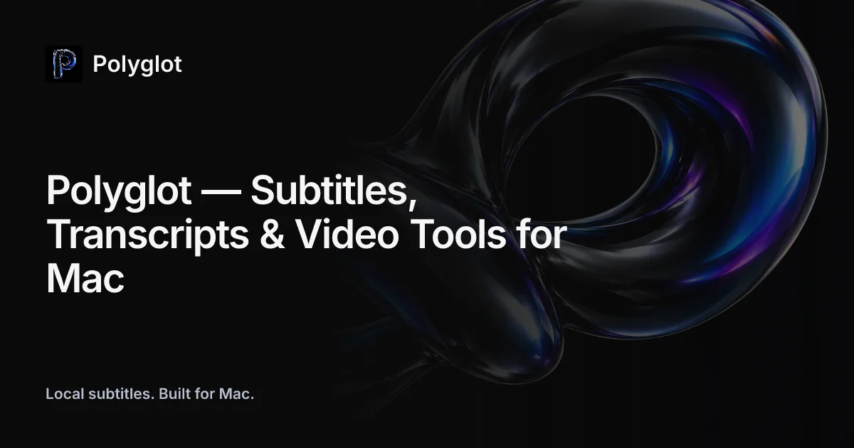
A 1200×630 dark social card split into a left text spine and a single hero render on the right. Three clear vertical stops on the left — logo lockup top-left, a three-line bold ~64px headline mid-left, and a small gray tagline bottom-left — while a glossy dark torus-knot with iridescent blue-violet rim light occupies the right half and bleeds off the top edge. Hierarchy is carried entirely by type weight and size on a near-black canvas; there is no UI chrome, only typography plus one artwork, which keeps the card legible even at thumbnail size.
Prompt preview
## Reference images

Study these alongside the description below: hierarchy, rhythm, spacing, colour. Build for the product you are asked about, using this design language.

- Screenshot: https://kage-design-assets.t3.tigrisfiles.io/screenshots/polyglot/ae7ed0e0-1ff4-45bd-99dd-1aa45b0c5539-1790402569633.webp
- Design on Kage: https://kage.design/designs/polyglot-og-image

# Build a 1200×630 Open Graph social card

Produce a single self-contained `og-card.html` (inline CSS, no external assets except optional fonts) sized exactly **1200×630**, ready to be rendered to PNG (e.g. headless browser screenshot at 1200×630). An equivalent SVG is acceptable. Use placeholder branding and copy throughout.

## Before you start
Ask the user:
1. What product or site is this card for, and who is the audience?
2. What brand assets exist — name, logo/monogram, colours, typeface, and a one-line tagline?
3. Is there existing artwork (3D render, illustration, product shot) to feature, or should you build an abstract substitute?

Wait for the answers. Everything below is applied to **their** product, not to the reference.

## Page structure
1. **Canvas** — 1200×630, near-black background (`#0a0a0c`), no border or rounding (platforms round it themselves). No buttons, no URL, no UI chrome anywhere on the card.
2. **Logo lockup, top-left** — at ~64px margins: a rounded-square app-icon tile (~56px, dark fill, gradient monogram letter) beside the wordmark in white semibold, ~28px, with a ~16px gap. One row, vertically centred.
3. **Headline block, middle-left** — starts around 40% of canvas height, left-aligned, capped at ~55% of canvas width so it never collides with the artwork. Three lines, bold, ~64px, line-height ~1.15, following the pattern `Brand — Category, Feature & Platform`. Break the lines so each is short and the block reads as a solid mass.
4. **Tagline, bottom-left** — ~64px from the bottom edge, one short sentence, ~24px, mid-gray (`#9aa0a6`). It is the quietest element and anchors the left spine.
5. **Hero artwork, right side** — a single glossy, chrome-like dark 3D form (twisted loop / knot / fluid blob) filling the right ~55% of the canvas, rotated dynamically and deliberately cropped by the top and right edges so it feels larger than the frame. Highlights are iridescent blue-violet rim light only; the body of the shape sinks into the background. Nothing overlaps the text column.

## Design language
- **Exactly three stops of hierarchy** on a left spine: lockup → headline → tagline. Spacing between them is generous and uneven (headline gets the most air); everything is hard left-aligned to one edge.
- **Colour discipline**: near-black canvas `#0a0a0c`, pure white headline `#ffffff`, gray secondary `#9aa0a6`. Iridescence lives only inside the artwork and the logo gradient — blues around `#1c7ed6`/`#4263eb`, violet `#7048e8`, pale highlights `#dbe4ff`. No other accents anywhere.
- **One typeface, weight does the work**: a single neo-grotesque sans (SF Pro / Inter class). Semibold for the wordmark, bold for the headline, regular for the tagline. Tight leading (~1.1), sentence case, no all-caps, no serif, no italic.
- **Imagery treatment**: the hero form emerges from shadow — most of its surface is near-black, with colour appearing only as edge highlights. If no 3D asset exists, fake it with layered `radial-gradient`/`conic-gradient` blobs plus `filter: blur()` and a dark vignette, clipped by the canvas edges.
- **Thumbnail test**: the composition must survive being scaled to ~200px wide — three big value masses (white text, black field, one glinting object), never fine detail.
- **Diagonal balance**: text mass sits bottom-left-leaning, artwork mass top-right-leaning; the card should feel weighted along that diagonal without any element touching the other half.

## Never
- Do not use the reference product's name, wordmark, "P" monogram, app icon, headline text, or tagline copy ("Local subtitles. Built for Mac." or similar). Invent placeholder brand and copy for the user's product.
- Do not recreate the exact torus render; build an original abstract form in the user's brand colours.
- Do not add badges, buttons, URLs, screenshots-with-UI, or extra lines of copy not in the three-stop composition.