kage
kage
openwhispr.com
Design analysis
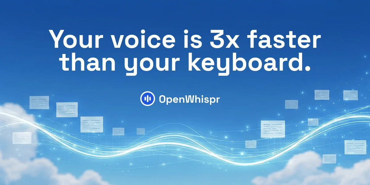
A 1200×630 link-preview card built as a vertical three-band composition: a two-line white headline fills the upper half against a saturated sky-blue gradient, the circular icon-plus-wordmark lockup sits dead center as the brand anchor, and the lower third carries the atmosphere — luminous white waveform ribbons sweeping edge to edge with translucent message cards riding the stream and soft clouds grounding the corners. Hierarchy is strictly single-focus: one headline, one lockup, no supporting copy, letting the calm blue field and glowing stream do the storytelling about voice and speed.
Prompt preview
## Reference images

Study these alongside the description below: hierarchy, rhythm, spacing, colour. Build for the product you are asked about, using this design language.

- Screenshot: https://kage-design-assets.t3.tigrisfiles.io/screenshots/openwhispr-for-ios/50897f8c-ca3a-402a-afa6-9dc3faf59e3c-1791957681535.webp
- Design on Kage: https://kage.design/designs/openwhispr-for-ios-og-image

# Social card in the style of this OpenWhispr link preview

## Before you start
Ask the user what they are building, who it is for, and what brand assets they already have (name, colours, type, any icon/mark). Wait for the answers. Everything below is applied to *their* product — the reference card only defines the composition and visual language.

## Deliverable
Produce one social/share card image at exactly **1200×630** (1.91:1). Build it as a single self-contained HTML file styled with CSS (then screenshot/export to PNG, e.g. with a headless browser at `--window-size=1200,630`), or as a hand-authored SVG. No external images, fonts fetched only from Google Fonts or embedded.

## Page structure (canvas zones, top to bottom)
- **Background field (full canvas):** a vertical sky gradient — deep saturated blue at the top easing into a lighter, hazier blue near the horizon line (~70% down). Add soft, low-contrast cloud shapes in the bottom-left and bottom-right corners so the base doesn't read as a flat gradient.
- **Headline zone (top ~10–45%):** the single message, centred, set on two balanced lines. This is the only text with weight on the card. Use a placeholder headline of similar length (one short claim with one concrete number works well).
- **Brand lockup (centred at ~50–55%):** a small circular badge (solid brand colour, white glyph inside) followed by the wordmark in white, sitting horizontally centred directly under the headline. This is the only branding on the card.
- **Imagery zone (bottom ~40%):** 2–3 luminous ribbons/streams sweeping horizontally across the full width, overlapping in a gentle S-curve, glowing white with a light halo. Scatter 6–10 small, semi-transparent rounded "content chips" (rounded rectangles with 3–4 faint text lines inside) along the stream at varied sizes and slight rotations, as if carried by the flow. Sprinkle small glowing dots/particles around the ribbons for sparkle.

## Design language
- **Single-focus hierarchy:** one headline → one lockup → atmosphere. No subtitles, no URLs, no CTA buttons. If the user wants more text, push back — the card works because it says one thing.
- **Colour:** background gradient from ~#1E6FD0 (top) through ~#2E7CD6 to ~#7EB8E8 near the horizon; all type and the stream in pure white #FFFFFF; badge in a solid deeper blue ~#2F6FE0 with white glyph; chips in white at ~85% opacity with text lines in ~#9FC4E8. Keep the entire card to blue + white so it survives tiny preview sizes.
- **Type:** one rounded geometric sans (e.g. Nunito, Baloo 2, or the user's brand font if provided). Headline bold, ~90–96px on the 1200px canvas, ~1.05 line-height, centre-aligned, normal case with a period at the end. Wordmark ~36px bold next to a ~44px circular badge. Nothing else gets type above caption size.
- **Imagery treatment:** the glowing ribbons are drawn as layered strokes — a soft wide blurred white stroke underneath and a crisp 2–3px core stroke on top, with a cyan-white halo (~#BFE6FF). Blur/glow (CSS `filter: blur()` or SVG `feGaussianBlur`) does the "light" work; there is no photography except the stylised clouds.
- **Depth:** chips overlap the ribbons (some in front, some behind) and vary in scale and opacity to fake depth; corners get the heaviest cloud coverage so the centre stays clear for text.
- **Legibility check:** the headline must contrast against the top band without any overlay — keep the top third of the gradient dark enough that white text reads at 400px wide.

## Never
- No real wordmarks, logos, icon designs, copy, headlines or illustration styles copied from the reference — use the user's own brand name and a placeholder headline if they have none.
- Never present the output as OpenWhispr or reuse its waveform-in-circle mark.
- No extra copy blocks, stock photos, or a third typeface — the language is one claim, one lockup, one atmospheric field.