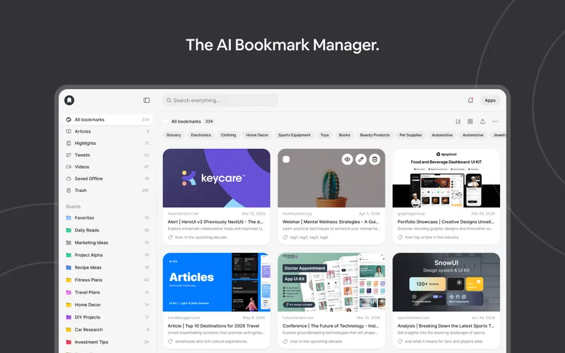
kage
kage
grimoai.com
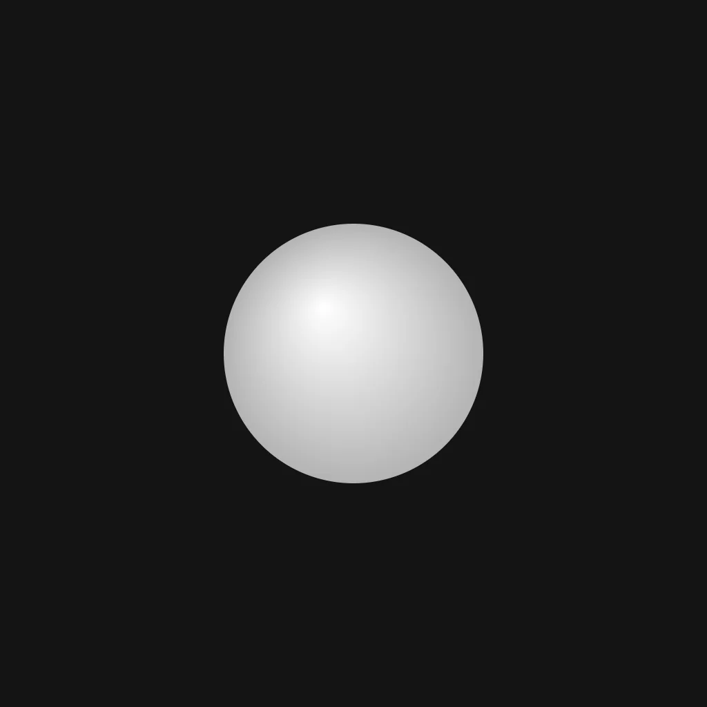
Design analysis
A near-black canvas carries a single luminous sphere set just above centre — no typography at all; the orb itself is the entire brand statement. Focal hierarchy is absolute: a radial highlight at the sphere's upper centre falls off to mid-grey at the rim, and roughly 70% of the canvas is untouched negative space. Framed at 1200×630 it reads as an app-icon-style card; the orb would remain the sole focal point with any wordmark and one-line headline kept small and subordinate beneath it.
Prompt preview
## Reference images

Study these alongside the description below: hierarchy, rhythm, spacing, colour. Build for the product you are asked about, using this design language.

- Screenshot: https://kage-design-assets.t3.tigrisfiles.io/screenshots/grimo-ai/71f45766-3228-4548-9fdd-37ac6b7c6a65-1789538658166.webp
- Design on Kage: https://kage.design/designs/grimo-og-image

# Build a minimal dark orb social card (1200×630)

## Before you start
Ask the user what they are building, who it is for, and what brand assets they already have (product name, brand colours, typeface). Wait for the answers before designing. Everything below is applied to **their** product as placeholder branding and copy — never to the reference product.

## Output
Produce one static social card image, exactly **1200×630 px**. Either an HTML/CSS file with a `1200×630` stage that can be screenshotted to PNG, or a standalone SVG with `viewBox="0 0 1200 630"`. No animation needed; it must read correctly when scaled down to a small link-preview thumbnail.

## Canvas structure
1. **Full-bleed background** — one flat, near-black field with no texture, vignette or border.
2. **Focal object, slightly above centre** — a single soft-shaded orb, ~380–420 px diameter, centred horizontally with its centre around y ≈ 260 (slightly above the vertical midpoint so text has room below).
3. **Wordmark** — the product name in one short line, centred, sitting ~60–80 px below the orb, small and quiet relative to the orb.
4. **Headline** — one line of supporting copy beneath the wordmark in a lighter, smaller weight; at most ~70 characters.
5. **Safe-zone check** — keep the orb and all text inside a ~60 px margin so nothing is cropped in rounded-corner or cropped-height previews.

## Design language
- **One focal point, everything else subordinate.** The orb carries ~90% of the visual weight; type is small, low-contrast and centred so it never competes. If the user's brand has a symbol, it becomes the orb; otherwise a neutral sphere does.
- **Colour:** background `#161616`–`#1a1a1a`. The orb is a radial gradient from near-white `#f7f7f5` at an upper-centre highlight to mid-grey `#8e8e8e` at the rim, blended smoothly so the edge stays soft but defined against the dark field. Optionally tint the orb's midtones with the user's brand hue at ≤ 8% so it still reads as monochrome. No second accent colour anywhere.
- **Depth without shadows:** all shading is internal to the orb (the highlight falloff is the depth cue). Do not add drop shadows, outer glows, strokes, outlines or background gradients.
- **Negative space is the layout:** at least ~65% of the canvas is empty background. Resist adding badges, taglines in corners, patterns, borders or corner marks.
- **Type:** one sans-serif only. Wordmark ~30–34 px, medium weight, slight letter-spacing, `#ececec`. Headline ~20–22 px, regular weight, `#9a9a9a`. Both centred on the orb's axis. No serif/display pairings, no all-caps shouting.
- **Form:** the orb is a perfect circle; the only radius on the canvas is that circle. No cards, chips or rounded rectangles.
- **Interaction:** none — this is a still image exported once.

## Never
- Do not reproduce the reference product's name, wordmark, copy or its exact orb as a logo; build the composition with the user's own branding and placeholders (e.g. `[PRODUCT]`) until they supply real assets.
- Do not add illustrations, photography, icon sets, textures or extra colours borrowed from the reference.
- Never present the result as the reference product's card.