kage
kage
raycast.com

Design analysis
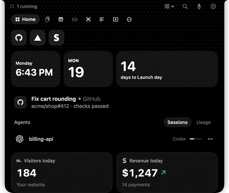
A 1200×630 social card that reads as one vertical stack on a near-black stage: centered wordmark, a single oversized gradient headline, and a command-palette app window that bleeds off the bottom edge. All colour is environmental — diagonal red light streaks rake across the backdrop and rim-light the window's border, so the UI itself stays monochrome glass. Focal hierarchy is achieved purely through scale and position: type at the top does the talking, the product shot below proves it.
Prompt preview
## Reference images

Study these alongside the description below: hierarchy, rhythm, spacing, colour. Build for the product you are asked about, using this design language.

- Screenshot: https://kage-design-assets.t3.tigrisfiles.io/screenshots/raycast-com/0ad10ca7-9e38-40ee-bcc1-17e09b8f6b56-1789059985949.webp
- Design on Kage: https://kage.design/designs/raycast-og-image

## Before you start
Ask the user what product the card is for, who it targets, and what brand assets they already have (name, logo shape, accent colour, typeface). Wait for the answers. Everything below is applied to *their* brand — the reference is only a composition and lighting lesson. Use placeholder branding and copy throughout.

## Page structure
Produce a single static image at exactly **1200×630** (HTML/CSS rendered to PNG, or SVG). One composition, top to bottom:

1. **Background stage** — a near-black canvas with two or three diagonal light streaks raking across it at roughly 45°, brightest in the upper half, blurred like long-exposure light. A soft ambient glow pools where the app window will sit so it reads as rim-lit.
2. **Brand lockup** — logo mark + wordmark centered horizontally, ~60px from the top edge, modest size (wordmark ~34px), pure white.
3. **Headline** — one sentence, centered, very large (~92–104px), sitting under the lockup with generous breathing room (~70px below the wordmark). The sentence is the only body of the card.
4. **Product window** — a wide (~960px) app-window mockup centered horizontally, top edge ~290px from the top, deliberately cropped by the bottom edge of the canvas so it bleeds off. It should depict the product's core surface (command palette, dashboard, chat, editor…) with realistic but placeholder content.

## Design language
- **One stack, three beats.** Wordmark → headline → product. Everything is centered on a single axis; no columns, no sidebars, no footer. Scale does all the work: lockup ~34px, headline ~100px, UI text ~14px.
- **Environmental colour.** Keep the base near-black (#0b0b0e) and the UI monochrome (#151518 panels, #8e8e93 secondary text, #ffffff primary). Introduce the brand accent (#ff4f42-ish red in the reference) *only* as light: diagonal streaks, a glow behind the window, and a 1px luminous window border (#ff5a4a at low alpha over the dark panel). Nothing inside the UI uses the accent.
- **Headline treatment.** Grotesque sans (Inter/Söhne-class), regular-to-medium weight, tight tracking (−0.02em). Apply a subtle left-to-right gradient across the text from dim grey (#9a9a9a) to white (#ffffff) so the eye lands at the end of the sentence. No bold, no uppercase, no background shapes behind type.
- **Window as glass.** Rounded corners (~12px), near-opaque dark translucent panel, hairline border, no drop shadow — depth comes from the glow bleeding behind it. Inside the window, use a plain two-pane layout: a primary input row with a query/cursor, then a divider, then a list pane (small section label, 4–5 rows with icons, one row highlighted as selected) beside a preview pane (dark media thumbnail, then a metadata label/value row).
- **Realism in the mockup.** Fake content must look like working software: a text caret in the input, selected-row highlight, small grey metadata text. This is what makes the card feel like product, not illustration.
- **Cropping as a device.** Let the window run past the bottom edge. Partial visibility implies the product continues beyond the frame.
- **No motion.** It is a static card; all depth comes from blur, glow and gradient, never from decorative frames, badges or patterns.

## Never
- Do not use the Raycast logo, wordmark, the tagline "Your shortcut to everything.", the `.heic` file list, the loupe/ring preview image, or any Raycast UI copy.
- Do not imitate Raycast's red if the user's brand has its own accent — map the light treatment to their colour.
- Never present the output as Raycast's card or mention Raycast in the rendered image.