 kage
kage
airjelly.ai

Design analysis
A compact top bar pairs a tiny brand mark with centered utility links and right-aligned language and download actions. The generous white space makes the interface feel calm and premium.
Prompt preview
## Reference images

Study these alongside the description below: hierarchy, rhythm, spacing, colour. Build for the product you are asked about, using this design language.

- Component: https://kage-design-assets.t3.tigrisfiles.io/components/airjelly/990a635f-6745-4f3e-9b4f-9fb8b62b8b48-1792044309-0.webp
- Full page it was cut from: https://kage-design-assets.t3.tigrisfiles.io/screenshots/airjelly/990a635f-6745-4f3e-9b4f-9fb8b62b8b48-1792044207019-full.webp
- Component on Kage: https://kage.design/component/airjelly-navigation

## Before you start
Ask what the user's product, brand, audience, and primary conversion goal are, then apply the principles below to that product rather than copying the reference.

Build a responsive navigation bar for a calm, premium software landing page. Use a full-width white background, a thin accent rule at the top, and a centered max-width content row around 680–720px wide. Put a small abstract brand mark at left, sparse text links in the middle, and language plus a dark pill-shaped primary action at right. Use 12–13px neutral sans-serif text, generous horizontal spacing, 20–24px vertical padding, and a sticky or static layout depending on the product context. Keep the brand mark simple and original. Links should have subtle hover colour transitions; the primary button should darken slightly on hover and remain keyboard accessible. Collapse links into a compact menu on narrow screens.

Never: use logos, product names, copy, illustrations, or imagery from the reference.
More components

 Announcement bar and primary navigation
AdAnt 2.0 · Navigation
Announcement bar and primary navigation
AdAnt 2.0 · Navigation
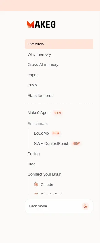
 Product sidebar navigation
Make0 Brain · Navigation
Product sidebar navigation
Make0 Brain · Navigation

 Announcement bar and primary navigation
Retriever AI · Navigation
Announcement bar and primary navigation
Retriever AI · Navigation

 Minimal product navigation
Pancake · Navigation
Minimal product navigation
Pancake · Navigation

 Minimal utility navigation
Diagramly · Navigation
Minimal utility navigation
Diagramly · Navigation

 Minimal developer navigation
OpenCode 2.0 · Navigation
Minimal developer navigation
OpenCode 2.0 · Navigation