 kage
kage
make0.ai
Design analysis
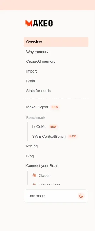
A persistent left rail provides product-area navigation, grouped links, nested benchmark items, integrations, and a dark-mode control.
Prompt preview
## Reference images

Study these alongside the description below: hierarchy, rhythm, spacing, colour. Build for the product you are asked about, using this design language.

- Component: https://kage-design-assets.t3.tigrisfiles.io/components/make0-brain/19c81372-003a-4a5c-a9ad-89626e51177c-1792044274-0.webp
- Full page it was cut from: https://kage-design-assets.t3.tigrisfiles.io/screenshots/make0-brain/19c81372-003a-4a5c-a9ad-89626e51177c-1792044170316-full.webp
- Component on Kage: https://kage.design/component/make0-brain-navigation

## Before you start
Ask what the user's product and brand are, then apply these principles to that product rather than reproducing the reference.

Create a left product-navigation rail for a desktop marketing/product overview page. Make it approximately 230px wide, separated from the main canvas by a very light vertical rule around `#eeeae6`, with a compact wordmark area at the top, vertically stacked links, and clear active-state treatment. Use a warm off-white background around `#fcfbf9`; active items get a soft peach fill around `#ffe4dc` and dark text; secondary and nested links use smaller muted gray text and indentation. Include section groupings, small “new” badges where useful, and a bottom dark-mode toggle row. Use a clean sans-serif, 12–14px navigation text, 8–10px vertical gaps, and avoid visual heaviness. On mobile, collapse this into a top drawer or horizontal menu.

Never: use logos, product names, copy, illustrations, or imagery from the reference.
More components

 Announcement bar and primary navigation
AdAnt 2.0 · Navigation
Announcement bar and primary navigation
AdAnt 2.0 · Navigation

 Minimal product navigation
AirJelly · Navigation
Minimal product navigation
AirJelly · Navigation

 Announcement bar and primary navigation
Retriever AI · Navigation
Announcement bar and primary navigation
Retriever AI · Navigation

 Minimal product navigation
Pancake · Navigation
Minimal product navigation
Pancake · Navigation

 Minimal utility navigation
Diagramly · Navigation
Minimal utility navigation
Diagramly · Navigation

 Minimal developer navigation
OpenCode 2.0 · Navigation
Minimal developer navigation
OpenCode 2.0 · Navigation