 kage
kage
pancake.ai

Design analysis
A restrained header balances a left-aligned wordmark, compact centered navigation, and two right-side account actions. The warm background and dark plum text establish the visual language without competing with the hero.
Prompt preview
## Reference images

Study these alongside the description below: hierarchy, rhythm, spacing, colour. Build for the product you are asked about, using this design language.

- Component: https://kage-design-assets.t3.tigrisfiles.io/components/pancake/f2dcc4e1-7584-486e-8c34-37279d03f6e2-1792044190-0.webp
- Full page it was cut from: https://kage-design-assets.t3.tigrisfiles.io/screenshots/pancake/f2dcc4e1-7584-486e-8c34-37279d03f6e2-1792044073540-full.webp
- Component on Kage: https://kage.design/component/pancake-navigation

## Before you start
Ask what the user's product is, who it serves, and what brand personality, name, and primary action should appear. Apply the principles below to that product rather than reproducing the reference.

Build a responsive top navigation for a modern B2B software landing page. Use a warm ivory background near `#fbf7f1`, dark plum text near `#210025`, a compact max-width container, and generous horizontal breathing room. Put the brand mark or product name on the left, a short set of links in the middle on desktop, and a subtle secondary account button plus a strong rounded primary CTA on the right. Use a clean sans-serif with 12–14px navigation text, medium weight, and a clear 28–34px wordmark treatment. Keep the header around 68–76px tall, vertically centered, with 12–16px button padding, 10–12px radius, and no heavy borders. Collapse links into a menu control on small screens. Add visible hover and focus states, and make the primary action keyboard accessible.

Never: use the reference logo, product name, exact copy, illustrations, or imagery.
More components

 Announcement bar and primary navigation
AdAnt 2.0 · Navigation
Announcement bar and primary navigation
AdAnt 2.0 · Navigation

 Minimal product navigation
AirJelly · Navigation
Minimal product navigation
AirJelly · Navigation
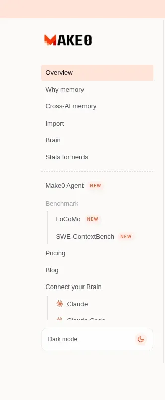
 Product sidebar navigation
Make0 Brain · Navigation
Product sidebar navigation
Make0 Brain · Navigation

 Announcement bar and primary navigation
Retriever AI · Navigation
Announcement bar and primary navigation
Retriever AI · Navigation

 Minimal utility navigation
Diagramly · Navigation
Minimal utility navigation
Diagramly · Navigation

 Minimal developer navigation
OpenCode 2.0 · Navigation
Minimal developer navigation
OpenCode 2.0 · Navigation