kage
kage
airjelly.ai

Design analysis
A very spacious, mostly white landing page combines large black sans-serif headlines with small gray serif section labels and occasional serif feature titles. The page moves from a centered hero and oversized product screenshot into alternating two-column proof sections, then becomes denser through ruled capability lists, a privacy statement, audience rows, and FAQ accordions before returning to a centered download CTA and oversized pale footer wordmark. Cyan is reserved for primary actions and small product accents, while thin gray rules and almost no shadow keep the interface quiet and editorial.
Prompt preview
## Reference images

Study these alongside the description below: hierarchy, rhythm, spacing, colour. Build for the product you are asked about, using this design language.

- Full page: https://kage-design-assets.t3.tigrisfiles.io/screenshots/airjelly/990a635f-6745-4f3e-9b4f-9fb8b62b8b48-1792044207019-full.webp
- Above the fold: https://kage-design-assets.t3.tigrisfiles.io/screenshots/airjelly/990a635f-6745-4f3e-9b4f-9fb8b62b8b48-1792044203622.webp
- Design on Kage: https://kage.design/designs/airjelly-landing-page

## Before you start
Ask the user what they are building, who it is for, and what brand assets they already have (name, colours, typography, logo, and imagery). Wait for their answers before designing. Apply the reference’s layout and interaction principles to their product, not to AirJelly, and use their own content and assets.

## Page structure
Build a long, calm product landing page with generous vertical spacing and a centered content column.

1. **Header/navigation** — Place a small brand mark at the far left, a compact horizontal navigation in the center, and language plus a dark pill CTA at the right. Keep the header light, short, and unobtrusive.
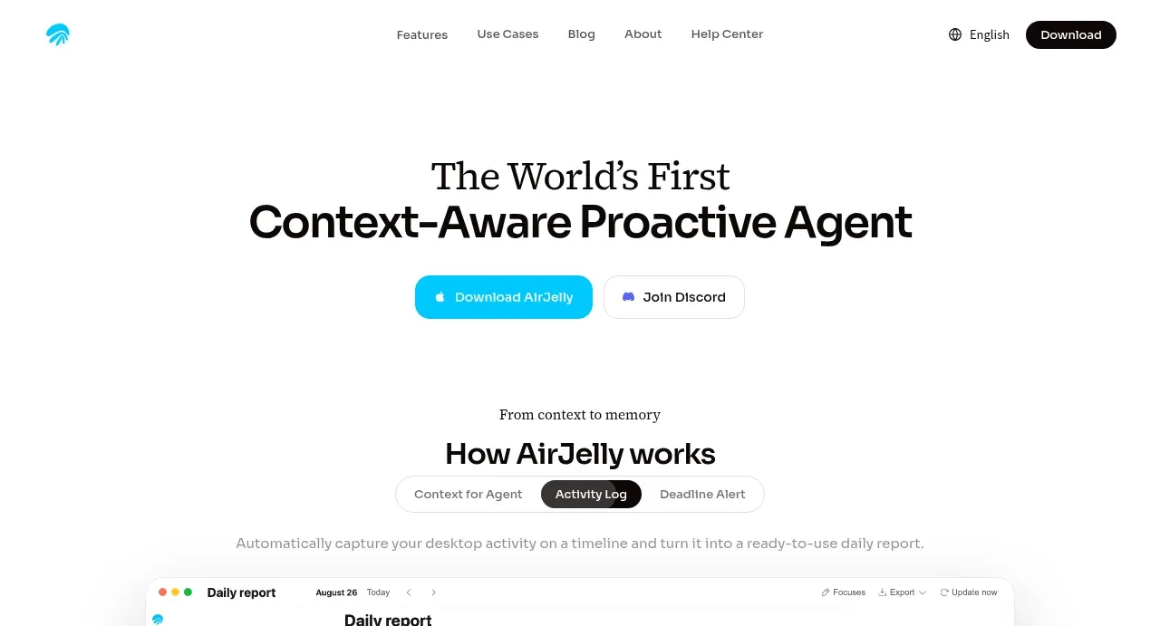
2. **Hero** — Center a two-line headline with a refined serif first line and a heavier sans-serif second line. Put two compact CTAs beneath it: a bright accent primary button and a white outlined secondary button.
3. **Product explanation intro** — Add a small serif eyebrow, a centered “how it works” heading, and a pill-style three-option tab control with the middle tab active. Follow it with a muted explanatory sentence.
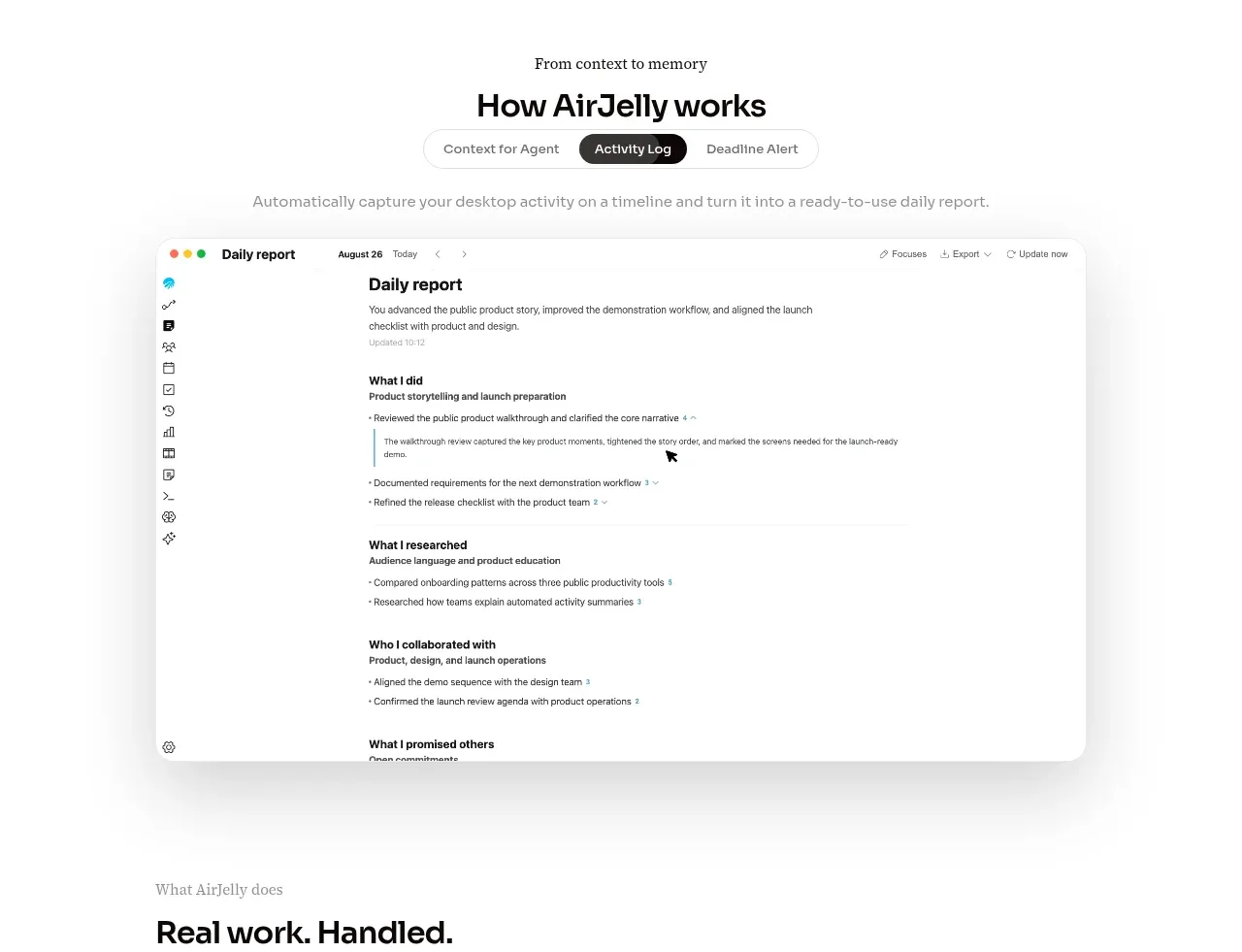
4. **Primary product screenshot** — Show a large desktop application screenshot centered on the page, with a subtle rounded frame and soft, diffuse shadow. Let it serve as the main visual proof without adding decorative artwork.
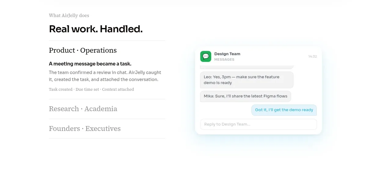
5. **What the product does** — Use a two-column section: left side has an eyebrow, bold heading, and stacked use-case rows with thin rules; right side shows a softly framed contextual UI mockup such as a message or task card. Make the first row expanded and the remaining rows quieter.
6. **How it works** — Introduce a section label and bold heading, then use three full-width numbered rows. Each row has a tiny number, a large serif concept title, and a concise gray explanation aligned in columns.
7. **Features** — Add a denser ruled list of feature names and descriptions. Use a strong section heading, five or so rows, and a small text link below rather than cards or icons.
8. **Privacy** — Create a spacious text-led reassurance block with an eyebrow, bold statement, short muted paragraph, and a small outlined action button. Keep it visually simple and avoid badges or illustrations.
9. **Audience/use cases** — Split the section into two columns: a large heading and supporting copy on the left, and a numbered list of audience groups on the right. Separate each item with thin horizontal rules.
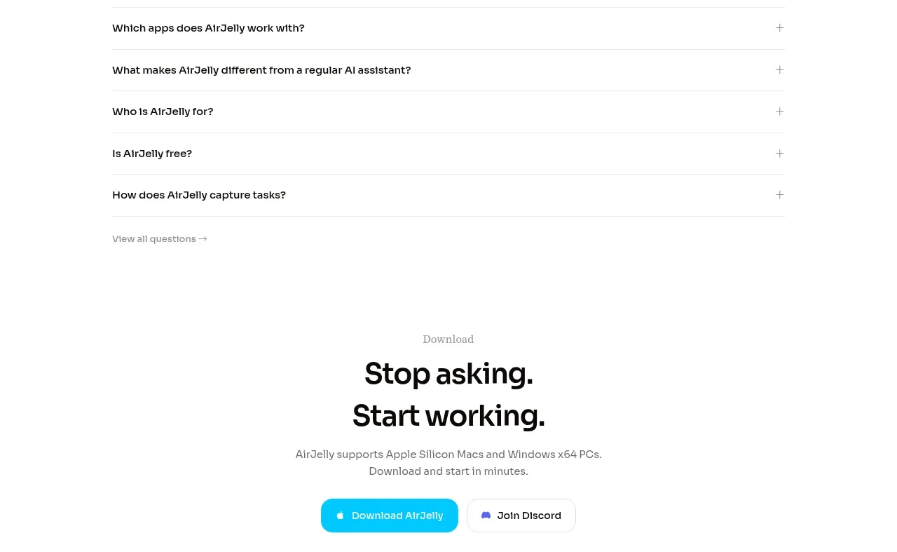
10. **FAQ** — Add an eyebrow and bold heading followed by five accordion-like question rows. Put a plus sign at the far right of each row, with a small link to view all questions underneath.
11. **Final download CTA** — Center a small eyebrow, a large two-line headline, supporting compatibility text, and the same paired accent/outlined buttons used in the hero.
12. **Footer** — Add a thin top border, a small copyright line on the left, compact utility links on the right, and an oversized low-contrast pale brand treatment below. Keep the footer mark decorative and subdued.

## Design language
- Build hierarchy through scale, whitespace, and alignment rather than containers: bold near-black sans-serif headings, small muted labels, and occasional elegant serif display text.
- Use a restrained editorial rhythm. The hero and screenshot breathe with very large gaps; middle sections alternate spacious two-column compositions with denser ruled lists; the FAQ and footer become compact again.
- Keep the page on an off-white/white background around `#FFFFFF` or `#FCFCFB`, with near-black text around `#111111`, secondary gray around `#777777`, and rules around `#E8E8E8`.
- Reserve a vivid cyan accent around `#12BFE5` for primary CTA fills, selected states, and tiny product highlights. Do not spread the accent across every section.
- Pair a contemporary sans-serif for navigation, body copy, controls, and bold headings with a high-contrast serif for editorial eyebrows and selected feature titles. Use a large hero scale, roughly `56–72px` desktop, with tight line-height; section headings around `32–42px`; body copy around `13–16px`.
- Prefer a centered max-width layout near `1100–1200px`, with wide side margins and consistent two-column grids. Align list content to clear vertical tracks.
- Use 1px light-gray borders for rows, tabs, and secondary buttons. Keep radii modest: about `8–14px` for screenshot frames and `999px` for compact pills. Avoid heavy card borders, gradients, and strong drop shadows; product screenshots may use a very soft gray shadow.
- Make primary buttons compact, rounded, and high contrast; keep secondary actions white with a subtle border. Repeat the CTA treatment at the bottom for continuity.
- Make tabs, FAQ rows, and audience/feature rows interactive with clear hover and focus states. FAQ rows should expand in place, while the active tab changes the explanatory copy or screenshot. Use restrained transitions such as `150–250ms` opacity, border, and height changes.
- Ensure the long page remains readable on mobile: collapse two-column sections into a single flow, preserve generous spacing, make the header wrap or use a compact menu, and turn ruled rows into stacked label/description blocks.

## Never
- Do not copy AirJelly’s logo, wordmark, product name, tagline, exact copy, screenshots, UI content, or branded iconography.
- Do not use the reference’s product mockups, illustrations, photography, or icon sets; create neutral, original visuals appropriate to the user’s product.
- Never present the result as AirJelly or imply an affiliation with it. Use the user’s brand assets and write original content throughout.
Components from this page
All components
 Minimal product navigation
AirJelly · Navigation
Minimal product navigation
AirJelly · Navigation
 Centered product promise hero
AirJelly · Hero
Centered product promise hero
AirJelly · Hero
 How the product works demo
AirJelly · Feature grid
How the product works demo
AirJelly · Feature grid
 Real work handled showcase
AirJelly · Feature grid
Real work handled showcase
AirJelly · Feature grid
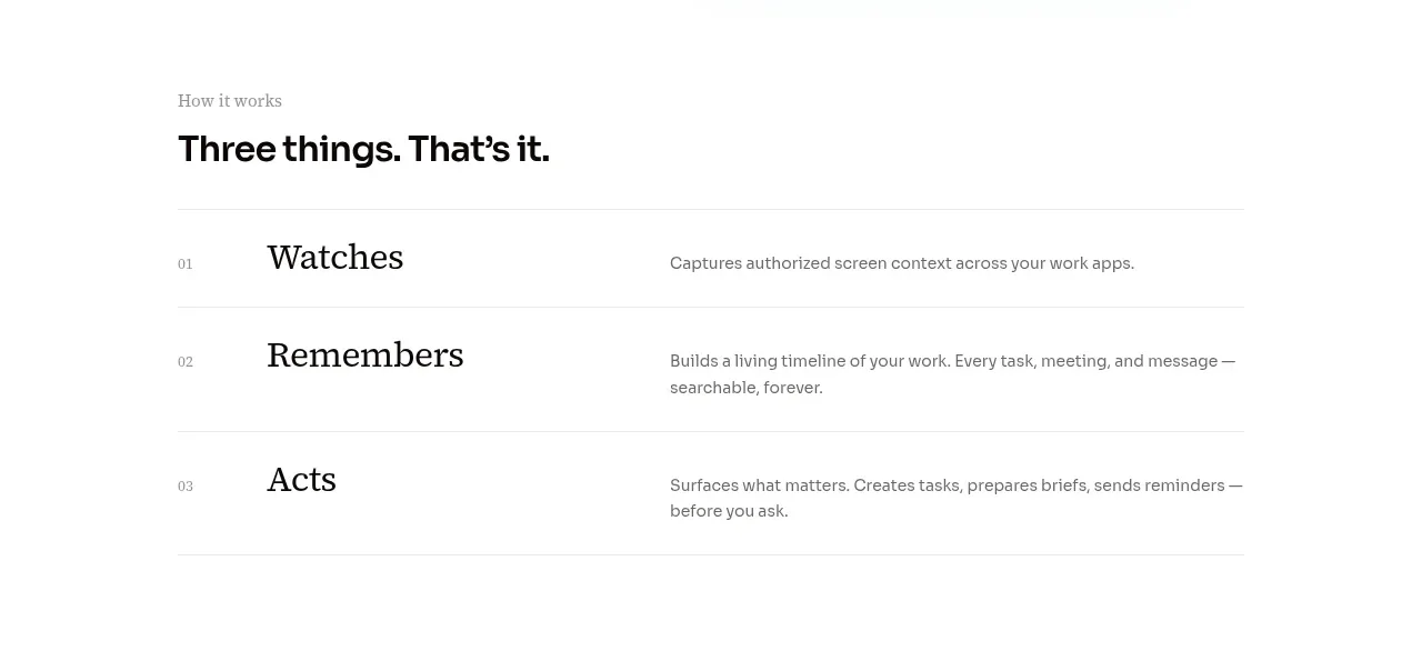 Three-step operating model
AirJelly · Feature grid
Three-step operating model
AirJelly · Feature grid
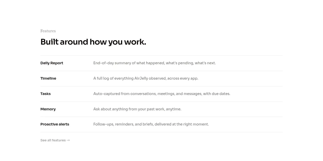 Feature capabilities list
AirJelly · Feature grid
Feature capabilities list
AirJelly · Feature grid
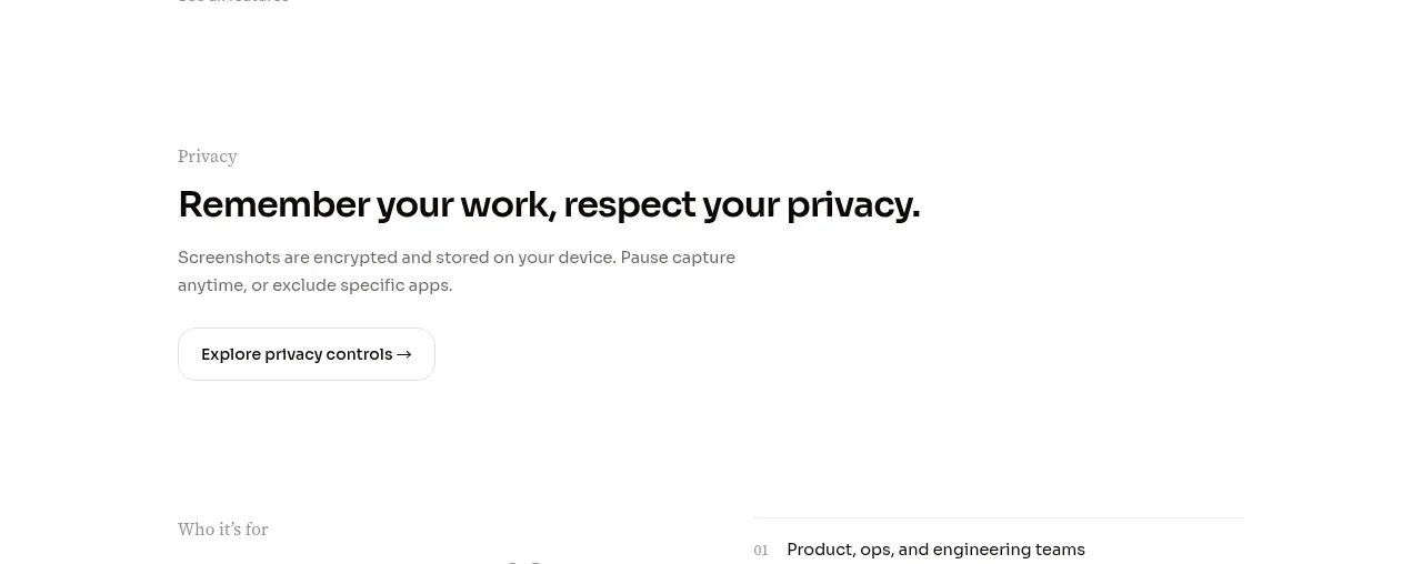 Privacy reassurance call to action
AirJelly · Call to action
Privacy reassurance call to action
AirJelly · Call to action
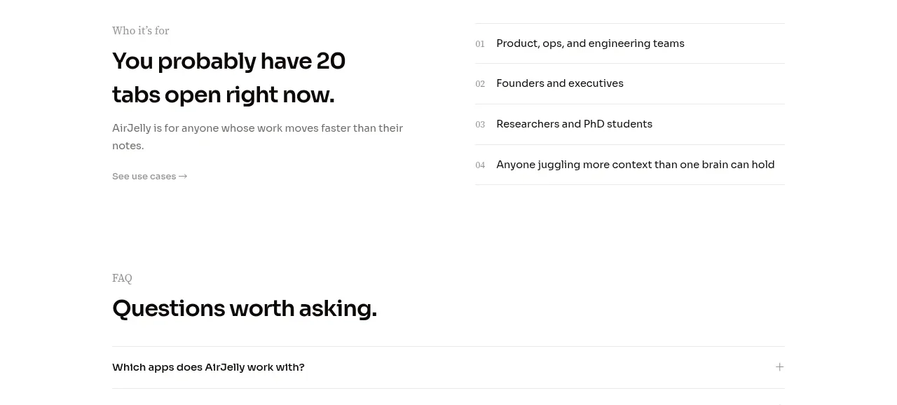 Audience and use cases
AirJelly · Feature grid
Audience and use cases
AirJelly · Feature grid
 Questions worth asking FAQ
AirJelly · FAQ
Questions worth asking FAQ
AirJelly · FAQ
 Download conversion close
AirJelly · Call to action
Download conversion close
AirJelly · Call to action
 Minimal information footer
AirJelly · Footer
Minimal information footer
AirJelly · Footer