 kage
bestproxy.com
Design analysis
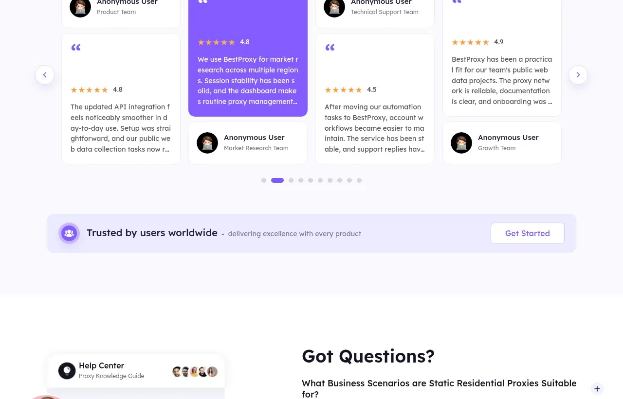
A pale testimonial area uses a multi-card carousel with one purple featured card, ratings, role labels, pagination, and navigation controls.
Prompt preview
## Reference images

Study these alongside the description below: hierarchy, rhythm, spacing, colour. Build for the product you are asked about, using this design language.

- Component: https://kage-design-assets.t3.tigrisfiles.io/components/bestproxy-com/755647b7-f613-40ca-b212-ae56a9e7b331-1792344034-10.webp
- Full page it was cut from: https://kage-design-assets.t3.tigrisfiles.io/screenshots/bestproxy-com/755647b7-f613-40ca-b212-ae56a9e7b331-1792343992980-full.webp
- Component on Kage: https://kage.design/component/bestproxy-testimonials

## Before you start
Ask what the user's product, audience, and brand are, then apply the principles below to that product rather than reproducing the reference.

Build a testimonial carousel section on a very pale lavender background (#faf9ff). Center a 32–40px heading above a row of four partially overlapping or tightly spaced testimonial cards. Each card should include an avatar placeholder, anonymous role/company label, quotation mark, 1–5 star rating, and short quote; emphasize the active card with a purple gradient background and white text while inactive cards stay white with subtle borders. Add circular previous/next controls and dot pagination below. Use 12–16px card radii, 20–24px padding, 16px gaps, and ensure keyboard, touch, and reduced-motion support.

Never: use logos, product names, copy, illustrations, or imagery from the reference.
More components
 Second customer quote
Inflight · Testimonials
 Third customer quote
Inflight · Testimonials
 First customer quote
Inflight · Testimonials
 Customer testimonial
formabledocs.com · Testimonials
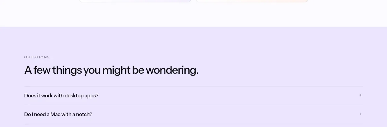
 Social proof and comparison links
CrewTower Mod for Claude Code · Testimonials
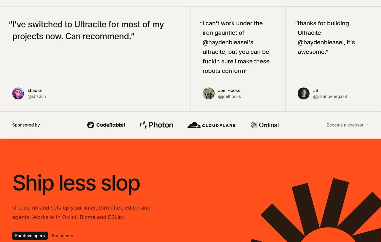
 Developer testimonials and sponsor strip
Ultracite v8 · Testimonials