 kage
kage
crewtower.app

Design analysis
A restrained testimonial quote is followed by a small set of comparison/use-case links, providing credibility without interrupting the purchase flow.
Prompt preview
## Reference images

Study these alongside the description below: hierarchy, rhythm, spacing, colour. Build for the product you are asked about, using this design language.

- Component: https://kage-design-assets.t3.tigrisfiles.io/components/crewtower-mod-for-claude-code/6a95b5f4-2bf6-41f9-aa93-70409ededf43-1792303421-5.webp
- Full page it was cut from: https://kage-design-assets.t3.tigrisfiles.io/screenshots/crewtower-mod-for-claude-code/6a95b5f4-2bf6-41f9-aa93-70409ededf43-1792303277739-full.webp
- Component on Kage: https://kage.design/component/crewtower-mod-for-claude-code-testimonials

## Before you start
Ask what customer outcome or proof point is credible for the user's product and whether comparison pages are useful to their audience. Use original content.

Build a compact social-proof band after pricing. Center one italic or editorial-style quote at 20–26px, followed by a small attribution line in muted 12–13px text. Beneath it, add a centered “find your fit” row or two-column set of quiet comparison cards. Cards should use near-white surfaces, 1px #e7e3eb borders, 12px radii, 16–20px padding, and a title plus one-line description. Keep the section visually lighter than the pricing card, with 48–64px vertical spacing and strong alignment to the main content column.

Never use logos, product names, copy, illustrations, or imagery from the reference.
More components
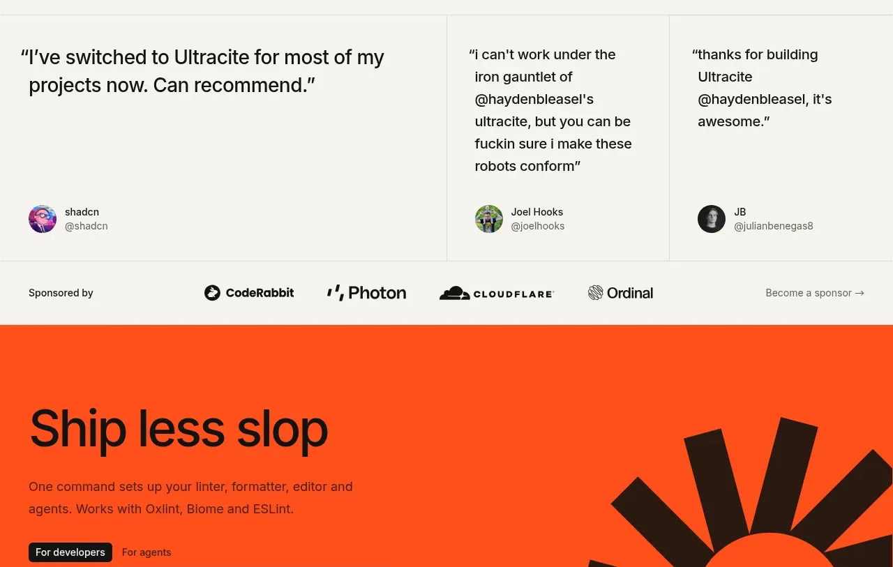
 Developer testimonials and sponsor strip
Ultracite v8 · Testimonials
Developer testimonials and sponsor strip
Ultracite v8 · Testimonials
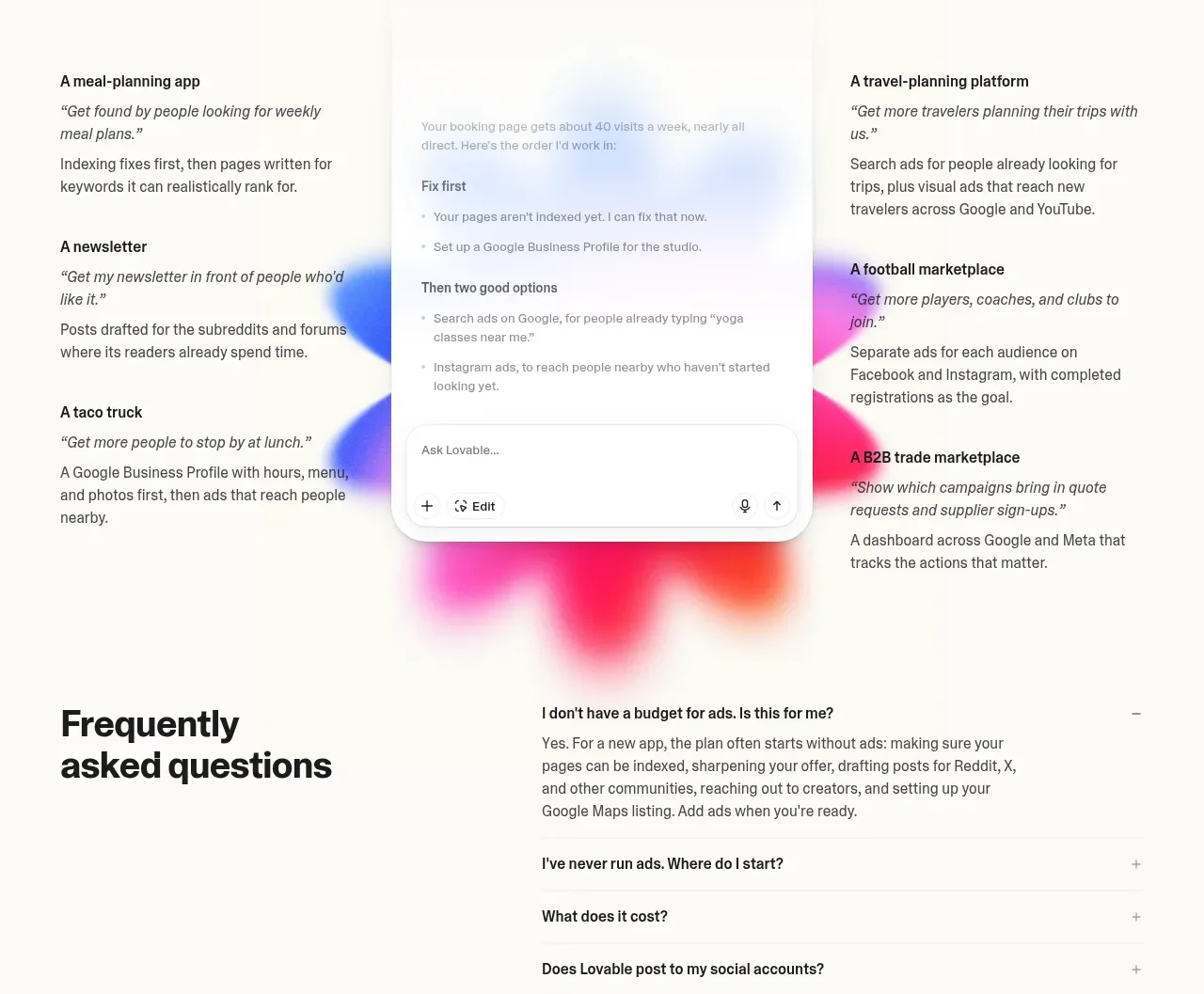
 Customer growth examples
Lovable Growth Tools · Testimonials
Customer growth examples
Lovable Growth Tools · Testimonials
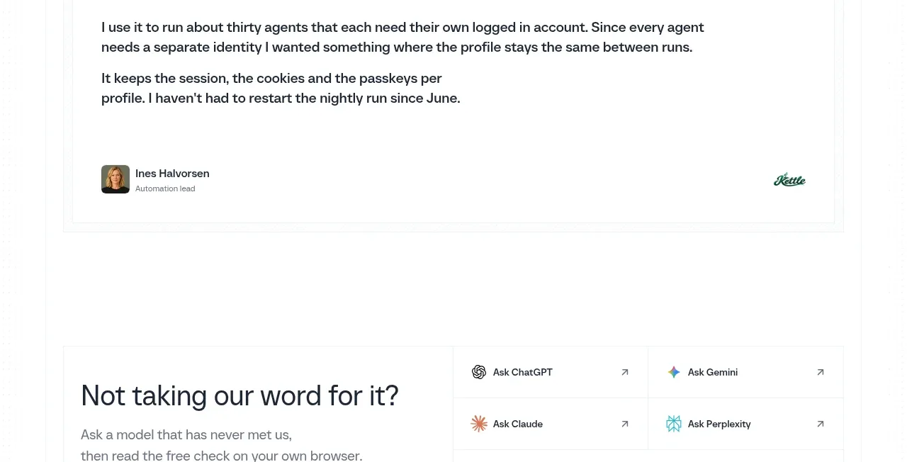
 Customer proof quote
Scalebrowser · Testimonials
Customer proof quote
Scalebrowser · Testimonials
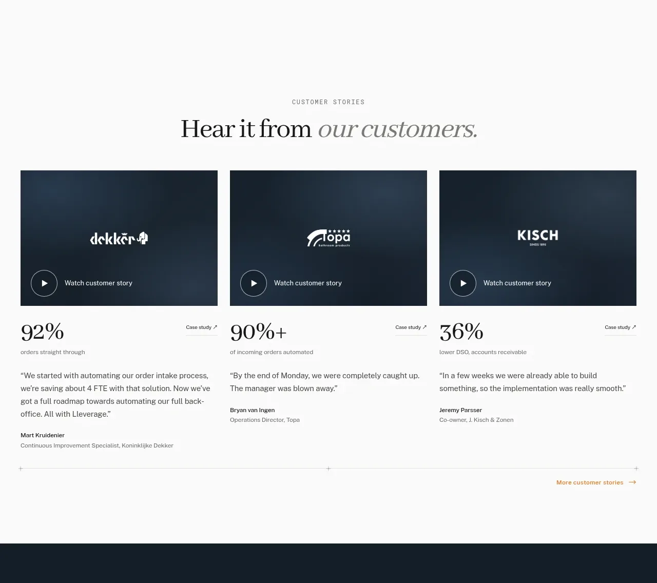
 Customer story cards
Lleverage · Testimonials
Customer story cards
Lleverage · Testimonials
 Customer proof mosaic
Lleverage · Testimonials
Customer proof mosaic
Lleverage · Testimonials
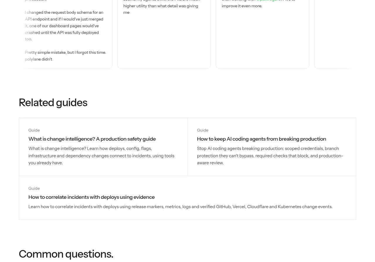
 Developer testimonials
Polylane Impact Analysis · Testimonials
Developer testimonials
Polylane Impact Analysis · Testimonials