 kage

Design analysis
A dense, conversion-focused proxy-provider landing page that leans on a violet/indigo brand ramp with mint-green CTAs and playful pill chips. The hero pairs a left-aligned headline with a collage of floating UI cards (stats card, photo card, support card) to suggest product richness rather than one flat screenshot. Down the page, rhythm alternates deliberately: white product-pricing cards with one highlighted dark-violet middle card, alternating image/text feature rows, a full-bleed dark use-case panel, an illustrated purple band, a bento grid of oversized statistics, a light code-snippet section, a testimonial carousel with one purple accent card, an FAQ accordion, and a saturated gradient CTA banner before a long dark footer. Rounded corners (16–24px), soft shadows, small green check bullets, and consistent pill buttons keep the many sections feeling like one system despite the density.
Prompt preview
## Reference images

Study these alongside the description below: hierarchy, rhythm, spacing, colour. Build for the product you are asked about, using this design language.

- Full page: https://kage-design-assets.t3.tigrisfiles.io/screenshots/bestproxy-com/755647b7-f613-40ca-b212-ae56a9e7b331-1792343992980-full.webp
- Above the fold: https://kage-design-assets.t3.tigrisfiles.io/screenshots/bestproxy-com/755647b7-f613-40ca-b212-ae56a9e7b331-1792343984952.webp
- Design on Kage: https://kage.design/designs/bestproxy-landing-page

# Build a proxy/infrastructure provider landing page in this design language

## Before you start
Ask the user what they are building, who it is for, and what brand assets (name, colours, type) they already have. Wait for the answers before writing any code. Everything below is applied to *their* product, not to the reference site.

## Page structure
Build a single long marketing page with these sections, top to bottom:

1. **Sticky top nav** — logo left, 4–5 dropdown nav items, a globe/localisation icon, user icon, and one filled primary CTA button on the right. White background, subtle bottom border.
2. **Hero (2 columns)** — Left: small green-dot trust badge pill, a two-line display headline, a short paragraph, then two buttons (primary pill + secondary "start with provider" outlined button), a dashed divider, and two rows of soft pastel pill chips describing use cases. Right: a collage of overlapping rounded cards — one dark stat card (big number + country flags), one photo card with a small overlay chip, one small support card with avatar, plus a couple of floating gradient blobs. No single flat hero screenshot; layer 2–3 distinct cards.
3. **Logo strip** — single row of greyscale/coloured partner logos with a "Trusted by X users worldwide" label. Generous vertical padding, no borders.
4. **Product pricing trio with tabs** — centered section heading + subtitle, then a small tab switcher (three product types, active tab underlined). Below, three equal pricing cards: white cards for products 1 and 3, the middle card elevated with a dark-violet filled background and white text. Each card: icon, product name, price line ("Starting from"), "Best for" line, an INCLUDES list with green check bullets, a full-width pill CTA (green on the highlighted card), and a small "View pricing" text link underneath.
5. **AI feature row (alternating)** — left: a dark chat/terminal-style mock card ("prompt in → data out" idea) overlapping a photo, with a floating icon badge; right: small coloured eyebrow label ("Reliable proxy for AI"), H2, paragraph, single primary button.
6. **Dashboard feature row (reversed)** — heading + paragraph + button on the left, dashboard screenshot collage with a floating "sub-users" avatar chip card on the right.
7. **Three-column value props** — three icon + bold title + two-line paragraph columns, no cards, lots of whitespace. This is the page's lightest, most breathing section.
8. **Dark use-cases panel** — full-width rounded dark-navy-to-violet gradient block. Small uppercase eyebrow, big white heading, right-aligned intro paragraph; below, a vertical accordion-style list of use cases (first item expanded with description + Learn More button), and a decorative abstract star/sparkle graphic on the right.
9. **"Why choose" split** — heading centered, then a 50/50 split: dark card on the left with heading, paragraph, four green-check bullets and a text link; large portrait photo on the right with rounded corners.
10. **Bento stats band** — one wide illustrated purple block (hands + shield illustration) spanning left, plus a right column of two stacked blocks: a light block with concentric-circle graphic and caption, and two dark stat tiles with oversized numbers ("200+", "7800+"). Grid of 2 rows, mixed fills (purple, white, dark).
11. **Developer integration row** — left: eyebrow, big heading, paragraph, primary button; right: a light code card with a language tab row on top, syntax-highlighted snippet, and a Copy button. Keep the code card light-themed with soft shadow.
12. **Compatibility icon grid** — centered heading + right-aligned subtext, then a dense grid of small rounded white tiles each holding one tool logo. 4–5 rows, uniform tile size, generous gutters.
13. **Testimonial carousel** — centered heading, then a horizontal row of 4 cards: mostly white cards with avatar + name + role, star rating, quote text; one card filled purple with white text as the accent. Prev/next arrows and dot pagination below.
14. **FAQ** — left: a collage card with "Help Center" header, a chat bubble, and support contact card; right: "Got questions?" heading plus a 6–7 item accordion with +/− toggles and a "View all FAQs" button.
15. **CTA banner** — full-width rounded gradient (violet → indigo) block: big white headline, one supporting line, two pill buttons (primary green + outlined white), decorative floating avatar/illustration elements.
16. **Footer** — dark near-black, 5 link columns (Products with "Popular" badges on some items, Features, Use Cases, Locations, Resources), a "Friends Links" partner row, bottom bar with small legal links, language selector, and payment/flag icons.

## Design language
- **Colour system**: near-white page background (#FFFFFF / #F7F7FB), primary violet ramp from #7C5CFF (buttons, fills) to #5B3FD6 and dark indigo #1B1440 for dark panels; mint/green accent #2BC48A used only for CTAs, check bullets and status dots; soft pastel chip fills (lavender, mint, peach) for tag pills. Dark sections sit at #0E0B2A–#1B1440.
- **Type**: a geometric/rounded sans throughout. Tight scale: display headings ~40–48px bold, section H2s ~32–36px, body 14–15px with 1.6 line height, eyebrow labels 11–12px uppercase or coloured. Headlines are left-aligned in split rows, centered in symmetric sections (pricing, testimonials, FAQ header).
- **Rhythm down the page**: alternate dense and airy — the card-heavy hero and pricing section are followed by open three-column whitespace, then a heavy dark panel resets attention, then bento stats re-tighten. Never place two dark sections adjacent; every dark band is framed by white space above and below.
- **Cards & surfaces**: 16–24px radius everywhere, no sharp corners. Cards use very soft diffuse shadows (`0 8px 30px rgba(20,15,60,0.08)`) and 1px light borders on white surfaces. Highlighted cards swap to solid violet with white text instead of using a shadow to stand out.
- **Buttons**: pill-shaped (fully rounded), 40–48px tall. Primary = violet fill with arrow icon; accent = green fill reserved for the highlighted pricing card and final CTA; secondary = white with border. One accent button per viewport region, no more.
- **Bullets & micro-UI**: green circular check icons for all feature lists; small floating chip cards with avatars/icons pinned to the corners of photos and screenshots to add depth; dashed dividers used once in the hero as a casual separator.
- **Icons & illustration**: flat rounded icon style in a consistent line/duotone treatment; illustrated human hands + shield for the compliance block; abstract sparkle/star shapes for dark panels — decorative, never photographic replacements.
- **Motion**: subtle only — card hover lift, accordion expand, carousel slide, tab underline slide. No parallax or heavy animations.
- **Density**: pricing cards and the icon grid are the densest zones; support them with at least one low-density three-column breather section before the next heavy block.

## Never
- Do not use the BestProxy name, logo, wordmark, exact copy, testimonial text, photography, or its partner/tool logos and icon set.
- Do not clone the flagged-country stat card or its specific flag row; represent any similar concept with the user's own data and imagery.
- Never present the result as BestProxy or imply affiliation with it.
Components from this page
All components
 Global navigation
bestproxy.com · Navigation
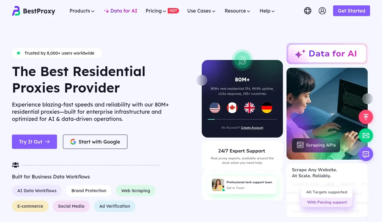 Residential proxy hero
bestproxy.com · Hero
 Customer trust logos
bestproxy.com · Logo cloud
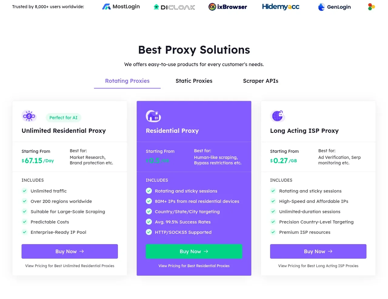 Proxy solutions comparison
bestproxy.com · Pricing table
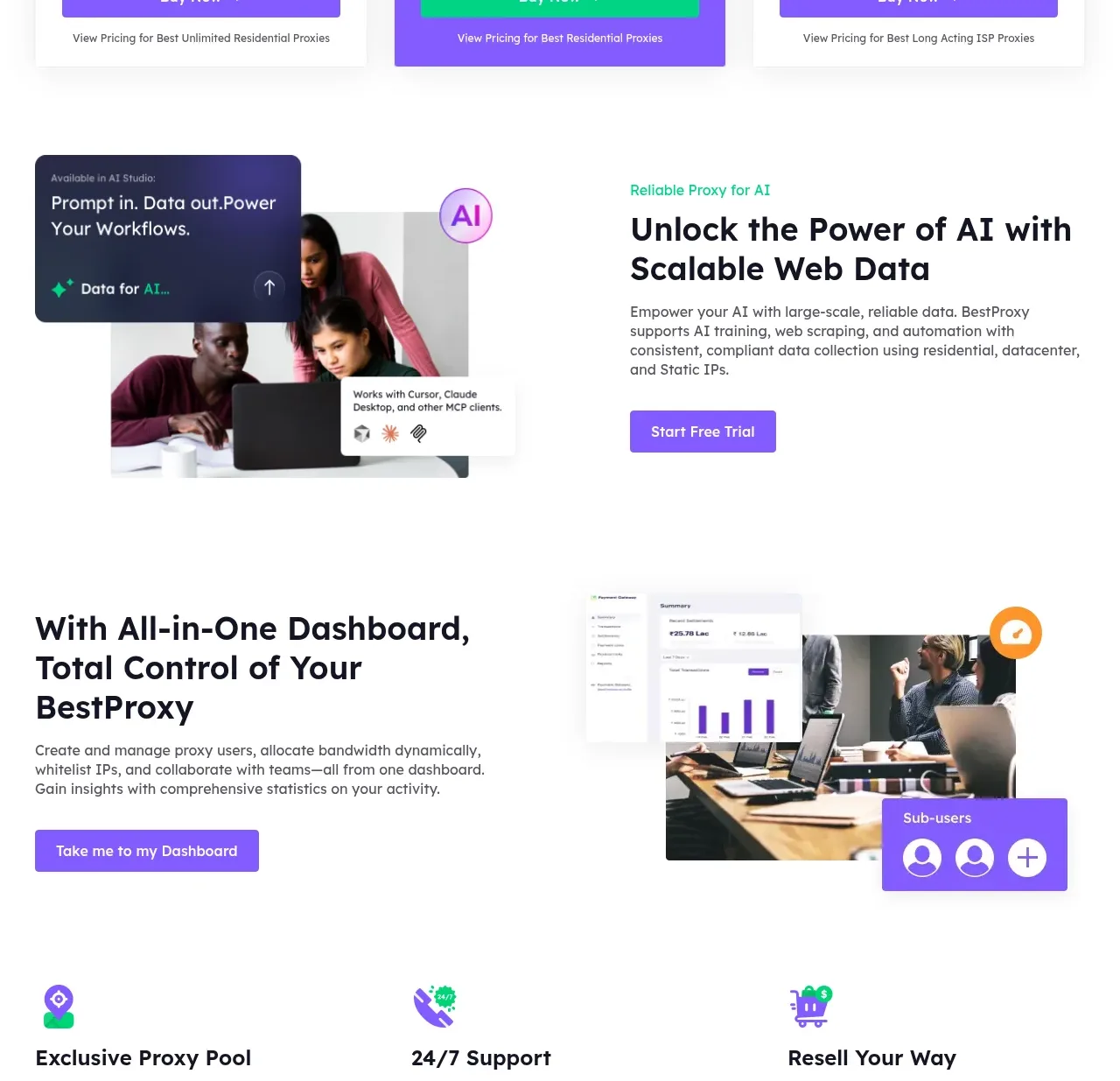 AI and dashboard capabilities
bestproxy.com · Feature grid
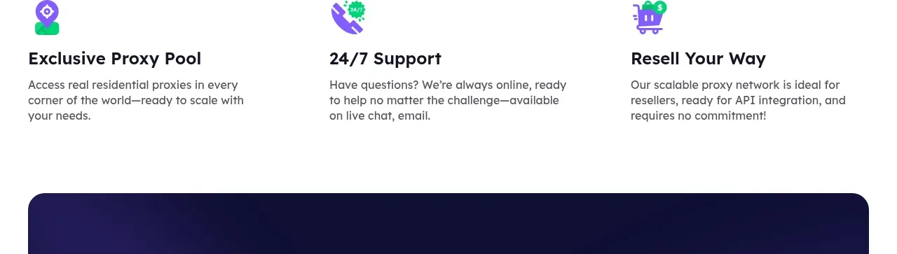 Service advantages
bestproxy.com · Feature grid
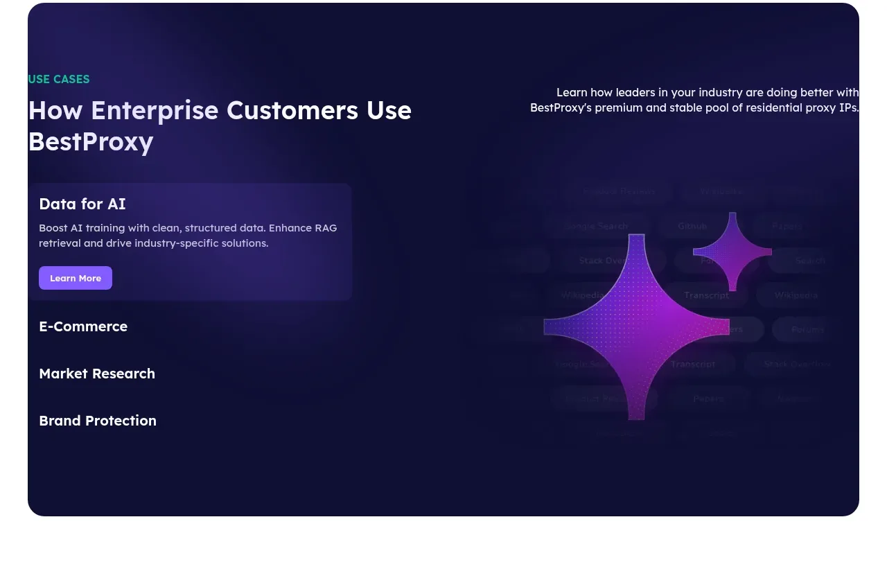 Enterprise use cases
bestproxy.com · Tabs & steps
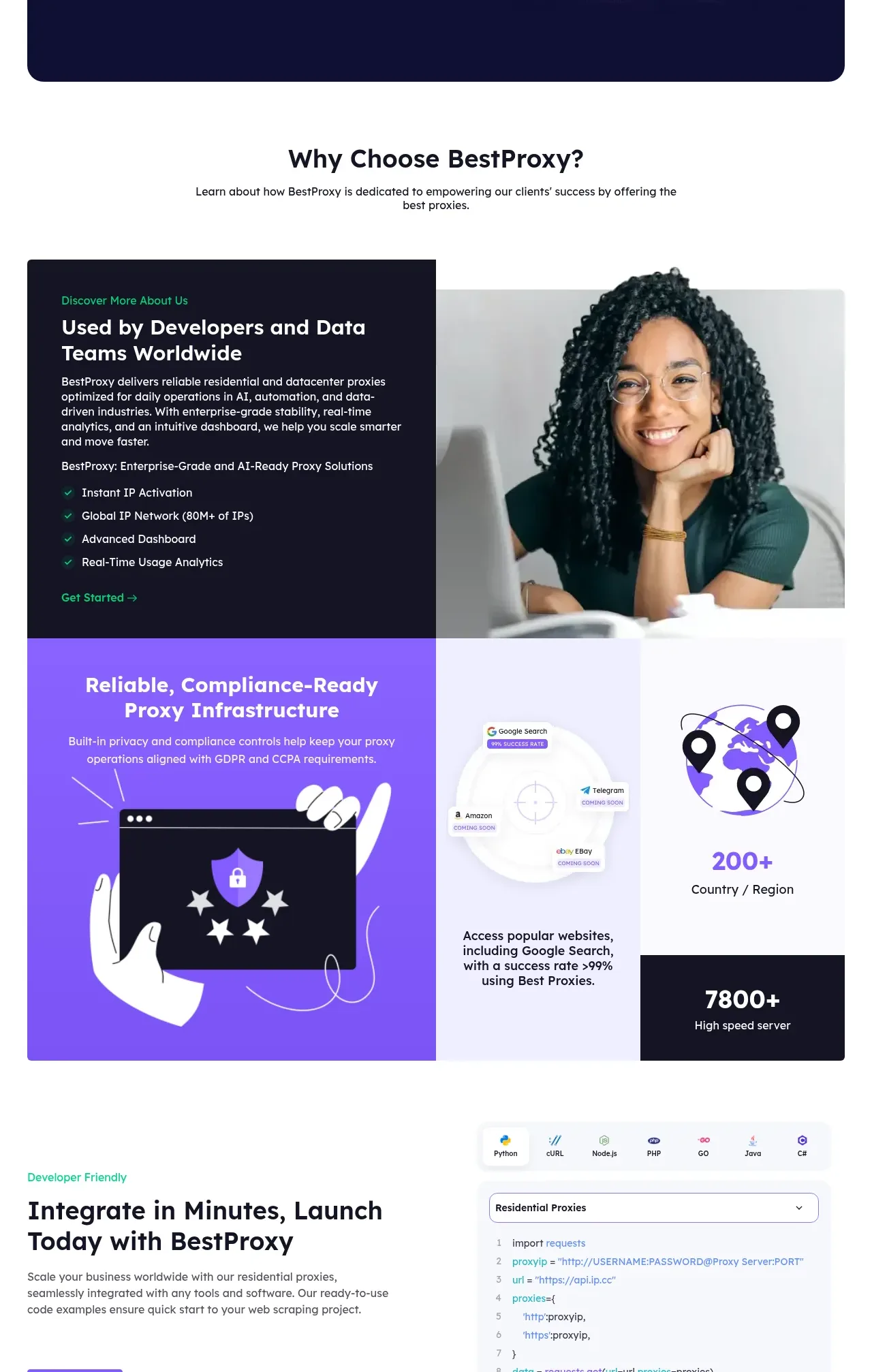 Why choose us
bestproxy.com · Feature grid
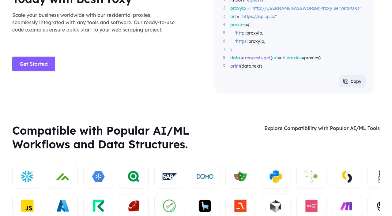 Developer integration
bestproxy.com · Code block
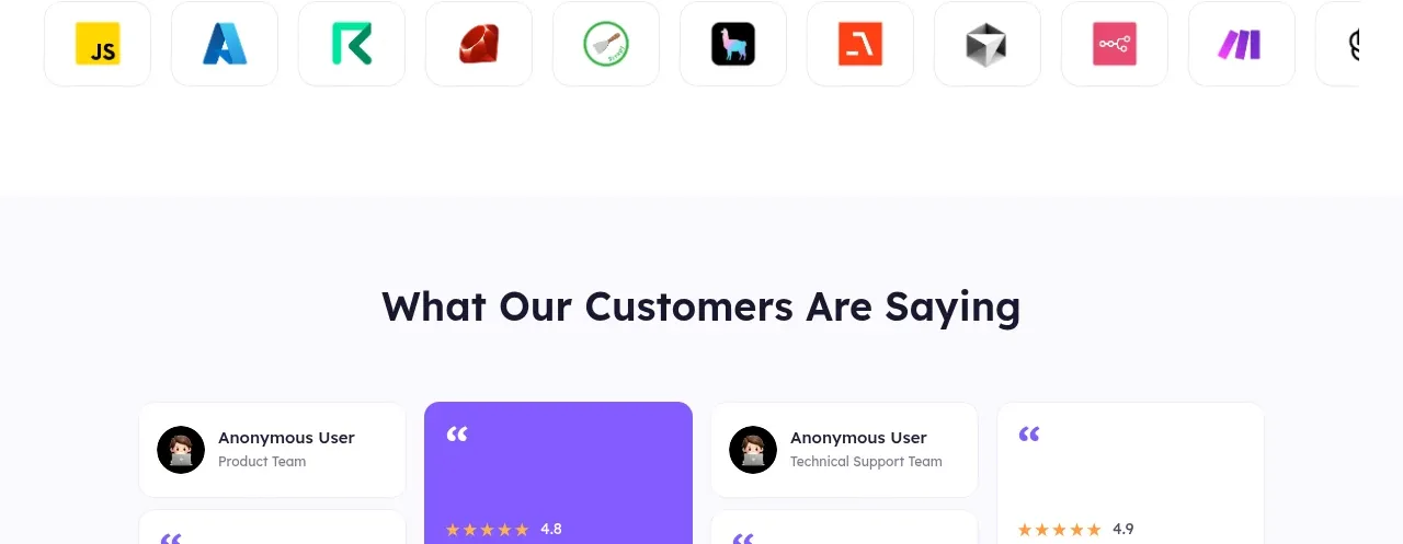 AI and ML compatibility
bestproxy.com · Logo cloud
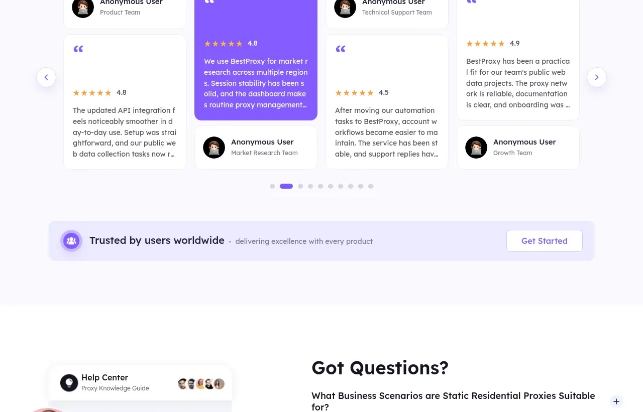 Customer testimonials
bestproxy.com · Testimonials
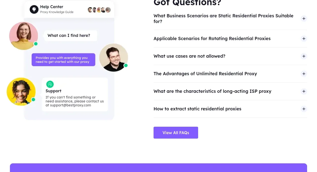 Frequently asked questions
bestproxy.com · FAQ
Related designs
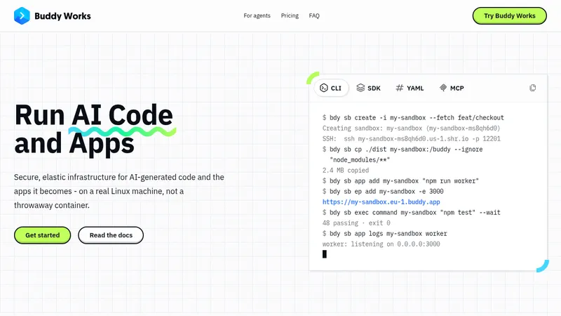

 AI Sandboxes by Buddy
Landing page · Cloud & infrastructure


 upstash.com
Landing page · Cloud & infrastructure


 render.com
Landing page · Cloud & infrastructure


 fly.io
Landing page · Cloud & infrastructure


 supabase.com
Landing page · Cloud & infrastructure
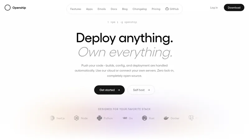

 OpenShip Cloud
Landing page · Cloud & infrastructure