 kage
formabledocs.com
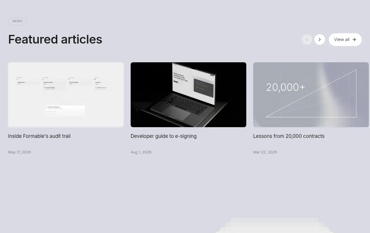
Design analysis
A single oversized quote gives the page an emotional pause and connects the workflow benefits to a named customer and role.
Prompt preview
## Reference images

Study these alongside the description below: hierarchy, rhythm, spacing, colour. Build for the product you are asked about, using this design language.

- Component: https://kage-design-assets.t3.tigrisfiles.io/components/formabledocs-com/3108c64d-0f5a-4f45-931d-d27909065482-1792440523-6.webp
- Full page it was cut from: https://kage-design-assets.t3.tigrisfiles.io/screenshots/formabledocs-com/3108c64d-0f5a-4f45-931d-d27909065482-1792440481208-full.webp
- Component on Kage: https://kage.design/component/formabledocs-testimonials

## Before you start
Ask what the user's product, audience, and brand are, then apply the following principles to that product rather than reproducing the reference.

Build a spacious testimonial band with a small customer eyebrow, one large multi-line quote, and a compact attribution row containing an avatar, person name, and role/company. Keep the quote as the dominant element and constrain its measure so it remains easy to scan. Use generous top and bottom padding and avoid surrounding it with multiple competing testimonials.

Use the page's pale cool background #eeeef4, near-black quote text #15161a, a soft gray oversized quotation mark, and muted attribution text #747780. Use a 30–42px quote size on desktop, 1.15 line-height, 16px attribution text, and a 32px circular avatar. Ensure the quote remains readable on small screens with a responsive 24–30px size.

### Never
- Never copy logos, product names, copy, illustrations, or imagery from the reference.
- Never invent a real person's identity or unverifiable claim.
- Never use tiny attribution text with insufficient contrast.
More components
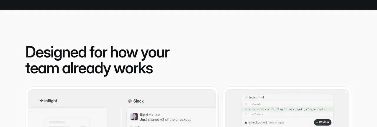
 Second customer quote
Inflight · Testimonials
 Third customer quote
Inflight · Testimonials
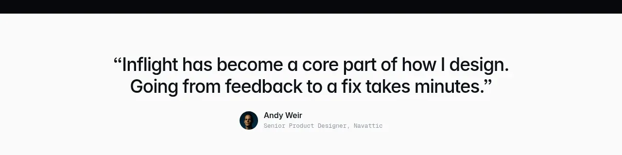 First customer quote
Inflight · Testimonials
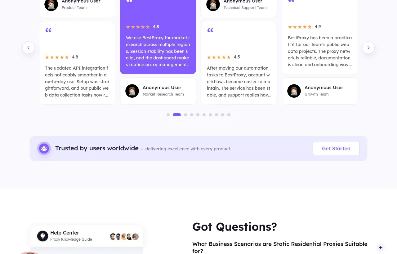
 Customer testimonials
bestproxy.com · Testimonials
 Social proof and comparison links
CrewTower Mod for Claude Code · Testimonials
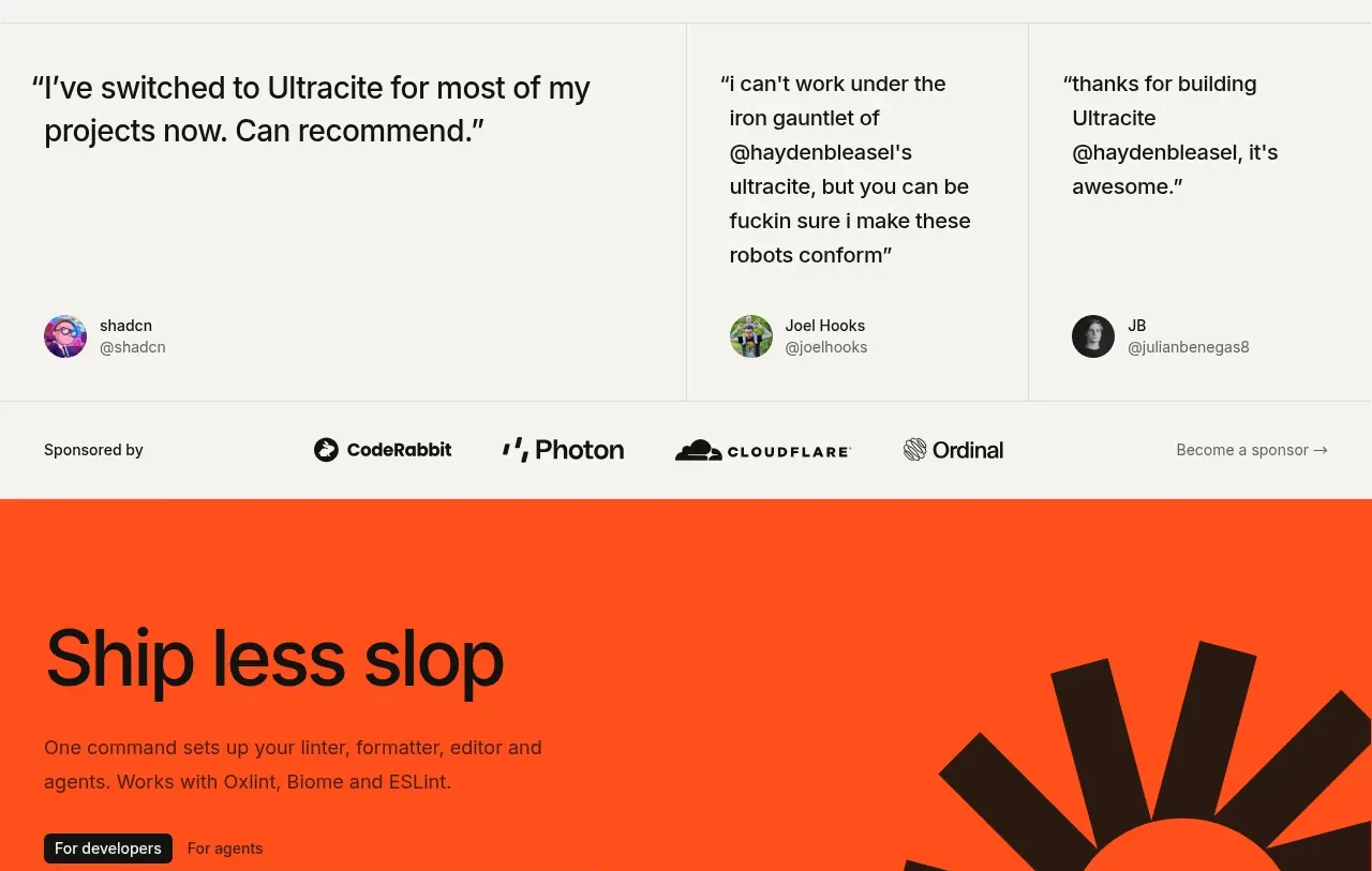
 Developer testimonials and sponsor strip
Ultracite v8 · Testimonials