 kage
contextengine.com

Design analysis
A slim mint announcement strip sits above a clean navigation row with the product mark, centered links, sign-in, and a dark primary action.
Prompt preview
## Reference images

Study these alongside the description below: hierarchy, rhythm, spacing, colour. Build for the product you are asked about, using this design language.

- Component: https://kage-design-assets.t3.tigrisfiles.io/components/context-engine/37fe6fcb-aa91-474a-8a89-1c1cadc0a655-1792821969-0.webp
- Full page it was cut from: https://kage-design-assets.t3.tigrisfiles.io/screenshots/context-engine/37fe6fcb-aa91-474a-8a89-1c1cadc0a655-1792821825382-full.webp
- Component on Kage: https://kage.design/component/context-engine-navigation

## Before you start
Ask what the user's product is, who it serves, and what its brand voice and visual identity are. Apply the principles below to that product rather than copying the reference.

Build a responsive top-of-page header with two stacked bands: a very slim, pale mint announcement bar and a spacious navigation row. Keep the content in a centered max-width container with generous horizontal padding. Put a small announcement label and inline link in the first band, with a subtle dismiss control at the far right. In the navigation row, align the brand mark and name on the left, a compact horizontal link group in the middle, and secondary sign-in plus a dark primary button on the right. Use a near-white background, black text, muted gray secondary text, and mint/teal accents around #35D3A0 and #0D755D. Use a modern sans-serif, 13–15px navigation text, 12px announcement text, 8px button radius, and a 1px translucent gray divider. Collapse links into a menu on narrow screens. Make the announcement dismissible and preserve keyboard focus states.

Never: use logos, product names, copy, illustrations, or imagery from the reference.
More components
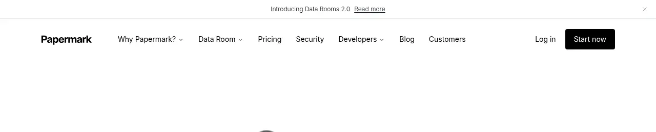
 Announcement bar and primary navigation
Papermark Data Rooms · Navigation

 Minimal product navigation
Badgey · Navigation

 Floating product navigation
Clips by Plastic · Navigation

 Top navigation
AgentGrid.io · Navigation

 Minimal brand navigation
Peras · Navigation

 Minimal product navigation
Dots · Navigation