kage

Design analysis
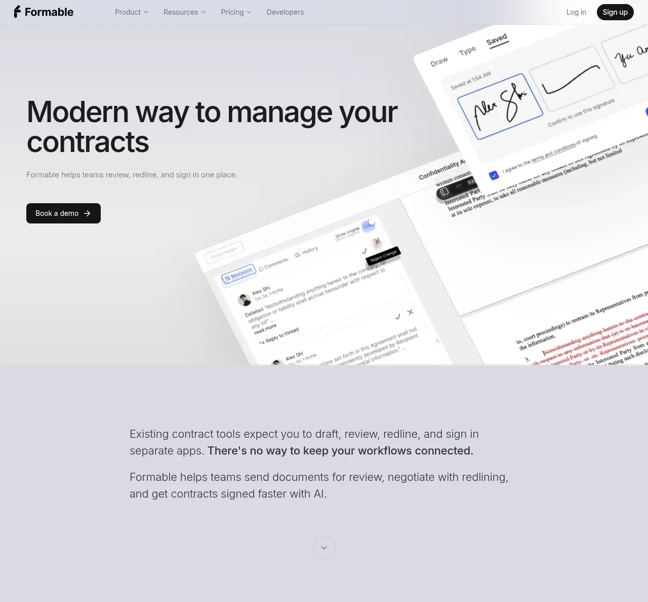
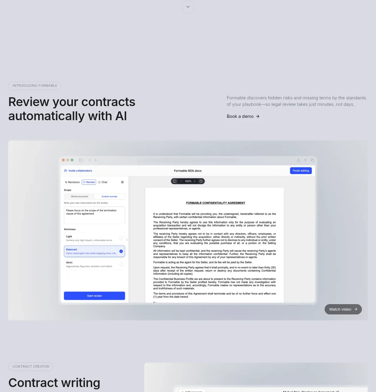
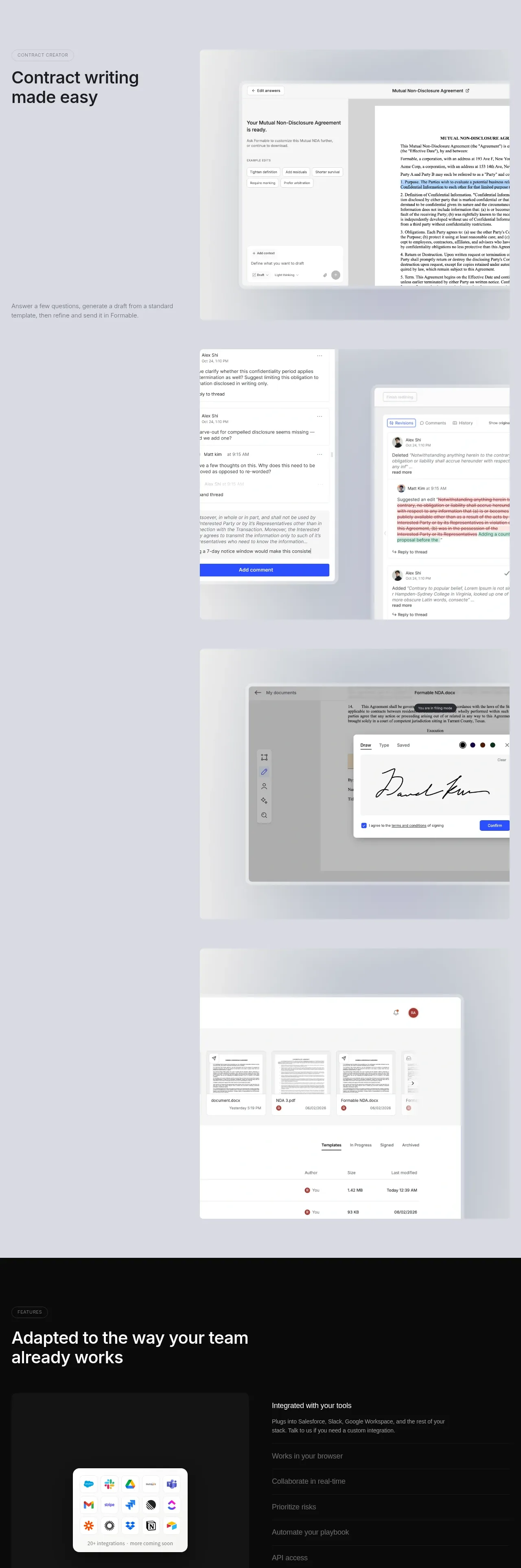
A greige, near-monochrome legal-tech landing page where a tight two-line grotesque hero sits beside tilted, softly shadowed product mockups that preview signature, redlining and comment workflows immediately. Down the page, eyebrow pills and two-column heading rows pace alternating screenshot "stages" — AI review, drafting, comment threads, e-signing, a dark file browser — before a full-black features band with an accordion and integration grid resets the rhythm, followed by a rounded photo panel for security, an oversized pull quote, three article cards, an email CTA and a dark footer crowned with a giant ghosted wordmark. A single blue accent appears almost exclusively inside the mockups' own UI, keeping the marketing chrome restrained and editorial.
Prompt preview
## Reference images

Study these alongside the description below: hierarchy, rhythm, spacing, colour. Build for the product you are asked about, using this design language.

- Full page: https://kage-design-assets.t3.tigrisfiles.io/screenshots/formabledocs-com/3108c64d-0f5a-4f45-931d-d27909065482-1792440481208-full.webp
- Above the fold: https://kage-design-assets.t3.tigrisfiles.io/screenshots/formabledocs-com/3108c64d-0f5a-4f45-931d-d27909065482-1792440474755.webp
- Design on Kage: https://kage.design/designs/formabledocs-landing-page

## Before you start
Ask the user what product they are building, who it is for, and what brand assets they already have (name, logo, colours, typeface). Wait for the answers before writing any code — everything below is applied to *their* product, not to the reference site.

## Page structure
Build a long-scroll B2B landing page in this order:

1. **Top navigation** — slim single-row bar on the page canvas: logo left; centred links with dropdown carets (Product, Resources, Pricing, Developers); right-aligned "Log in" text link and a solid dark pill "Sign up" button.
2. **Hero** — two-column. Left: a two-line display headline, one short grey subhead line, and a dark pill CTA with a trailing arrow. Right: a collage of two or three tilted, floating product-UI cards (an input/creation panel, a document excerpt, a comment thread) overlapping each other on a soft gradient wash. Fill the mockups with plausible content for the user's product.
3. **Editorial statement** — a narrow text column set off-centre-left with generous empty canvas: a two-sentence problem statement (one phrase bolded mid-sentence), a two-line solution sentence, then a small circular scroll-down chevron.
4. **Feature block A** — uppercase eyebrow pill; a two-column header row with the large heading left and a short support paragraph plus arrow text-link right; below it a full-width "stage": a realistic app screenshot in a rounded card floating on a pale gradient, with a small "Watch video" chip pinned bottom-right.
5. **Feature block B** — eyebrow pill, heading on the left, and a tall screenshot card on the right showing a drafting/generation UI; one small grey caption line closes the block.
6. **Feature cascade** — three overlapping screenshot cards drifting down the page (comment-thread cards, an e-signature pad panel, a dark file browser with document thumbnails and a data table), slightly rotated and layered so each reads as a real product moment.
7. **Dark features band** — full-bleed near-black section: eyebrow pill, white two-line heading, then a two-column body: left a white card holding a grid of integration logos with a "20+ integrations" caption; right an accordion of six or seven capability rows, the first expanded with a grey description, the rest collapsed behind hairline dividers.
8. **Security panel** — a large rounded light container: left a soft/blurred photographic image; right an eyebrow pill, a large two-line heading, an arrow text link, and a small grey trust paragraph pushed toward the bottom of the column.
9. **Testimonial** — eyebrow pill, an oversized multi-line pull quote in dark ink, then a small circular avatar with name and role beneath it.
10. **Articles** — eyebrow pill; a heading row with circular prev/next buttons and a "View all →" pill on the right; three equal article cards (cover image, title, date) on hairline-bordered white surfaces.
11. **Conversion band** — left: a heading, one-line subcopy, and an inline email field joined flush to a dark pill "Request demo" button; right: a floating screenshot card with a short caption beneath.
12. **Footer** — full-bleed near-black: five link columns under small uppercase column labels, a social icon row, then a colossal ghosted wordmark of the user's brand at roughly 10% opacity spanning the full width, with a one-line copyright at the very bottom.

## Design language
- **Palette**: one warm light-grey canvas (#ECECEA), near-black ink (#111213), white card surfaces (#FFFFFF), muted grey body text (#6E6E6B), and a single blue accent (#2563EB) reserved for buttons *inside* product screenshots and one or two primary UI states. One full-bleed near-black band (#0A0A0A) mid-page and a matching footer. No text gradients, no secondary accent colours.
- **Type**: a single neutral grotesque family throughout. Display sizes are very large and tight: hero ~72–96px at 1.05 line-height with slightly negative tracking; section headings ~40–56px; eyebrows 11px uppercase with +0.08em letter-spacing inside small outlined pills; body 16–17px in muted grey at 1.6 line-height; screenshot captions 13–14px grey.
- **Hierarchy**: every section opens with the eyebrow pill → heading → optional support copy pattern, so the reader always knows which section they've entered. Headings carry the page; body copy stays small and quiet. Bold is used sparingly — once, inline, in the statement section.
- **Rhythm and density**: 120–160px vertical padding between sections; alternate wide gradient "stages" (screenshots) with narrow text columns so density breathes. Reset the pace once with the dark band mid-page; the quote and article sections return to sparse light layouts; close on the dark footer.
- **Mockup treatment**: product screenshots are real-feeling UI, not illustrations — window chrome, tabs, tables, comment threads, avatars. Layer them with slight rotations (−3° to 6°), 1px rgba(0,0,0,0.06) hairline borders, 12–16px radii, and large diffuse shadows (0 40px 80px rgba(0,0,0,0.12)) over radial gradient backdrops (#F7F7F5 fading to #E0E1DF).
- **Buttons and links**: primary actions are solid near-black pills with white 14px labels and a small trailing arrow; secondary actions are grey text links with "→". Inputs are white with hairline borders, joined flush to the submit button in the CTA row.
- **Motion**: restrained — gentle float/scale-in on the hero collage, smooth accordion expansion, subtle hover lift on cards and pill buttons; nothing bouncy.

## Never
- Do not use the reference product's name, logo, wordmark, or any of its copy, headlines, testimonial text, article titles, or screenshot contents.
- Do not recreate its document templates, legal comment text, or signature imagery; invent neutral placeholder content for the user's own product.
- Never present the result as made by or for the reference brand.
Components from this page
All components
 Primary navigation
formabledocs.com · Navigation
 Contract management hero
formabledocs.com · Hero
 AI contract review showcase
formabledocs.com · Hero
 Contract workflow feature suite
formabledocs.com · Feature grid
 Integrations and team fit
formabledocs.com · Feature grid
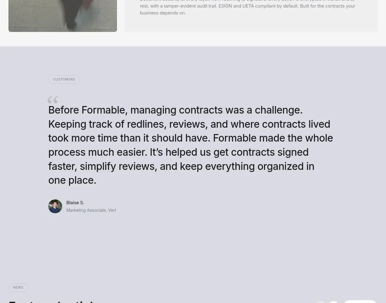 Security feature panel
formabledocs.com · Feature grid
 Customer testimonial
formabledocs.com · Testimonials
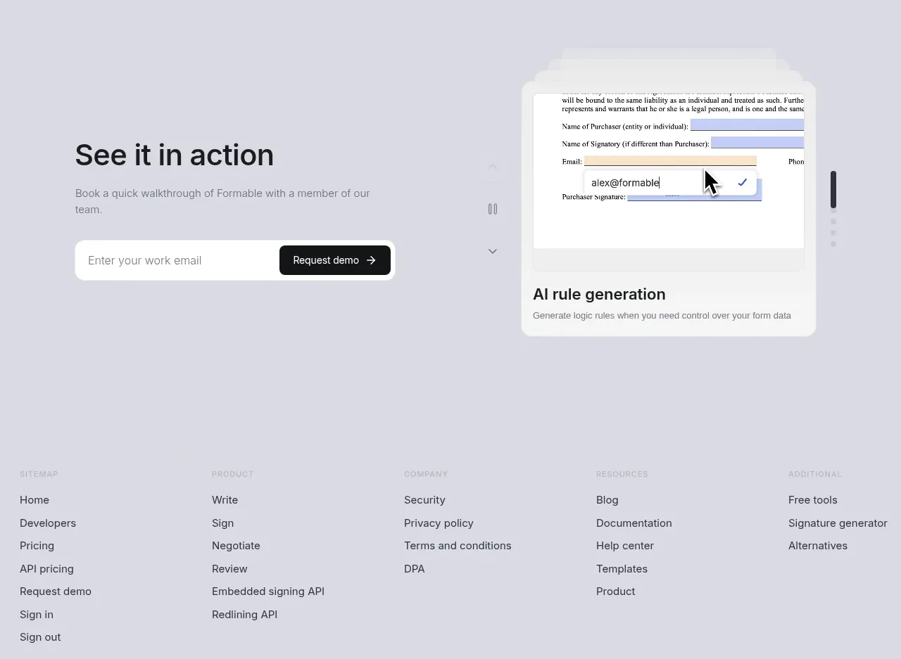 Featured articles
formabledocs.com · Gallery
 Demo request call to action
formabledocs.com · Form
 Site footer
formabledocs.com · Footer