kage
kage
make0.ai
Design analysis
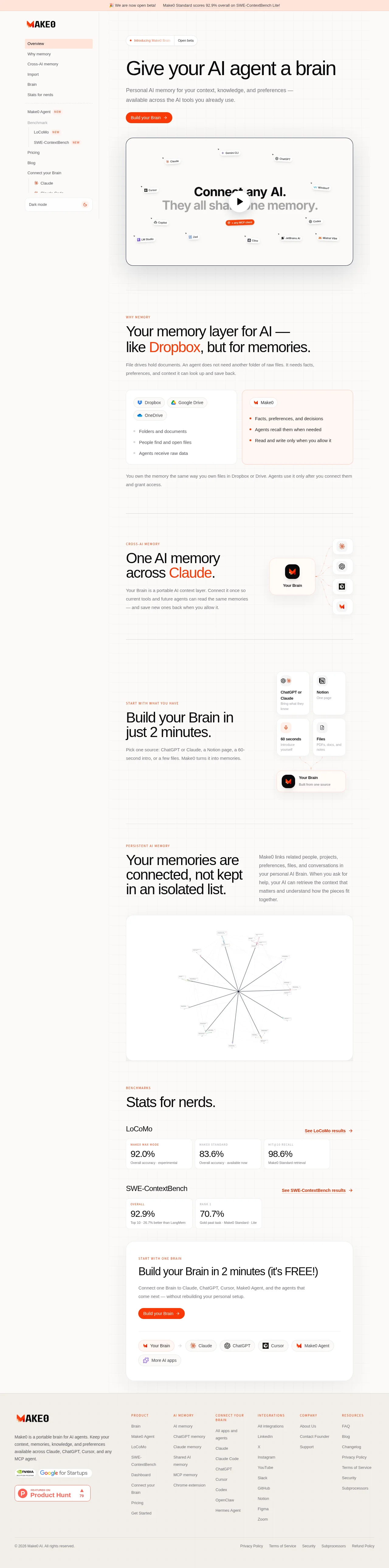
A light, documentation-like AI product landing page uses a fixed-looking left navigation rail and a narrow central content column to create an application-oriented frame. The hero establishes a large black headline, muted explanatory copy, orange CTA, and bordered video, then the page shifts into alternating feature rows, comparison cards, connection diagrams, a network visualization, benchmark metrics, and a final conversion panel. Thin gray rules, small uppercase orange section labels, soft off-white surfaces, restrained corner radii, and sparse shadows keep the long page calm while orange is reserved for actions and emphasized words.
Prompt preview
## Reference images

Study these alongside the description below: hierarchy, rhythm, spacing, colour. Build for the product you are asked about, using this design language.

- Full page: https://kage-design-assets.t3.tigrisfiles.io/screenshots/make0-brain/19c81372-003a-4a5c-a9ad-89626e51177c-1792044170316-full.webp
- Above the fold: https://kage-design-assets.t3.tigrisfiles.io/screenshots/make0-brain/19c81372-003a-4a5c-a9ad-89626e51177c-1792044157380.webp
- Design on Kage: https://kage.design/designs/make0-brain-landing-page

## Before you start
Ask the user what they are building, who it is for, and what brand assets they already have, including the product name, colours, typography, logo, and any existing visual constraints. Wait for their answers before proceeding. Apply the system below to their product rather than copying the reference product.

## Page structure
- **Announcement strip:** Place a slim full-width pale peach bar at the very top with a short release or proof-point message.
- **Application-style shell:** Use a pale off-white page with a narrow left sidebar separated by a vertical rule and a main content column. Put the product mark at the top of the sidebar, followed by compact navigation groups, nested items, small NEW labels, and a dark-mode control near the bottom.
- **Hero:** Begin the main column with a small outlined status pill, a very large headline, muted two-line supporting copy, and a compact orange rounded CTA. Follow it with a large bordered video/player panel with a centered play button and an abstract product-network preview.
- **Why-it-matters section:** After generous whitespace and a horizontal divider, introduce a small uppercase eyebrow, a large statement headline with one highlighted word in the accent colour, and a short paragraph. Below it, show two side-by-side comparison cards contrasting conventional file storage with the product’s conceptual model.
- **Cross-product memory section:** Add another ruled feature row with text on the left and a compact connection diagram on the right: one central brain card linked to several vertically stacked AI-tool cards.
- **Fast setup section:** Continue with a feature row describing a short onboarding flow. On the right, arrange four small source cards in a two-by-two grid connected to a larger destination brain card below.
- **Persistent-memory section:** Use a two-column heading and explanatory paragraph, then place a wide rounded white visualization card beneath them containing a sparse radial graph of connected memory nodes.
- **Benchmarks section:** Introduce a compact uppercase eyebrow and a large title. Organize benchmark groups vertically, each with a benchmark name, a right-aligned results link, and a row of small metric cards containing labels, large percentages, and short captions.
- **Final CTA panel:** Place a large rounded white conversion card with a small eyebrow, a prominent free setup headline, supporting copy, orange CTA, a divider, and a row of pill-shaped connected integrations or destinations.
- **Footer:** End with a wide warm-gray footer. Put the product description and trust badges in the first column, then several compact link columns for product, memory, integrations, company, and resources. Finish with a thin lower rule and a legal/copyright row.

## Design language
- Build hierarchy with a very large, plain sans-serif hero and section headlines, compact muted body copy, and tiny uppercase orange eyebrows with generous letter spacing.
- Keep the composition narrow and editorial inside a broad application shell: the sidebar provides persistent navigation while the main column uses long vertical spacing and occasional full-width panels to pace the scroll.
- Change rhythm down the page: use a spacious, low-density hero; alternate text-led feature rows with small diagrams; then increase information density in comparison cards, benchmark tiles, and the final integration row.
- Use a restrained palette: warm white/off-white backgrounds around `#FCFBF9` and `#F6F4F0`, near-black text around `#111111`, muted gray text around `#77736E`, pale rules around `#E8E5E0`, and a vivid orange-red accent around `#F0441E`. Reserve the accent for CTAs, eyebrows, highlighted words, arrows, and small status details.
- Pair a neutral geometric sans-serif throughout. Scale the hero headline around 56–72px desktop, section headlines around 32–44px, card headings around 16–22px, and supporting copy around 13–16px with relaxed line height.
- Prefer 1px borders, very soft shadows, and restrained radii: about 8–14px for cards, 20–24px for large panels, and pill radii for buttons, tags, and integration chips. Avoid heavy elevation and glossy effects.
- Make diagrams feel like interface artifacts: white cards, tiny app/source labels, fine connector lines, sparse nodes, and subtle orange emphasis rather than decorative illustration.
- Use orange pill buttons with concise labels and a small directional arrow. Add understated hover transitions such as a slight colour shift, border change, or 1–2px lift; keep the overall motion calm and functional.
- Preserve responsive intent: collapse the sidebar into a top navigation on small screens, stack comparison cards and feature rows, and let benchmark cards wrap without losing the generous vertical spacing.

## Never
- Do not use the reference product’s logo, wordmark, product name, tagline, copy, illustrations, photography, benchmark claims, or icon set.
- Do not reproduce the reference’s exact AI-tool names, navigation labels, diagrams, or integration badges; create equivalents for the user’s product and audience.
- Never present the result as the reference product or imply an affiliation with it.
Components from this page
All components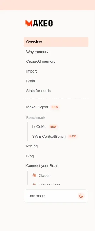
 Product sidebar navigation
Make0 Brain · Navigation
Product sidebar navigation
Make0 Brain · Navigation
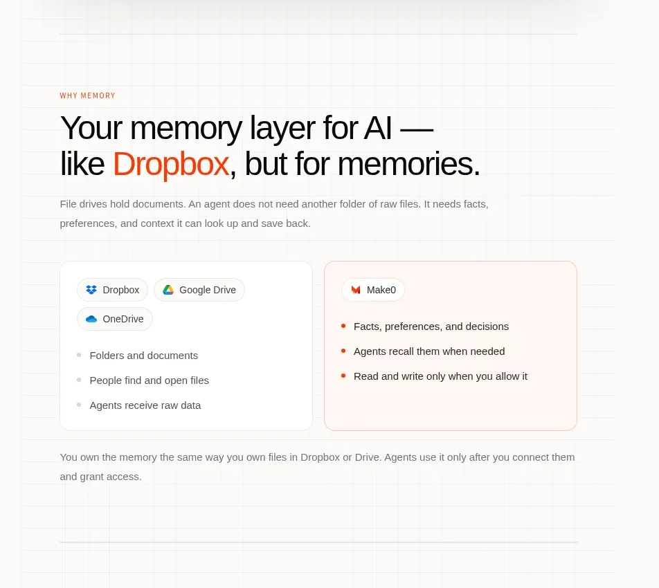 Memory layer explanation
Make0 Brain · Feature grid
Memory layer explanation
Make0 Brain · Feature grid
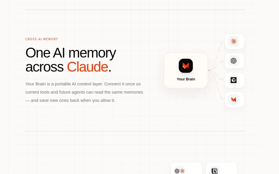 Cross-tool memory connection
Make0 Brain · Feature grid
Cross-tool memory connection
Make0 Brain · Feature grid
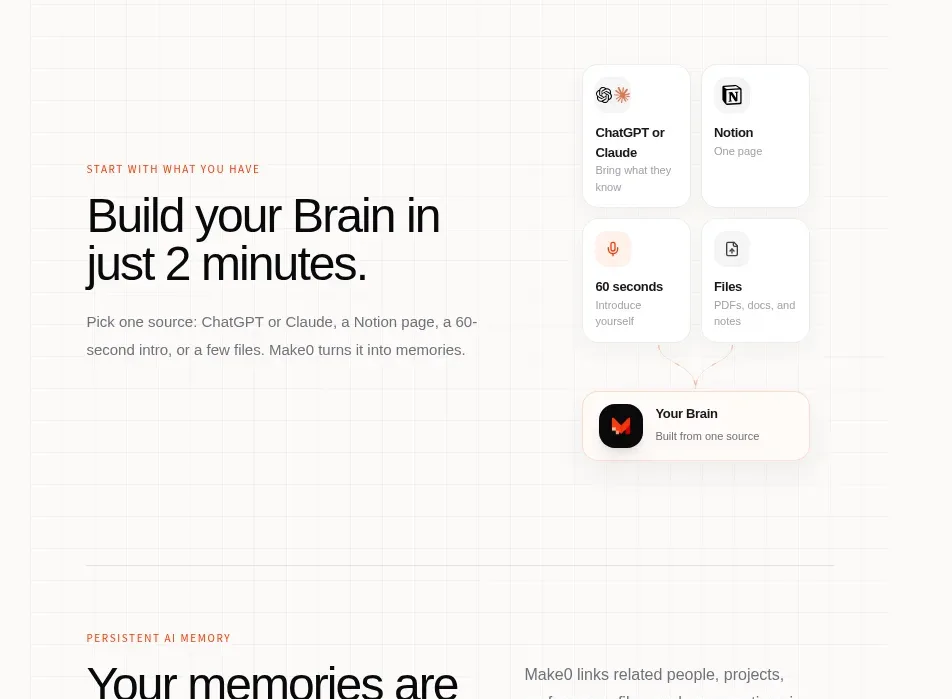 Two-minute setup flow
Make0 Brain · Feature grid
Two-minute setup flow
Make0 Brain · Feature grid
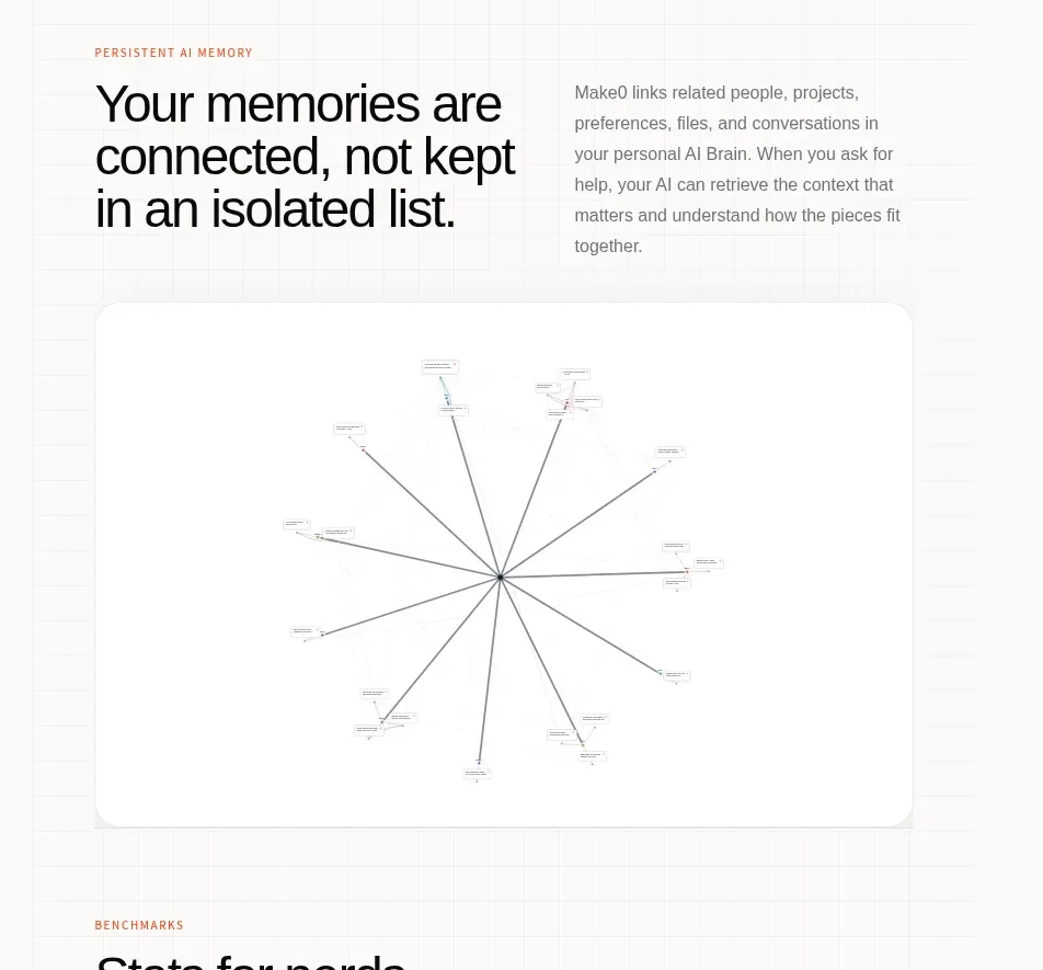 Connected memory graph
Make0 Brain · Feature grid
Connected memory graph
Make0 Brain · Feature grid
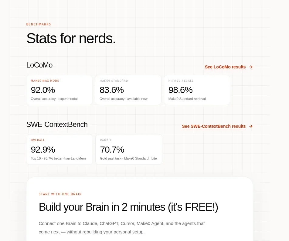 Benchmark results
Make0 Brain · Stats
Benchmark results
Make0 Brain · Stats
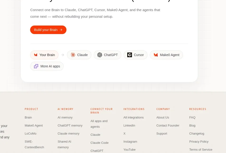 Build-your-brain conversion card
Make0 Brain · Call to action
Build-your-brain conversion card
Make0 Brain · Call to action
 Multi-column site footer
Make0 Brain · Footer
Multi-column site footer
Make0 Brain · Footer