kage
kage
mmbl.io

Design analysis
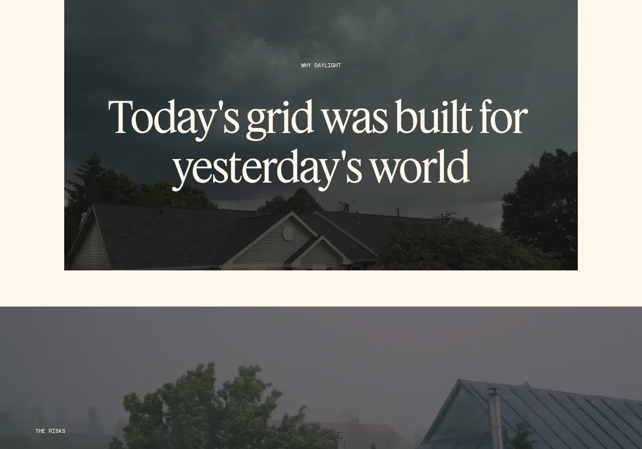
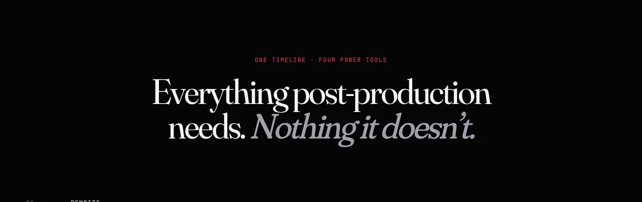
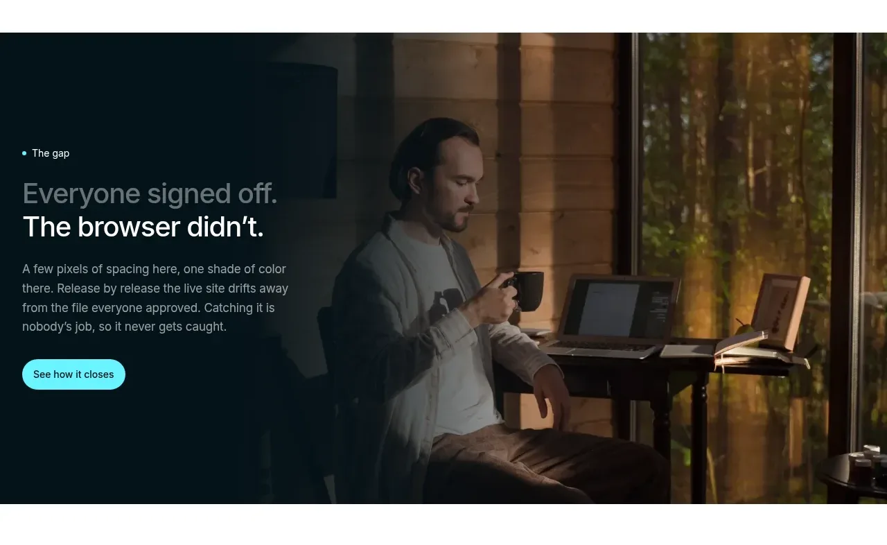
A spacious, editorial banner that turns a series of relatable phrases into a strong visual statement. Oversized type carries the hierarchy, while a compact supporting message sits offset to the right for contrast and balance.
Prompt preview
## Reference images

Study these alongside the description below: hierarchy, rhythm, spacing, colour. Build for the product you are asked about, using this design language.

- Component: https://kage-design-assets.t3.tigrisfiles.io/components/mmbl-io/849f4ec6-ce65-4185-a867-71fbc561b804-1789060566-3.webp
- Full page it was cut from: https://kage-design-assets.t3.tigrisfiles.io/screenshots/mmbl-io/849f4ec6-ce65-4185-a867-71fbc561b804-1789060540-full.webp
- Component on Kage: https://kage.design/component/mmbl-banner

## Before you start
Ask the user what their product is, who it is for, and what visual brand language they already use. Then apply the principles below to create an original version for that product rather than reproducing the reference.

## Design the section
Build a full-width editorial statement banner for a modern digital product. The section should feel calm, spacious, intelligent, and slightly conversational. Use a large text block on the left and a small supporting copy block on the right.

### Layout and alignment
- Make the banner full viewport width, with a pale tinted background and generous vertical padding.
- Use a centered content container with a maximum width of approximately 1160–1240px.
- Align the primary statement to the left edge of the container.
- Set the main statement to occupy roughly 60–70% of the available width, leaving deliberate negative space around it.
- Place a short supporting message in the right portion of the container, aligned near the lower portion of the statement rather than centered vertically.
- Compose the primary message as three short lines. Each line should have a similar rhythm and use sentence fragments or conversational phrases relevant to the product.
- On smaller screens, stack the supporting copy beneath the statement, preserving generous space and left alignment.

### Typography hierarchy
- Use a clean contemporary sans-serif with a large display size, approximately 54–64px on desktop and 36–44px on mobile.
- Use tight line-height around 0.98–1.08 and slight negative letter-spacing for the display text.
- Keep the supporting copy compact at approximately 14–16px with a line-height around 1.35.
- Use strong weight contrast: the first part of each statement can be near-black, while a quoted or emphasized phrase uses a muted secondary tone.
- Keep the copy short enough to remain a visual composition, not a paragraph.

### Colour
- Use a very light cool lavender-grey or warm off-white background, approximately `#F1EFF7`.
- Use a deep ink colour for primary text, approximately `#171622`.
- Use a softened plum-grey for quoted or emphasized words, approximately `#696477`.
- Ensure the supporting text remains readable with strong contrast against the light background.
- If the surrounding page uses dark sections, allow the banner to end cleanly against a deep charcoal or near-black adjacent section, approximately `#11111C`.

### Borders, radius, and surface treatment
- Keep the banner surface flat and unornamented.
- Do not add cards, shadows, gradients, decorative rules, or visible borders inside the section.
- Use square or nearly square outer edges so the banner reads as a strong page-level colour field.
- Let whitespace provide the separation and visual polish.

### Interaction and responsive behaviour
- This is primarily a reading moment, so avoid unnecessary animation or controls.
- If adding motion, use a subtle fade or upward reveal for the two text groups once on entering the viewport; do not animate individual letters.
- Preserve the line-based composition on desktop and allow natural reflow on mobile.
- Maintain accessible contrast, semantic heading structure, responsive text sizing, and sufficient spacing for touch devices even though the section has no interactive controls.

## Never
- Never copy the reference’s logos, product names, brand names, or wording.
- Never reuse the exact phrases, typography treatment, line breaks, or copy from the reference.
- Never include illustrations, photographs, icons, or imagery from the reference.
- Never make the result look like a direct clone; adapt the composition, tone, and content to the user’s product and brand.