kage
kage
layernote.io
Design analysis
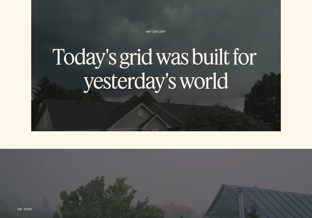
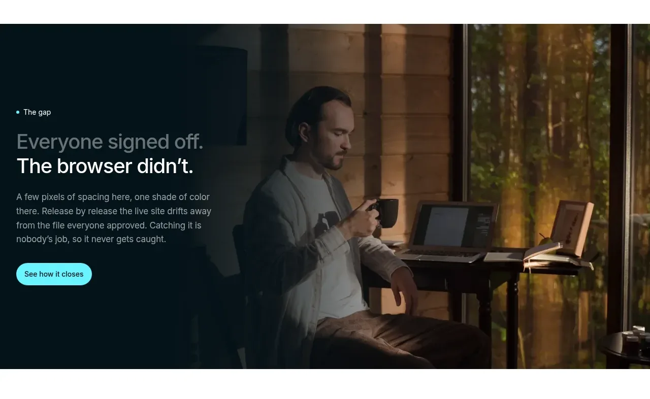
A dark, full-bleed visual interlude makes the cost of the old workflow emotional and memorable. Light text and a small CTA sit over a cinematic image with a strong dark gradient for readability.
Prompt preview
## Reference images

Study these alongside the description below: hierarchy, rhythm, spacing, colour. Build for the product you are asked about, using this design language.

- Component: https://kage-design-assets.t3.tigrisfiles.io/components/layernote/c87f4990-99cd-473d-ba2e-c718b2a2f8cb-1790402577-3.webp
- Full page it was cut from: https://kage-design-assets.t3.tigrisfiles.io/screenshots/layernote/c87f4990-99cd-473d-ba2e-c718b2a2f8cb-1790402512875-full.webp
- Component on Kage: https://kage.design/component/layernote-banner

## Before you start
Ask what failure, risk, or emotional moment best explains why the user's product matters. Use that context to create an original story banner.

Build a wide cinematic banner with a dark navy-to-transparent overlay, a background image or video chosen for the user's product context, and a constrained text block aligned left. Use a small eyebrow, a short two-line white heading, supporting copy in #b7c2c4, and a compact pale-cyan pill button. The overlay should be at least 0.65 opacity behind text, with 48–64px desktop padding and 24px radius only if the surrounding design supports a card treatment; otherwise let it run edge to edge. Add a visible pause or accessible video alternative if motion is used. Keep the visual secondary to the message and responsive with a shorter crop on mobile.

Never use the reference's logo, product name, copy, illustrations, imagery, or exact visual assets.