kage
kage
arsaze.com
Design analysis
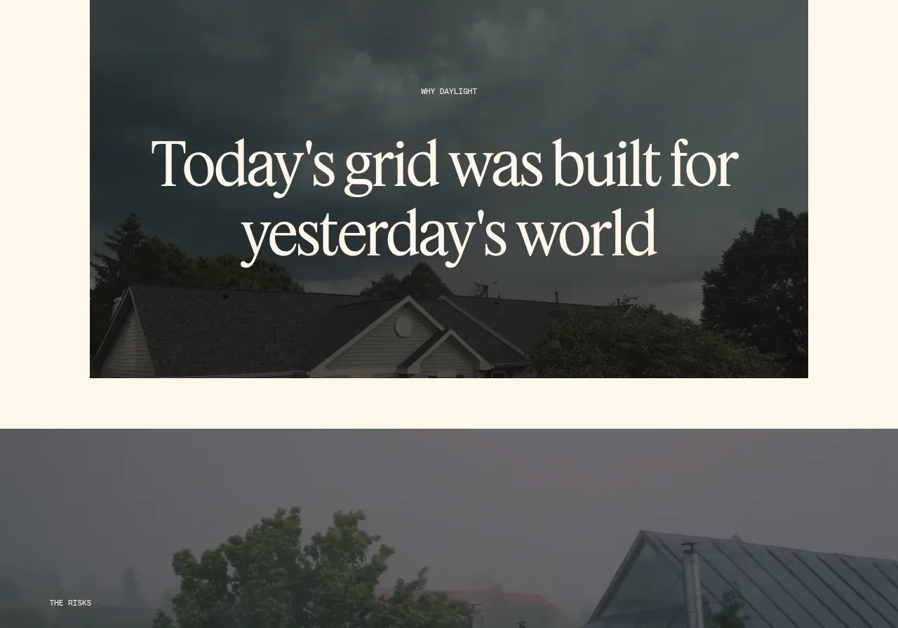
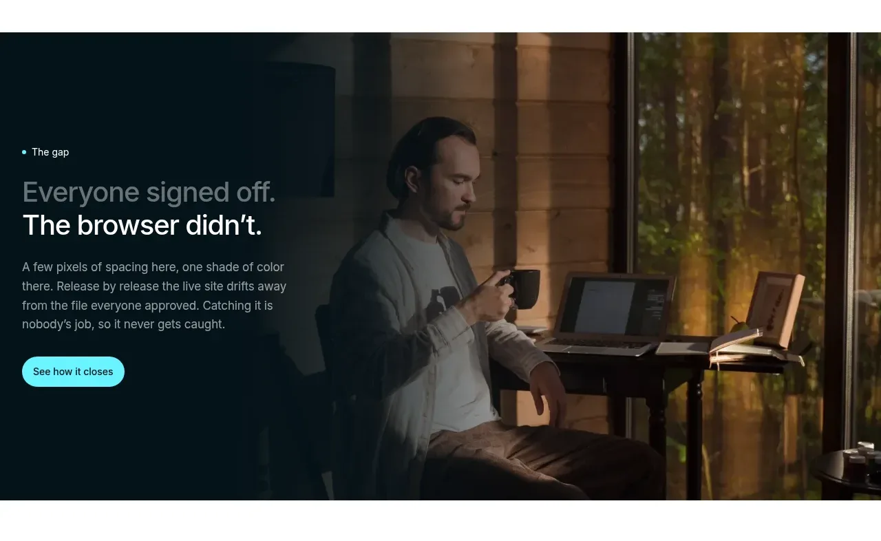
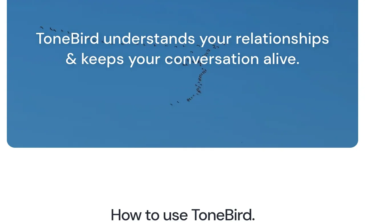
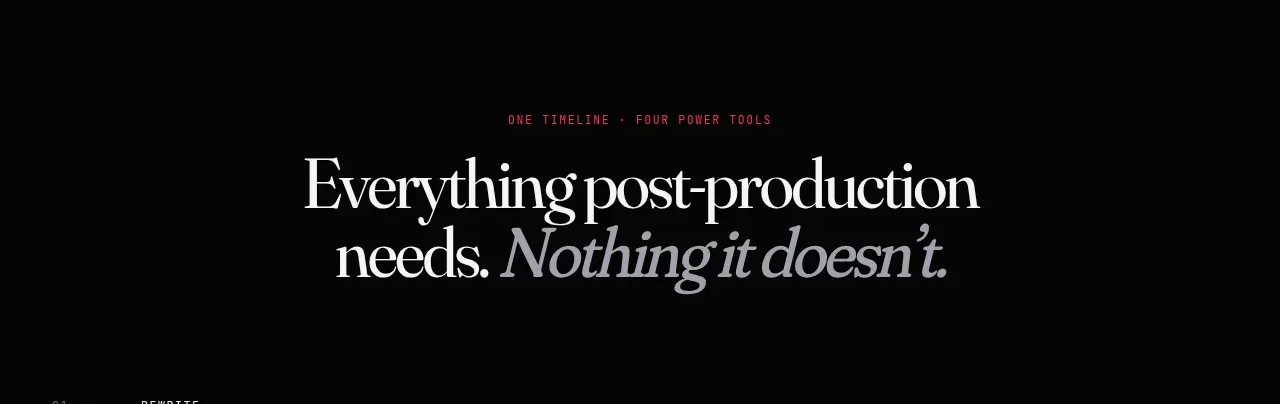
A centered transition statement resets the narrative after the hero, pairing a tiny pink eyebrow with a large two-line serif proposition and italic contrast.
Prompt preview
## Reference images

Study these alongside the description below: hierarchy, rhythm, spacing, colour. Build for the product you are asked about, using this design language.

- Component: https://kage-design-assets.t3.tigrisfiles.io/components/arsaze/e4f15c51-7821-4e39-ba4c-e316208d7c18-1790748084-3.webp
- Full page it was cut from: https://kage-design-assets.t3.tigrisfiles.io/screenshots/arsaze/e4f15c51-7821-4e39-ba4c-e316208d7c18-1790748036683-full.webp
- Component on Kage: https://kage.design/component/arsaze-banner

## Before you start
Ask what transformation the user's product promises and what tone the brand should convey. Use that information to write an original positioning statement.

Create a spacious centered statement band with a black background and a thin pink divider/accent. Place a tiny uppercase eyebrow in pink (#df315e), then a 40–54px editorial serif headline in warm off-white (#f0ece8) across two lines, using italic serif for the qualifying phrase. Keep the band visually sparse, with generous top and bottom padding and a max text width around 560px. It should function as a narrative pause rather than a card or a CTA.

Never: use logos, product names, copy, illustrations, or imagery from the reference.